
(April 2002) For the same reason that a picture is worth a thousand words, maps are important tools for communicating information and for analyzing data in a spatial context. An effective thematic map presents a picture of the spatial characteristics and patterns of a particular demographic variable. But a poorly — or cunningly — designed map can lead readers to the wrong conclusion.
Although maps are by their very nature generalizations and simplifications of reality, a mapmaker can mislead or even lie with maps by making choices about how to classify the data.
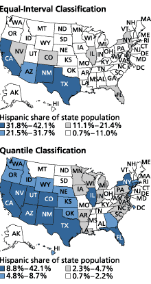
In Figure 1, both maps show the distribution of Hispanics in the United States in 2000 as a percentage of each state’s total population. The map on the top classifies states into four equal intervals. The equal-interval method of classifying data takes the range of data values (largest minus smallest) and divides it equally into a chosen number of classes. The map on the top in Figure 1 supports this conclusion: “Except in California, New Mexico, Texas, and a handful of other states that have high percentages of Hispanics, Hispanics’ share of the total population is roughly the same in every state.” So many states are grouped into the smallest category as a result of the equal-interval classification method that there appears to be little diversity anywhere else in the United States — a false impression.
Figure 1
Distribution of U.S. Hispanic Population, 2000
Source: U.S. Census Bureau, Profiles of General Demographic Characteristics, 2000 (www.census.gov/Press-Release/www/2001/2khus.pdf, accessed March 11, 2002).
The map on the bottom in Figure 1 classifies the same data into quantiles, classes that all contain the same number of states. This map sends a different message about the data: “The share of Hispanics in New York, Florida, Illinois, New Jersey, and Connecticut is roughly the same as in all southwestern and some Mountain states.” Because the categories all include the same number of states, Utah and Connecticut are seen as more similar to Texas and California than to Idaho and Massachusetts. This message is misleading because Hispanics account for 9 percent of the state population in Utah and in Connecticut; these states do not belong in the same category with Texas and California, where Hispanics account for over 30 percent of the state population.
The best way to go about creating a map that leaves the right impression is to take a look at the data before choosing the classification scheme. For example, equal-interval classification works best with data sets that have no outliers (extreme values) or that do not have a disproportionate number of similar values. The quantile method can be used to map outliers, but only if there are enough categories for the extreme values to be grouped into their own homogeneous class. To improve on the maps shown in Figure 1, one could use 12 different classes or provide a unique symbol to represent the extreme values.
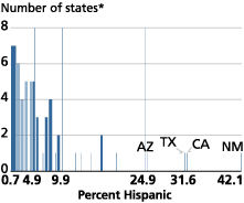
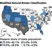
The bar chart in Figure 2 shows that there are four outliers — New Mexico, California, Texas, and Arizona. In these states, Hispanics account for a relatively large share of the total population. In fact, Hispanics in New Mexico account for 42 percent of the state population, greatly skewing the data. At the same time, there is a cluster of states in which the Hispanic share of the population is less than 10 percent. A classification scheme should recognize the diversity within these groups of states as well. The map in Figure 2, with intervals based on natural breaks, more accurately represents the distribution of Hispanics in 2000 as a percentage of each state’s total population.
Figure 2
Distribution of U.S. Hispanic Population, 2000
*Includes the District of Columbia.
Source: U.S. Census Bureau, Profiles of General Demographic Characteristics, 2000 (www.census.gov/Press-Release/www/2001/2khus.pdf, accessed March 11, 2002).
According to the National Geography Standards used to shape geography curricula in elementary and secondary schools, a geographically informed person should be able to use maps to acquire, process, and report information. Understanding the methods used to create maps like the ones shown here increases the reader’s ability to interpret maps correctly and to see the story behind the picture.
Cheryl Lynn Stauffer is a policy analyst at PRB, specializing in geography.
For More Information
Mark Monmonier, How to Lie With Maps, Second Edition (Chicago: The University of Chicago Press, 1996).
Geography Education Standards Project, Geography for Life: National Geography Standards (Washington, DC: National Geographic Research & Exploration, 1994).