map-washington-12-21-b

Making Sense of Geospatial Data with R

The R software environment allows researchers to create custom maps to help answer important questions.

Many questions asked by social science, behavioral science, and public health researchers have underlying geospatial components. That is, the phenomenon of interest is correlated across geography; if characteristics are found in one location, the likelihood of finding them in neighboring locations increases.

Spatial data can seem intimidating, as a different set of tools and software may be needed for analyzing or mapping geographic patterns. In years past, making sense of spatial data required specialized, complex geographic information system (GIS) software that could be intimidating to nonexperts. Additionally, GIS software often comes with costly licenses or investments in information technology (IT), along with more features than one might need to produce visualizations. Fortunately, today’s free online tools make it easier and less costly to process, analyze, and communicate findings from spatial data.

Using R Software to Process and Map Spatial Data

R is free statistical programming software environment used by scholars, scientists, and researchers from an array of fields and disciplines. Although it has a steep learning curve, it rewards those willing to learn with its openness and seemingly endless features. R works with many file types and can automate rote tasks, perform intensive calculations, and even create impressive data visualizations and presentations ready for sharing on the internet.

The power of the R programming environment is in its packages, which extend its capabilities. For instance, if you have a problem you are looking to solve, but R cannot solve it, another R user has likely built a package (a collection of functions, code, and data) that perform the task. And if a package has not already been developed, R allows users to develop a package and share it with others.

The R developer community has ported over many of the core libraries for working with spatial data to R (including GDAL and PROJ), and multiple visualization packages are available to create both static and interactive web-based maps. These include JavaScript libraries such as plotly, highcharter (R wrapper for the High Charts visualization library), and leaflet. Coupled with the R programming environment, these packages allow for a seamless integration of data processing, analysis, and visualization.

Tutorial: Creating A Map of Census Data

Following is an example of how to create a simple and web-ready map with R using the RStudio integrated development environment (IDE). The tutorial includes excerpted examples of R code; complete annotated code for the tutorial is available on GitHub. For this tutorial, let’s say we’re interested in understanding how geographic location is related to median income within a city. Specifically, are higher-income and lower-income households concentrated in specific regions of Washington, D.C.?

First, we can obtain American Community Survey (ACS) data on median household income at the census tract-level for Washington using the R package tidycensus. Tidycensus provides the ability to access specific U.S. Census Bureau data via their API (application programming interface), while simultaneously providing access to the underlying associated geographic data, making it a handy, all-in-one tool for mapping Census data with R.

Below is the code we could use to request relevant data from the Census Bureau API. Here, we request median income by census tract in Washington, based on 2015-2019 ACS 5-year estimates:

data <- get_acs(geography=”tract”,
state=”DC”,
variables=c(
medianIncome=”B19013_001″),
year = 2019,
survey = “acs5”,
output=”wide”,
geometry=TRUE)

In the R code above, year refers to the last year of the 5-year period.

Examining the first six rows of the ACS data from tidycensus, we see that each row includes census tract-level data for Washington. For each tract, information is available for FIPS code (GEOID), location name, median household income, and margin of error.

GEOID Location Median Household Income Margin of Error
11001009509 Census Tract 95.09, District of Columbia, District of Columbia 75515 19621
11001010100 Census Tract 101, District of Columbia, District of Columbia 94861 16089
11001008301 Census Tract 83.01, District of Columbia, District of Columbia 138487 30838
11001002101 Census Tract 21.01, District of Columbia, District of Columbia 67984 11327
11001004100 Census Tract 41, District of Columbia, District of Columbia 156625 27218
11001008001 Census Tract 80.01, District of Columbia, District of Columbia 154423 28910

Table note: In this example, the ACS data were requested with the corresponding geographic data using the geometry argument of the get_acs function. The corresponding geometry column is omitted from the example above.


While the Census API makes it easy to extract data, the resulting table doesn’t answer our research question on the relationship between location and household income. Visualizing these data in a map will help us answer that question.

A thorough spatial examination of our data can be achieved using the package mapview, which allows us to quickly overlay our dataset in an interactive web map:

mapviewMap <- mapview(data, zcol=c(“medianIncomeE”),
legend = TRUE, hide = TRUE)

Looking at the map, the relationship between location and median household income is more apparent. Households with lower median incomes are concentrated in the southern and eastern areas of Washington, while households with higher incomes are concentrated in the northwest. With our mouse, we can move around the map and zoom in to get a better look at streets, local parks, and other neighborhood characteristics from information gathered via the base map.

Mapview allows users to interact with and explore their spatial data, but it may not be the ideal choice for creating high-quality interactive maps for sharing on a webpage. Other interactive web mapping packages for R, like leaflet, allow greater customizability for those interested in creating maps that are ready for large audiences. Leaflet employs a variety of base maps that can bring more useful details into our visualization. Visualizations can be easily saved as standalone HTML files and posted to a webpage or shared with others.

As with mapview, we can use leaflet to produce a map of median household income by census tract for Washington. But here, we can extensively modify and customize components of our map, such as the information displayed when clicking on or hovering over a census tract or the legend:


leafletMap <-leaflet() %>%
addProviderTiles(“CartoDB.Positron”, group = “Positron”) %>%
addPolygons(data = data,
fillColor = ~pal(data$medIncCat),
color = “#5e5c5c”,
fillOpacity = 0.55,
weight = 0.4,
smoothFactor = 0.2,
label = labels,
highlightOptions = highlightOptions(
color=”#666″,
bringToFront = TRUE,
weight = 2
)) %>%
addLegend(pal = pal,
values = data$medIncCat,
position = “bottomright”)

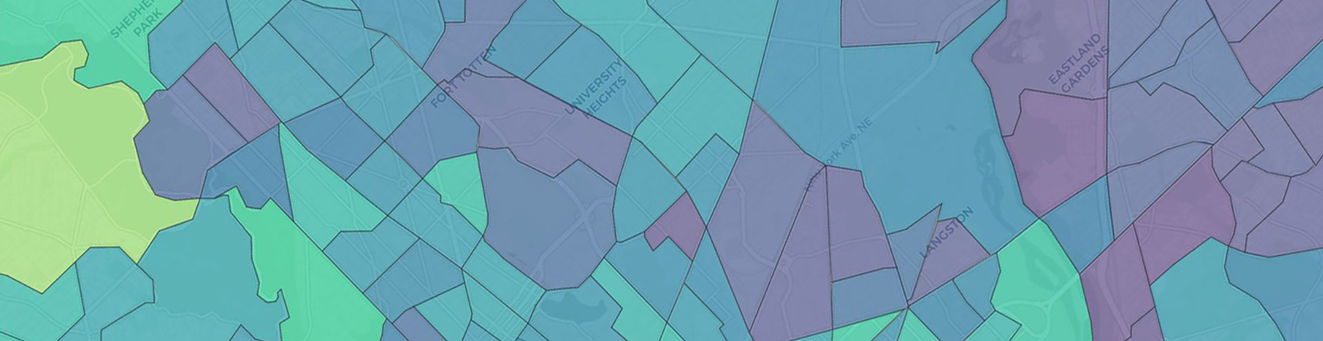
This map above has a customized hover-over message; when we hover over a tract, it displays relevant information. We can adjust the display to show specific data in a specific format. In addition, the map’s breakpoints and legend have been tailored to show income distribution by quartile.

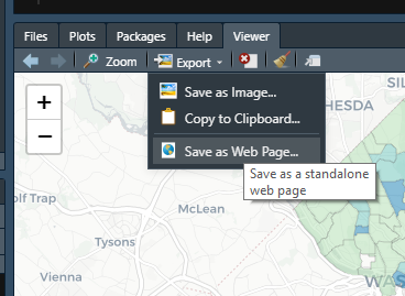
RStudio’s viewer makes it easy to save the interactive map as a HTML file. By clicking “Export,” we can access a dropdown menu and save the displayed map as a standalone HTML file, ready to be shared with others. It is as simple as uploading the file to a website and embedding it in a webpage or sending it to colleagues via email. No additional files or software are required.

R offers multiple paths for working with spatial data, far beyond the examples above. This tutorial only scratches the surface of R’s capabilities, which are extensive and constantly evolving through user contributions. To learn more about the basics of R, check out the free R for Data Science book. Or, for a thorough introduction to spatial data analysis and visualization using R, read the free Spatial Data Science book. With these tools, you’ll be developing your own maps in no time.

Annotated code for obtaining, processing, and visualizing the data for these examples can be found here.