How to Create Population Pyramids using Microsoft Excel and PowerPoint
Population pyramids are one of demography’s most useful graphics. And they can be easily prepared in Excel and PowerPoint. Here are some simple instructions and files to get you going.
To start, open the file Zambia Pyramid.xls and click on the tab at the bottom left, “DATA.” In Columns F and G, Zambia’s population by five-year age group and sex has been entered. In this case, it has been entered to the nearest person; depending on the source you use, it could be entered to the nearest thousand.
Now decide the scale you want to use. Graphing the data to the nearest person would result in the labels on the vertical y-axis to look a cluttered at best. The figures in Columns B and C are to the nearest million. Place the cursor on Cell B3: Two changes have been made to the data. First, the figures have been multiplied by -1 so that bars for males will appear on the left of the pyramid. Second, the figures have been divided by 1,000,000 in order to show labels in millions. If your data are in 1000s or some other form, simply change the “n” in the formula to some other value and copy the formula to 85+. Data for females are treated the same way, except that you don’t need to multiply by -1. Finally, the data are checked to see that they add up to Zambia’s total population.
The Zambia data used are for numbers of people. However, if you want to compare two countries of very different population sizes, pyramids using the percentage in each age group are a better way to present the data. The pyramid for Japan is a good example. In the file Japan Pyramid.xls click on the tab named “DATA.” Columns J and K contain the original data. Somewhat unusually, Japan shows population in 10,000s, but this is not of consequence since the pyramid will be built in percentages. In Columns F and G, the age groups are converted into percentages and then copied to Columns B and C with males multiplied by -1, as we did with Zambia. There are other options, such as labeling the age groups with years of birth (for example, 1985-1989).
Often, the scale of the lower, horizontal x-axis must be changed to reflect the range of data used. To make this change, right-click on the axis, select “format axis” and enter the high and low values. For Japan, the minimum value entered was -5 and the maximum was 5. The axis has also been formatted so that the minus signs do not show on the left side.
Making pyramids in PowerPoint is almost the same as in Excel. Usually, I prepare data in Excel and then cut and paste it into PowerPoint. The new PowerPoint in Office 2010 uses an Excel-type spreadsheet, so if you have that version, you can enter numbers in directly.
You can manually enter data from a country or other source but data are also available in Excel from these sources:
U.S. Census Bureau
www.census.gov/population/international/data/idb/region.php
The UN Population Division
http://esa.un.org/unpd/wpp/Excel-Data/population.htm
Hint: right-clicking and selecting “Save Target As” works faster than a straight download. The UN data are in rows, not column, but can easily be copied into columns with the “Paste Special” then “Transpose” option.
Carl Haub is a senior demographer at the Population Reference Bureau.
Related Posts
American Community Survey Resources, Shortcuts, and Tools Workshop
Expert data users from PRB, the U.S.

Lesson Plans on Human Population and Demographic Studies
Find out the answers to these questions and more. The sections listed below explore eight elements of population dynamics.

Report. Population Trends and Challenges in the Middle East and North Africa
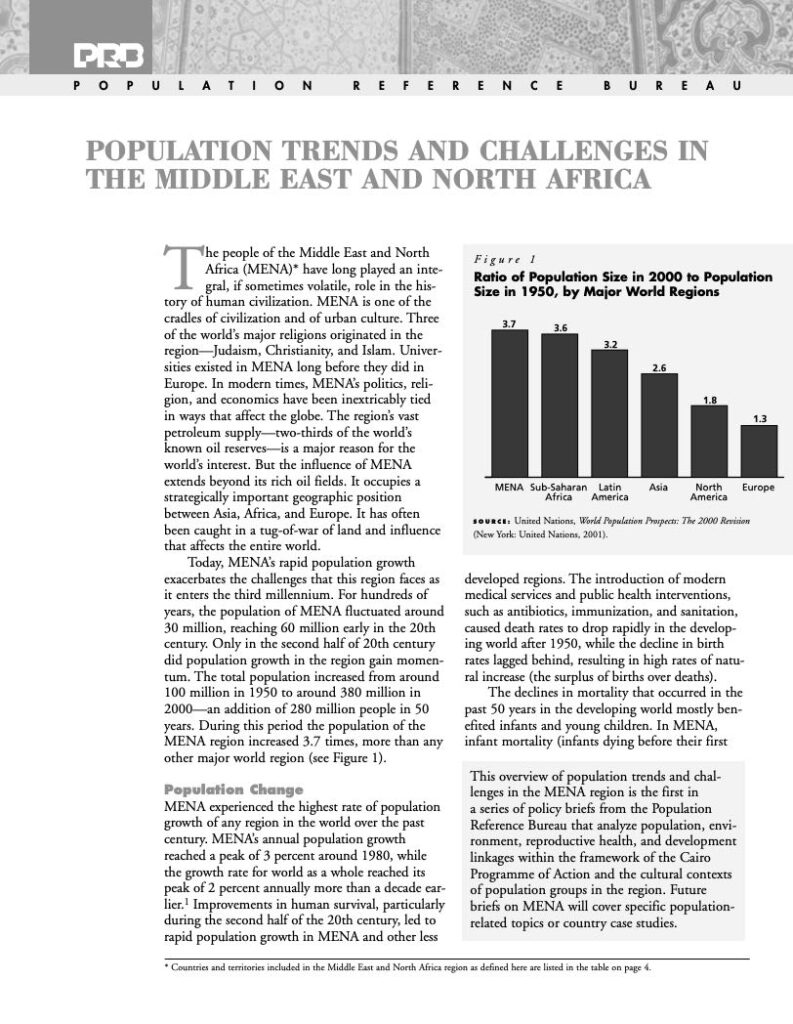
(2001) The people of the Middle East and North Africa (MENA) have long played an integral, if sometimes volatile, role in the history of human civilization.
Population Trends and Challenges in the Middle East and North Africa
(2001) The people of the Middle East and North Africa (MENA) have long played an integral, if sometimes volatile, role in the history of human civilization.