 ">
">
 ">
">
 ">
">
PRB’s World Population Data Sheet is an excellent reference and data analysis tool. Teachers are encouraged to have their students use the Data Sheet for a variety of topics and activities. The following series of short activities allows students to access a wealth of data on the world, regions, and individual countries, and develop their data literacy skills and knowledge of geography.
- Interactive Map for the 2018 World Population Data Sheet.
- Customizable Chart and Table.
- Insights from the 2018 World Population Data Sheet.
PRB’s Population Handbook, 6th edition (2011), is also a valuable resource.
These lessons may also be used with PRB’s online version of the Data Sheet, which includes all the data from the most recent edition except net migration. Data can be displayed as a map, chart, or table, and downloaded.
Grade Level
6–12.
Time Required
One class period for each activity.
Standards Addressed
Math and geography.
Vocabulary/Concepts
Population size, birth rate, death rate, infant mortality rate, total fertility rate, life expectancy, age distribution.
Learning Objectives
Activity 1
- Select a country’s population characteristics using the World Population Data Sheet.
- Identify countries that rank highest/lowest in a population indicator.
Activity 2
- Practice organizing a country’s population information into a country profile.
- Hypothesize about the data in the country profile.
Activity 3
- Illustrate countries’ selected population characteristics on a map
- Compare the illustrated population characteristics of selected countries.
Materials
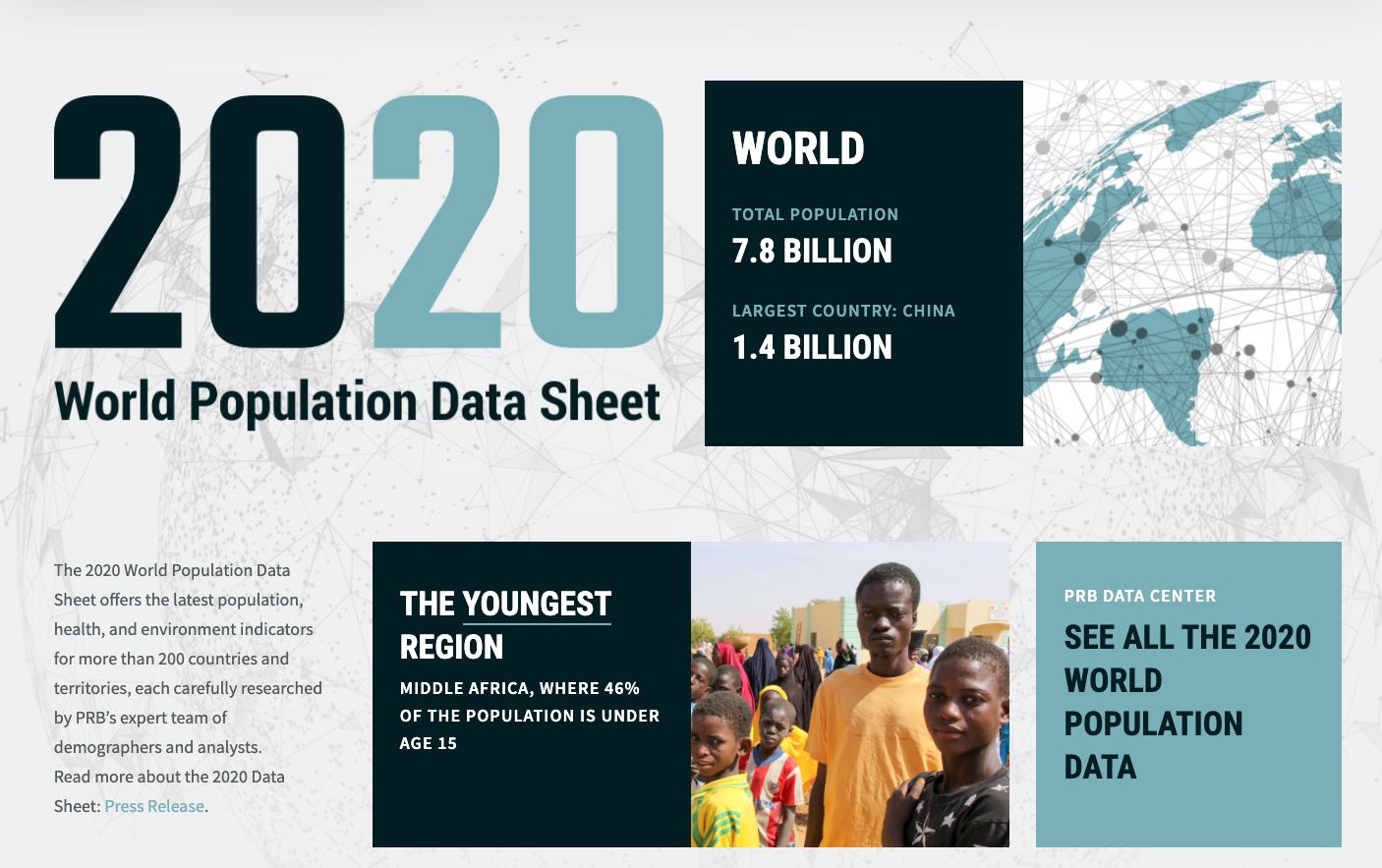
- All activities: Using the 2018 World Population Data Sheet (PDF: 2.0MB).
- Activity 2: County Profile Worksheet (PDF: 80KB).
- Activity 3: Country Outline Map (PDF: 368KB). Country outline maps for classroom use, including those for individual world regions, may be found online in a number of places.
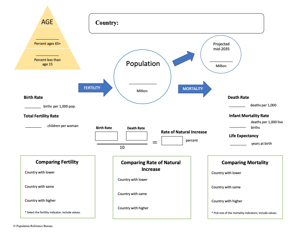
ACTIVITY 2: PROFILING A COUNTRY
The purpose of this activity is to introduce students to the demographic indicators listed on the Data Sheet by providing them with a tool to organize population information about a country. As students study different countries they can accumulate country profiles in their notebook. Students will need to use the World Population Data Sheet and the Country Profile Worksheet.
Note: The rate of natural increase is the rate at which a population is increasing (or decreasing) in a given year because of a surplus (or deficit) of births over deaths, expressed as a percentage of the base population. It is calculated by subtracting death rates from birth rates and then dividing by 10. This rate does not include the effects of immigration or emigration.
- Display the County Profile Worksheet. Distribute blank copies to students. Complete the profile of the United States, defining the indicators as they are mapped out on the worksheet. After completing the “country comparison blocks,” discuss.
- Have students place a copy of the U.S. profile in their notebooks and complete a new profile each time they start a unit on a new country. Before they do the profile of the new country, students should develop hypotheses about the population characteristics of the country and use the mapping activity (Activity 3) to test their hypotheses. They should compare the profile of each new country with the profile of the United States.
- As students learn more about the country, they can add other information from the Data Sheet (or other sources) to their profiles.
This lesson was adapted from a lesson developed by Jane Moriarty of the Michigan Geographic Alliance.
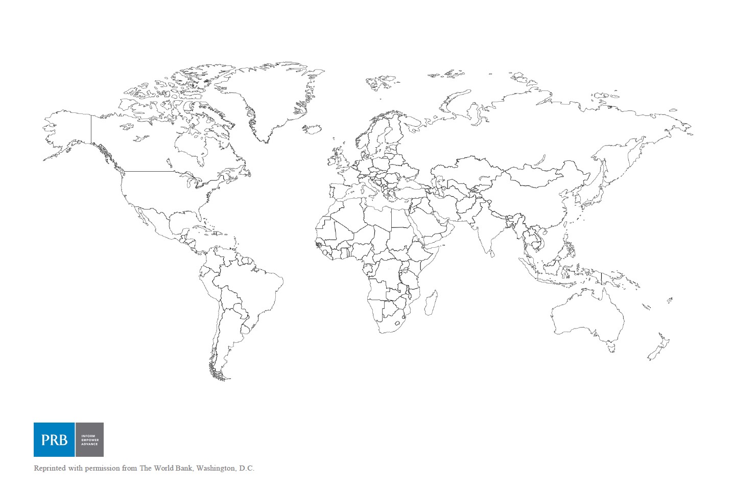
ACTIVITY 3: MAPPING THE DATA
Mapping data is often a good method for analysis. Most of the demographic characteristics on the World Population Data Sheet lend themselves to mapping. A map that uses color to represent quantitative data is called a choropleth map. Areas are distinguished from one another using different colors or different shades of the same color based on the values they represent. Brighter colors or dark shades of the same color indicate greater values and dimmer colors or lighter shades indicate lesser values.
Choose one of the following demographic variables using the World Population Data Sheet and map the world or regional distribution of that indicator on a world or regional country outline map:
| Infant Mortality | Birth Rate | Death Rate |
| Total Fertility Rate | Percent Ages 65 and Over | Percent Under Age 15 |
| Per Capita GNI PPP | Life Expectancy (Male) | Life Expectancy (Female) |
Note: PRB’s online resource (www.worldpopdata.org) is particularly appropriate for this activity. It includes all the data from the most recent PRB World Population Data Sheet except net migration. Data can be displayed as a map, chart, or table, and downloaded. Step-by-step instructions for creating a choropleth map are below.
Create a Choropleth Map: Country Outline Map
Determine the mapping categories by finding the range of values for that indicator. Determine the number of categories to be used for your map and the interval of each category. For example:
- After choosing the variable, determine the highest and lowest values for that measure.
- Subtract these two numbers to calculate the range for the data.
- Divide the range by the number of mapping categories planned for the map. Four to five categories will be adequate for most measures. The number produced by the division will indicate how many numbers to include in each category interval.
- Always construct categories so that the numbers in one category do not overlap those in adjacent categories.
- Arrange a color code or shading pattern for each category. Colors or patterns should increase from light to dark, from lowest to highest category.
- Determine the proper mapping category for each country and color or shade the country on an outline map, title the map, place a legend on the page, and indicate the source.
Interpret the Map
After the map has been drawn, consider the following to guide interpretation:
- Describe the patterns observed on the map.
- What accounts for the variation?
- Discuss the factors that could lead to the range of outcomes within this distribution.
Draw Another Map
Draw another map to examine the relationships that may exist between two variables or compare results with another student who has mapped a different variable. Possible pairs of variables to compare:
- Infant Mortality—Life Expectancy (Male or Female)
- Death Rate—Percent of Population Under Age 15
- Birth Rate—Percent of Population Ages 65 and Older
- Infant Mortality—Per Capita GNI PPP
Engage
- Does there appear to be a relationship between the two variables? If so, is the relationship positive of negative? For example, are the countries with the highest rates of one variable the same countries with the highest rates of the other variable? If so, then the relationship is positive. If the countries with the highest rate of one variable also have the lowest rates in another, then the relationship is negative.
- Discuss whether the factors that contribute to the patterns in one variable affect the patterns in another.
This activity was adapted from exercises submitted by Eugene J. Kinerney of the University of the District of Columbia and Basheer K. Nijim of the University of Northern Iowa. The lesson plan was updated in 2018 by Paola Scommegna and Nancy Matuszak, Population Reference Bureau.