Beth Jarosz
Senior Program Director

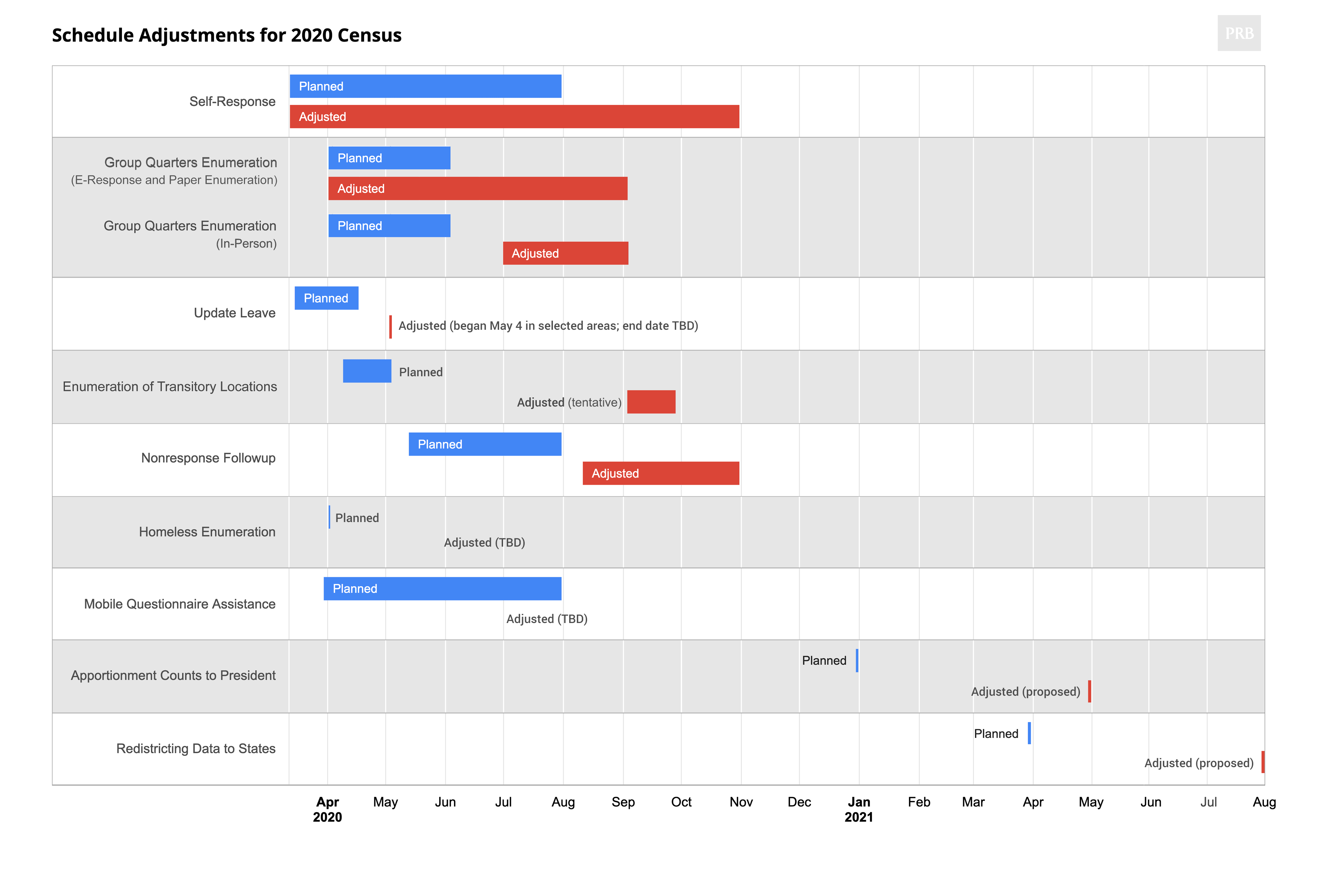
Notes: Enumeration of people who are homeless will take place at service locations (shelters, soup kitchens, mobile food vans) and unsheltered outdoor locations. Changes in the dates for apportionment counts to the president and redistricting data to states require congressional approval.
Source: U.S. Census Bureau, “2020 Census Operational Adjustments Due to COVID-19,” as of June 9, 2020, https://2020census.gov/en/news-events/operational-adjustments-covid-19.html?#.
Census Bureau transmits redistricting files to states in 2021.
Redistricting files contain housing unit counts and population data by race/ethnicity, voting age, and gender.
NEW: Redistricting files will contain group quarters data.
Other products releases, dates TBD (ongoing through 2022).
Advertising begins in January.
Data collection begins (March 2020).
Census Day: April 1, 2020.
First Data Release (originally planned): December 31, 2020 (state totals reported). Important note: This date could change.
Field offices begin to open.
Evaluation of End-to-End Test.
Defect Resolution and Performance Testing.
Formation of Complete Count Committees.
Early Education Phase of Communications Program begins.
Address Canvassing is completed.
Question wording sent to Congress by March 31.
End-to-End Census Test and Nonresponse Follow-up completed (April 1 is Census Day).
Partnership program begins.
Report to Congress on Subjects Planned for 2020 Census.
Local Update of Census Addresses (LUCA) begins.
Address Canvassing begins for 2018 end-to-end test.
Residency Rules announced.
Release 2020 Census Operational Plan.
Conduct testing.


California, Florida, and Texas made up a combined 27 percent of the U.S. population in 2015 but accounted for 48 percent of U.S. population growth between 2014 and 2015, according to new Census Bureau estimates. The relatively fast growth in these three states reflects a combination of factors, including a rebounding economy that has fueled domestic and international migration in many Sun Belt states; and rapid population growth among first- and second-generation immigrants, especially from Latin America. If current trends continue, the combined population in California, Florida, and Texas could exceed 100 million people by 2030—up from 81 million in 2010—as the three states increase their economic and political positions relative to the rest of the country.1
The recent population growth in California, Florida, and Texas represents a sharp increase compared with the 2000s (when the three states made up 38 percent of total growth) and the 1990s (when they accounted for just 34 percent of growth) (see figure). The 1980s was the only decade in which the three states accounted for a greater share of total growth (54 percent), owing mostly to rapid population growth in California during that decade. Since 2010, Texas has had the largest net increase in population among the 50 states—adding 2.3 million people, more than the net population increase in all of the states in the Northeast and Midwest combined (1.9 million).
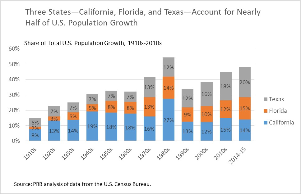
Since 2010, the percent increase in population in Texas (9.2 percent) was more than double the population growth rate in the United States as a whole (4.1 percent). Population growth in Florida (7.8 percent) and California (5.1 percent) was more modest but was still associated with large numerical gains because of the large populations in those states.
One hundred years ago, 60 percent of the U.S. population lived in the Northeast and Midwest. Populations in California, Florida, and Texas were increasing rapidly but made up just 8 percent of the total U.S. population. During the course of the 20th Century, as the U.S. population shifted to the South and West, California, Florida, and Texas accounted for a growing share of overall population change. This growth expanded rapidly in the 1980s as California attracted a large number of domestic and international migrants.
All three states continued to grow during the 1990s but trends in California, Florida, and Texas were overshadowed by rapid growth in the Mountain West, especially in Arizona, Colorado, Idaho, Nevada, and Utah. During the 2000s, the housing market crisis and recession dampened population growth in California and Florida, while the population in Texas—which was somewhat insulated from the economic downturn—continued to increase rapidly.
Since 2010, migration flows to the Sunbelt have rebounded, although they have not returned to their peak levels from the mid-2000s. Just last year, in a major shift in the demographic balance, Florida passed New York as the third most-populous state. Improvements in the housing and job markets may help explain Florida’s rebound. At 5 percent, the national unemployment rate is down sharply from its double-digit peak of more than 10 percent in October 2009, and fewer homeowners have mortgages that are “under water.” As of November 2015, the unemployment rates in Texas (4.6 percent) and Florida (5.0 percent) were at or below the national average (5.0 percent) while California’s rate remained relatively high at 5.7 percent.
Another key factor driving population growth in California and Texas is their relatively young populations relative to many other states. Having a young population creates population momentum through a large number of births relative to deaths. Between 2014 and 2015, California and Texas registered more than twice as many combined births (902,000) as deaths (443,000), resulting in the addition of 459,000 people through natural increase. Florida also experienced growth due to natural increase during this period, but because of its large population of retirees, had a more balanced mix of births relative to deaths.
The key to the relatively youthful populations in California and Texas—and to a lesser degree, Florida—is immigration, especially from Latin America. While the U.S. population as a whole is aging rapidly as the large cohort of baby boomers reaches retirement age, some states have become “fountains of youth” by attracting immigrant workers—many of whom start families after they arrive in the United States. Between 2014 and 2015, California, Florida, and Texas had a net (combined) increase of 412,000 international migrants, mostly from Latin America. California had the largest net increase in international migrants among the 50 states, followed by New York, Florida, and Texas.
Domestic (state-to-state) migration was another key factor driving population growth in Florida and Texas between 2014 and 2015. Young adults are moving to these states primarily for jobs, while many older adults move to the Sun Belt to escape the cold northern winters, to live closer to family members, or for the lower cost of living. During the same period, California experienced a net outflow of domestic migrants, as many residents moved to lower-cost states, especially Arizona, Nevada, and Texas.
State population gains and losses are important not only from a demographic and economic perspective, but also because they affect the balance of political power in Congress. After each decennial census, population totals in each state are used to reallocate the 435 seats in the U.S. House of Representatives.
Over the past century, southern and western states have gained seats at the expense of states in the Northeast and Midwest, and this trend is continuing. Texas gained four seats during the reapportionment process following the 2010 Census, while Florida gained two. In the current Congress, California leads the nation with 53 seats, followed by Texas (36), and Florida and New York (27 each).
If current trends continue, California and Florida could each gain another congressional seat after the 2020 Census, and Texas could gain another three seats.2 Although it’s difficult to predict longer-term trends, state demographers in California, Florida, and Texas expect that these population gains will continue at least through 2030, when the combined population of the three states could reach 100 million people.

Between 2010 and 2011, the U.S. population increased by 0.7 percent, after averaging 0.9 percent growth each year from 2000 through 2010.1 The United States added just 2.3 million people from 2010 to 2011, compared with 2.9 million from 2005 to 2006, just five years earlier. The decline in U.S. population growth is likely due to a confluence of factors: lower levels of immigration, population aging, and declining fertility rates.
A drop in net immigration to the United States is a key factor in the country’s declining population growth rate. Around the turn of the millennium, the Census Bureau was estimating net international migration at about 1.4 million per year. By late in the decade, that annual number had been adjusted downward to less than 900,000. Between 2010 and 2011, net migration was estimated at around 700,000. The drop in immigration levels means that a smaller share of U.S. population growth is directly attributable to immigration, as opposed to natural increase (the excess of births over deaths). In the early 2000s, immigration accounted for roughly 40 percent of U.S. population growth, leaving 60 percent from natural increase.2 During the past few years, however, net international migration is estimated to have accounted for only 30 percent of the annual population growth.
The decline in immigration has been linked to job losses in construction, manufacturing, and other occupations that are often filled by recent immigrants, as well as stricter enforcement of immigration laws. Net immigration levels from Mexico are estimated to have reached zero in recent years as an equal number of people entering the United States from Mexico are now returning to their home country.3
Because most immigrants to the United States arrive from Latin America or Asia, the decline in net international immigration has contributed to slower growth in the Latino and Asian American populations. Latinos and Asians remain the country’s two fastest-growing minority groups, but their growth rates have dropped below the peaks reported just a few years ago.
Population growth for Latinos averaged 3.6 percent per year during the previous decade, but fell to just 2.5 percent between 2010 and 2011 (see Figure 1). There was a similar drop for Asian Americans during the same period, from 3.6 percent to 2.2 percent.4 Although the rate of change fell for both groups, the number of Asians and Latinos is still increasing. And both groups are still growing faster than African Americans (1 percent) and non-Hispanic whites (0.1 percent).
Percent Annual Change in U.S. Population, by Racial/Ethnic Group
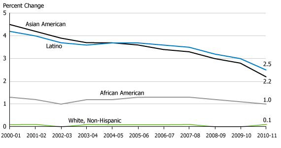
Source: U.S. Census Bureau, population estimates.
The recent decline in immigration has also accelerated population aging in the United States. Most immigrants are working-age adults, and many start families after they arrive in the U.S., creating an immigrant youth bulge.5 Less immigration therefore reduces the potential number of young people in the population. But even if immigrant levels had held steady during the recession, the U.S. population would still be growing older as the large cohort of baby boomers starts to reach retirement age.
A decade ago, children under age 18 made up a significant component of annual population growth and exceeded the growth of those ages 65 and older (see Figure 2). But by 2011, these patterns had reversed: The number of people under age 18 declined by 190,000 between 2010 and 2011, while the number of elderly increased by 917,000. Growth in the number of working-age adults, including those in prime childbearing ages, is also down sharply.
Annual Change in U.S. Population, by Age Group
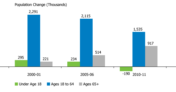
Source: U.S. Census Bureau, population estimates.
Because of its relatively young age structure, the United States still has a great deal of population momentum compared to many other developed countries.6 But as more baby boomers enter retirement and there are fewer people of reproductive age, we could see further declines in the number of births, and the age structure of the United States could start to resemble that of Europe.
U.S. fertility rates have also declined in recent years, reducing levels of natural increase in the population. There were an estimated 4 million births between 2010 and 2011, down from 4.2 million at the recent peak of U.S. population growth between 2005 and 2006. The total fertility rate (TFR) stood at 2.0 births per woman in 2009—down from 2.1 a few years ago—but preliminary data from the National Center for Health Statistics (NCHS) suggest that the TFR could drop below 2 births per woman in 2010.
Latinos currently account for more than one-fourth of all births in the United States. Yet the Latina general fertility rate (births per 1,000 Latinas ages 15 to 44) dropped from 102 in 2007 to 80 in 2010, according to preliminary NCHS estimates. This represents a significant decline for a group with historically high fertility rates—approaching 3 births per woman just a few years ago. If current trends continue, the Latina TFR could drop below 2.5 in the near future.
The U.S. population is currently projected to reach “majority minority” status (the point at which less than 50 percent of the population is non-Hispanic white) in 2042. However, a sustained drop in immigration levels and fertility rates would slow the pace of minority population growth. It’s too soon to tell whether these are short-term trends resulting from the U.S. economic downturn, or whether they will continue in the future. But either way, these current trends represent a significant departure from developments over the past decade.
(November 2011) Exactly 50 years ago, geographer Jean Gottmann coined the term “megalopolis” to describe the sprawling regional mega-city taking shape between Boston and Washington, D.C., gobbling up rural areas in its wake.1
“BosWash” is the nickname futurist Herman Kahn gave this potentially 400-mile urban area in the late 1960s. He called the urbanizing swath from Chicago to Pittsburgh along the Great Lakes and Ohio River “ChiPitts,” and the California coastal development stretching from San Francisco to San Diego “SanSan.”2
In a 1967 book, he predicted that by 2000 one-half of the U.S. population would live in those three megalopolises and that any examination of U.S. population trends in the 21st century “would largely be a study of BosWash, ChiPitts, and SanSan.”3
But a somewhat different story has unfolded over the past 50 years, says Mark Mather, co-author of PRB’s Reports on America: First Results From the 2010 Census. “The three megalopolises’ share of U.S. population actually declined somewhat between 1960 and 2010,” says Mather. “Rather than growing to encompass one-half of the U.S. population, the three areas are only home to about one-third of all U.S. residents.”
| 1960 Population | % of U.S. Total | 2010 Population | % of U.S. Total | |
|---|---|---|---|---|
| Total U.S. Population | 179,323,175 | 100 | 308,745,538 | 100 |
| Megalopolises | ||||
| BosWash | 37,152,310 | 21 | 51,770,596 | 17 |
| ChiPitts | 13,537,469 | 8 | 17,719,657 | 6 |
| SanSan | 12,180,125 | 7 | 26,745,198 | 9 |
| Total Share | 36 | 31 | ||
Note: See References below for definitions of the megalopolises.
Sources: U.S. Census Bureau, 1960 Census of the Population, Vol. A, Part 1 (Washington, DC: Government Printing Office, 1961) and for 2010 Census data, PRB’s DataFinder, accessed at www.prb.org/DataFinder.aspx, on Oct. 24, 2011.
Mather and his co-authors highlighted several key population trends that observers in the 1960s had not fully anticipated:
The U.S. population has shifted to the South and West since the 1950s. Today the South is the most populous region, followed by the West, Midwest, and Northeast. In 2010, the West overtook the Midwest as the second most-populous census region—just as it overtook the Northeast in 1990.
Old industrial cities in the Northeast and Midwest–often called the Rust Belt—lost population, as manufacturing declined and people left in search of better jobs. Many metro areas in ChiPitts–such as Detroit, Buffalo, Cleveland, and Pittsburgh—have been plagued by high rates of out-migration since the 1970s.
The fastest growing areas have been mainly outside the three megalopolises. These fast-growing areas included suburbs of metropolitan areas in the South and West, such as the region around Orlando, Fla.; the “Research Triangle” area of North Carolina; and the areas surrounding such cities as Las Vegas, Atlanta, and several cities in Texas (Houston, Dallas-Fort Worth, San Antonio, and Austin). The northern Virginia exurbs of Washington, D.C. —at the southern end of BosWash—are an exception.
Population aging has fueled growth in retirement destinations, which tend to be outside the three metropolises. During the 2000s, retirement-destination counties—ones that are attractive to people age 60 and older—were among the big demographic “winners.” One-third of the 440 retirement counties grew at least twice the national average between 2000 and 2010. Two of the large, fast-growing retirement destinations are Maricopa County, Arizona, and Clark County, Nevada.
But Gottmann’s main message—sprawling urban growth– reflects population dynamics still at play today, Mather noted:
Paola Scommegna is senior writer/editor at the Population Reference Bureau.
U.S. 2010 Census results show that black-white residential segregation declined modestly since 2000, continuing the gradual pace begun in 1980.
Among large metropolitan areas with a total population of 500,000 or more, the least segregated metros were located in the faster-growing South and West, while the most segregated metro areas were mainly concentrated in the slower-growing Northeast and Midwest (see table).
The 10 least-segregated metro areas all grew faster than the national average of 11 percent between 2000 and 2010, with seven of them seeing increases of 20 percent or more, reports Kelvin Pollard, PRB demographer and co-author of PRB’s Reports on America: “First Results From the 2010 Census.” Only one of the 10 most-segregated metros experienced growth rates that reached even half the national average.
“Least-segregated Raleigh and Las Vegas were among the nation’s fastest growing metros with growth rates topping more than 40 percent for the decade, while most-segregated Detroit, Cleveland, and Buffalo were among those that lost population,” he notes.
Demographers use the segregation (or dissimilarity) index to measure how racial groups are spread throughout a metro area’s census tracts. An index of 100 would mean blacks live in exclusively black neighborhoods and whites live in exclusively white neighborhoods, while a score of zero means each neighborhood has the same share of black and white residents as the metro area as a whole.
“Milwaukee’s index of 81.5 means that about eight out of 10 black residents would need to move to another Milwaukee neighborhood to be distributed throughout the metro area in the same way as whites,” Pollard explains. Demographers call levels of 60 and above highly segregated, 39 to 59 moderately segregated, and below 39 less segregated.
| wdt_ID | Least Black-White Segregated Metros | Segregation Index, 2010 | Percent Population Change, 2000-2010 |
|---|---|---|---|
| 1 | Tucson, Ariz. | 3.7 | 1.6 |
| 2 | Las Vegas-Paradise, Nev. | 37.6 | 41.8 |
| 3 | Colorado Springs, Colo. | 39.3 | 20.1 |
| 4 | Charleston-North Charleston-Summerville, S.C. | 41.5 | 21.1 |
| 5 | Raleigh-Cary, N.C. | 42.1 | 41.8 |
| 6 | Greenville-Mauldin-Easley, S.C. | 43.6 | 13.8 |
| 7 | Phoenix-Mesa-Glendale, Ariz. | 43.6 | 28.9 |
| 8 | Lakeland-Winter Haven, Fla. | 43.9 | 24.4 |
| 9 | Augusta-Richmond County, Ga.-S.C. | 45.2 | 11.5 |
| 10 | Riverside-San Bernardino-Ontario, Calif | 45.7 | 29.8 |
Note: Metro areas with fewer than 500,000 total residents or where non-Hispanic blacks made up fewer than 3 percent of the population were not included when ranking black-white segregation indices.
Sources: Segregation Indices: William H. Frey, Brookings Institution, and University of Michigan Social Science Data Analysis Network, Analysis of 1990, 2000, and 2010 Decennial Census tract data, accessed at www.psc.isr.umich.edu/dis/census/segregation2010.html, on Aug. 29, 2011. Population Data: Population Reference Bureau, analysis of 2000 and 2010 Decennial Census data.
| wdt_ID | Most Black-White Segregated Metros | Segregation Index, 2010 | Percent Population Change, 2000-2010 |
|---|---|---|---|
| 1 | Milwaukee-Waukesha-West Allis, Wisc. | 8.2 | 0.4 |
| 2 | New York-Northern New Jersey-Long Island, N.Y.-N.J.-Pa. | 78.0 | 3.1 |
| 3 | Chicago-Joliet-Naperville, Ill.-Ind.-Wisc. | 76.4 | 4.0 |
| 4 | Detroit-Warren-Livonia, Mich. | 75.3 | -3.5 |
| 5 | Cleveland-Elyria-Mentor, Ohio | 74.1 | -3.3 |
| 6 | Buffalo-Niagara Falls, N.Y. | 73.2 | -3.0 |
| 7 | St. Louis, Mo.-Ill. | 72.3 | 4.3 |
| 8 | Cincinnati-Middletown, Ohio-Ky.-Ind. | 69.4 | 6.0 |
| 9 | Philadelphia-Camden-Wilmington, Pa.-N.J.-Del.-Md. | 68.4 | 4.9 |
| 10 | Los Angeles-Long Beach-Santa Ana, Calif. | 67.8 | 3.7 |
Note: Metro areas with fewer than 500,000 total residents or where non-Hispanic blacks made up fewer than 3 percent of the population were not included when ranking black-white segregation indices.
Sources: Segregation Indices: William H. Frey, Brookings Institution, and University of Michigan Social Science Data Analysis Network, Analysis of 1990, 2000, and 2010 Decennial Census tract data, accessed at www.psc.isr.umich.edu/dis/census/segregation2010.html, on Aug. 29, 2011. Population Data: Population Reference Bureau, analysis of 2000 and 2010 Decennial Census data.
Segregation persists in older cities in the Northeast and Midwest where a large share of the nation’s African American residents live, “buttressed by a history of poor race relations and continuing discrimination,” says John Iceland, a Penn State University demographer who studies segregation and poverty. Cities like Chicago, Detroit, and Philadelphia have long-established black communities—often called ghettos—that grew during the migration of African Americans from the South for industrial jobs during the first half of the 1900s.
Still, the 2010 Census results offer some good news: “The ghettoes of the Northeast and Midwest are not being reconstituted in the fast-growing areas of the South and West,” he notes.
U.S. cities with high levels of growth and new construction tend to be less segregated. One reason may be that newer housing lacks a reputation for discrimination, while in older areas the perception—widely held or not—that blacks are unwelcome in a particular suburb or area of the city can linger for decades. Metro areas in the South and West tend to have more mobile populations, fewer blacks, and sometimes no long-established black community, Iceland points out. “The world of difference is easy to see in a short drive through Milwaukee or Detroit where there are starkly black and starkly white neighborhoods that you don’t see to nearly the same extent driving in places like Tucson or Las Vegas,” he says.
The way city boundaries were drawn in the past also plays a role in regional differences today, according to Reynolds Farley, a University of Michigan sociology professor emeritus, who began studying segregation in the 1960s. The boundaries of the Rustbelt cities of the Northeast and Midwest were established decades ago and are surrounded by independent suburbs, some with a history of hostility to blacks. In the South and West, central cities annexed outlying land after World War II; metro areas like Tucson include much of what might be considered the suburban ring in the Midwest. In some parts of the West and South, public schools are often organized on a county-wide basis, limiting white suburban enclaves.
By the 1990s, more African Americans were calling the suburbs home, but in many places those suburbs were predominantly black. “The important finding revealed by Census 2010 is that many, many places within suburban rings in the Northeast and Midwest appear to be quite open to African American residents,” says Farley. “You can find almost all-black neighborhoods, but such segregation is certainly declining. In quite a few metro areas in the South and West and some in the Midwest, you could say that black-white segregation is not much more than moderate.”
Researchers are now tracking the impact of growing Hispanic and Asian populations on black-white segregation. “As a community becomes more diverse, racial mixing appears easier to achieve and a different dynamic seems to be playing out,” says Iceland.
Black-white segregation has declined gradually and continuously over the last 40 years, but as the nation’s population has become more diverse some analysts anticipated more rapid change, even hoping for a breakthrough.
“The growth of the black middle class, the passage of time since Fair Housing Laws were enacted, and the evidence from surveys that white Americans are becoming more tolerant of black neighbors all point toward progress in overcoming the high level of segregation that had been reached in 1970,” says Brown University sociology professor John Logan.
A report from the US2010 Census Project, directed by Logan, found overall black-white residential segregation in U.S. metropolitan areas declined from a high of 79 in 1970 to 59 in 2010 (as measured by the segregation index).1 Logan calls the progress “mixed,” noting that at the current rate of change it will be 2030 before blacks reach the same level of segregation as Hispanics today (index of 48). The report also found that cities with the largest share of black residents registered the smallest declines in segregation over the past 30 years, while metro areas with black populations of less than 5 percent showed the greatest declines.
One cost of residential segregation for African Americans is quality of life. The neighborhoods where they live typically have fewer resources and higher poverty than neighborhoods where comparable non-Hispanic whites live, according to the US2010 Census Project.2 The average black household earning more than $75,000 was in a neighborhood with a higher poverty rate than the average white household earning less than $40,000.
For children, segregation continues to be more pronounced than for adults. The Harvard School of Public Health’s Diversity Data project reports that segregation declined moderately for black children in most U.S. metropolitan areas since 2000, but remains high.3 Their analysis of 2010 Census data found that black child segregation relative to white children in the 100 largest metropolitan areas fell between 2000 and 2010 from 72 to 68, as measured by the segregation index. Child segregation declined most in larger, very highly segregated metros in the Midwest and smaller metros in Florida and the western United States, the researchers found.
“In very few instances do the very best neighborhoods where black and Hispanic children live have opportunities and amenities close to the average level of neighborhoods where white children live,” write the Diversity Data project authors.
Farley calls “residential segregation a lens to assess whether the U.S. has achieved the equality that some felt the 2008 election symbolized.”4 He points to declines in segregation, increases in interracial marriages, documented changes in racial attitudes, and widespread acceptance of equal housing opportunities as signs of weakened systemic discrimination.
Yet he acknowledges that while white attitudes have become more accepting over the past 30 years, full acceptance is a long way off. About half of whites surveyed in Detroit in 2004 told Farley’s research team they would move if the racial composition of their neighborhoods reaches 50-50, down from three-quarters in 1976. Still, he is cautiously optimistic: “The long trend toward lower levels of black-white segregation seems sure to continue.”
(July 2011) PRB Reports on America: “First Results From the 2010 Census” looks at demographic trends in the U.S. population since 2000.
Here are 10 key findings about how the U.S. population has changed:
In this video, Mark Mather, associate vice president, and Linda A. Jacobsen, vice president, Domestic Programs at PRB discuss four key tables and figures from the report:
This report was written by Mark Mather, associate vice president, Domestic Programs, at PRB; Kelvin Pollard, senior demographer; and Linda A. Jacobsen, vice president, Domestic Programs.
The 2010 Census questionnaire will be sent to every housing unit in the country. The person in who fills out the form (Person 1) will provide the household information, including whether the home is rented or owned, and will answer just seven questions about every household member, including himself or herself:
Each question—how it is worded, how many and which categories are included—is carefully considered and pretested. The information is either required by law to provide constitutionally mandated information for apportioning congressional seats, or for drawing new legislative district boundaries, distributing federal funds, administering federal programs, or it is collected to help ensure the accuracy and completeness of the census. Although the name of each household member is also collected, it remains confidential for 72 years.
Three of the above questions included in the 2010 Census are highlighted below.
Relationships Within the Household
Everyone living in a household is listed according to his or her relation to “Person 1,” in one of 14 categories, including husband or wife, stepson or stepdaughter, roomer or boarder, or unmarried partner. These responses tell us, for example, how many people live alone or with nonrelatives; how many children live with one parent or grandparent; and how many households include extended family members such as in-laws or adult siblings. Together these responses provide a snapshot of the American family. The information about relationships within U.S. households is used for federally funded nutrition and education programs, housing funding, and other social services.
 Hispanic Identity
Since the 1970 Census, the questionnaire has asked U.S. residents whether they are of Hispanic origin, and if so, which broad Hispanic group they identify with. Hispanic origin is considered separately from race in the Census—and Hispanics may identify with any race. As the largest and fastest-growing ethnic minority in the United States, the information about Hispanic origin is of growing importance. It is used in numerous programs and for monitoring equal employment opportunities.

Race
The 2010 questionnaire lists 15 racial categories, as well as places to write in specific races not listed on the form. The 2010 Census continues the option first introduced in the 2000 Census for respondents to choose more than one race. Only about 2 percent of Americans identified with more than one race in the 2000 Census, but the percentage was much higher for children and young adults and will likely increase in 2010.

For More Information
U.S. Census Bureau, The 2010 Census Questionnaire: Informational Copy (January 2009), accessed online at http://2010.census.gov/2010census/pdf/2010_Questionnaire_Info_Copy.pdf, on April 13, 2009.
U.S. Census Bureau, Questions Planned for the 2010 Census and American Community Survey (March 2008), accessed online at http://2010.census.gov/2010census/pdf/2010ACSnotebook.pdf, on April 13, 2009.
(March 2009) High unemployment rates are not just creating a drag on the U.S. economy, but are also linked to lagging population growth in economically distressed areas, according to a PRB analysis of data from the U.S. Census Bureau. Between 2007 and 2008, the population in distressed counties—areas with unemployment rates of 6 percent or more in 2007—grew 0.3 percent, compared with a 1.2 percent growth rate in areas with relatively low unemployment (less than 4 percent). Nationwide, the population grew 0.9 percent during 2007-2008.
Most states and counties are still gaining population, but trends vary widely in different parts of the country. While populations increased in every state except Michigan and Rhode Island between 2007 and 2008, more than a third of U.S. counties experienced population losses during this period. The population decline was most pronounced in Michigan, where 60 of the state’s 83 counties lost population during the year. Michigan’s unemployment rate currently stands at 11.6 percent, higher than any other state.
What is driving these population losses? For counties in Michigan and many other states, the main factor is out-migration: people moving from one county to another, often in search of better job opportunities. Between 2007 and 2008, counties with high or moderate unemployment experienced negative net domestic migration, meaning that the number of people moving out of those counties exceeded the number moving in (see figure). Only those counties with the lowest unemployment rates experienced a net gain of domestic migrants.
In contrast, there was a net gain of international migrants across a large majority of counties, regardless of unemployment levels. Many counties with high unemployment rates, such as the Bronx in New York, are important gateways for international migrants. Some immigrants move there for work but others use these areas as a launching pad to find jobs in other parts of the country.
Net Population Change From 2007 to 2008, by County Unemployment Rate
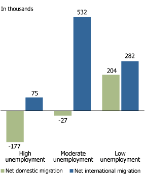
Note: High unemployment=6 percent or more, moderate unemployment=4 percent to 5.9 percent, and low unemployment=less than 4 percent. Unemployment rates are based on 2007 annual averages from Bureau of Labor Statistics.
Source: U.S. Census Bureau and Bureau of Labor Statistics.
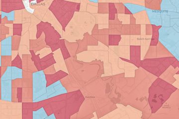
About one in eight U.S. counties (the ones shaded dark blue in the map) experienced a recent reversal in domestic (county-to-county) migration, from a net gain in 2000-2007 to a net loss during the more recent period from 2007 to 2008. The drop in domestic migration is evident not only in Michigan but also in parts of Florida, interior California, northern New England, and the outer suburbs of metropolitan New York and Washington, D.C. For Florida, the latest census figures represent a major reversal, from a net gain of more than a million domestic migrants from 2000 through 2007 to a net loss of nearly 10,000 migrants between 2007 and 2008. Parts of Florida, California, and many suburbs of large metropolitan areas were hit particularly hard by the mortgage meltdown, which likely contributed to these recent population losses.
Even with the recession that began in December 2007, there were pockets of rapid population growth. Nearly 300 counties nationwide, mostly in the South and West, grew at least 2 percent between 2007 and 2008—more than twice the national rate. In Texas, 47 of the state’s 254 counties grew at least 2 percent during this most recent period, and Georgia had 34 such counties (out of 159). One-fifth of the counties in North Carolina and over two-thirds of those in Utah also grew by 2 percent or more (20 counties in each state). In fact, Utah recently replaced Nevada as the fastest-growing state in the country. Population growth may have slowed in some of these areas given the economic events of recent months, but we won’t know the full impact until next year, when the 2009 county population estimates are released.
Virtually all of the fastest-growing counties registered positive gains in net immigration, net domestic migration, and natural increase (the excess of births over deaths). Migration accounted for about two-thirds of the overall growth in these counties. In Utah, however, natural increase accounted for most of the population gains.
Mark Mather is associate vice president, Domestic Programs and Kelvin Pollard is senior demographer at the Population Reference Bureau.

 ">
">
 ">
">