


PRB Projects 2050 World Population at 9.8 Billion,
Youth Population to Reach 1.4 Billion
The world population will reach 9.8 billion in 2050, up 31 percent from an estimated 7.5 billion now, according to projections included in the 2017 World Population Data Sheet from the Population Reference Bureau (PRB).
This edition of the annual Data Sheet, also shows a worldwide total fertility rate (TFR, or average lifetime births per woman) of 2.5. The three countries with the highest TFRs are Niger (7.3), Chad (6.4), and Somalia (6.4), while there is a five-way tie for the lowest TFR (1.2) among Bosnia-Herzegovina, Romania, Singapore, South Korea, and Taiwan.

PRB’s 2050 projections show Africa’s population will more than double to 2.6 billion by 2050 and account for more than half (57 percent) of the global population increase by that date. The number of people in Asia will rise about 750 million to 5.2 billion, while Europe (including all of Russia) is headed for a population decline from 745 million to 736 million. The Americas population is seen increasing to 1.2 billion from 1 billion now, and Oceania (which includes Australia and New Zealand) would rise from 42 million to 63 million.
PRB’s widely referenced Data Sheet has been produced annually since 1962. This year’s edition provides the latest data on 17 key population, health, and environment indicators for the world, major regions, and more than 200 countries. This Data Sheet’syouth focus features nine special indicators and several analytical graphics exploring the state of the world’s youth, defined as people ages 15 to 24.
The Data Sheet’s midcentury population projections indicate that:
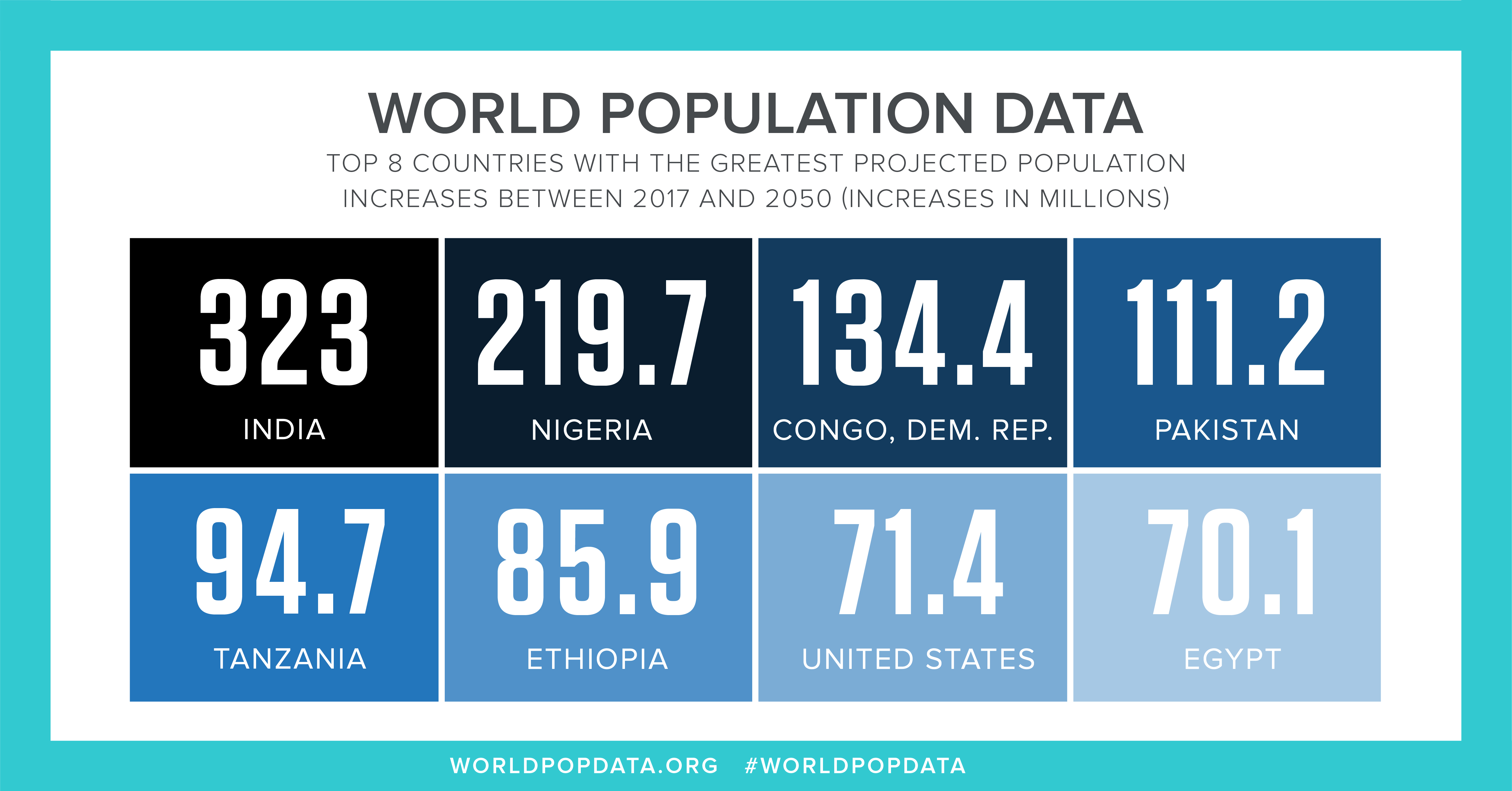
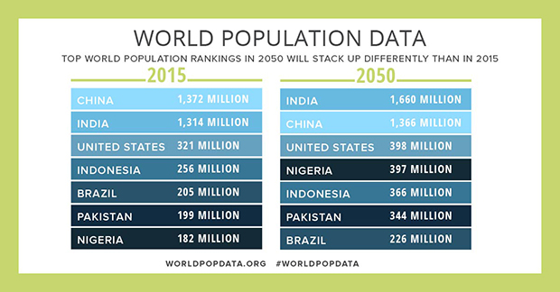
- India will become the world’s most populous country with 1.7 billion people, with China in second place at 1.3 billion. Currently China is at 1.39 billion, compared with 1.35 billion in India.
- India will also register the largest numerical increase in population of any country, adding 323 million people by 2050. Nigeria will post the second-largest rise at 220 million, followed by Democratic Republic of Congo at 134 million.
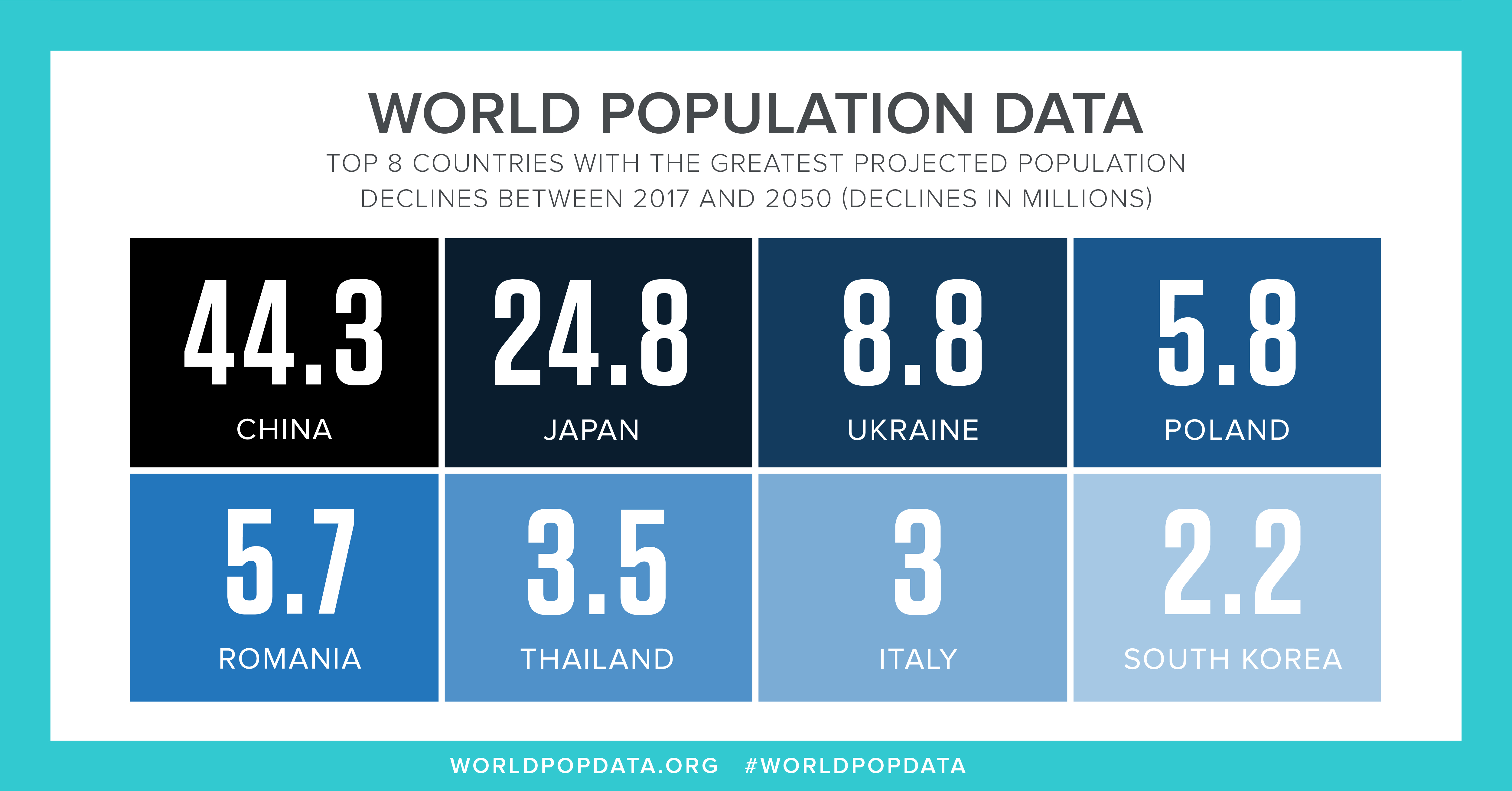
- Thirty-nine countries will have smaller populations in 2050 than in 2017. China will register the largest numerical population decrease of 44 million, followed by Japan at 25 million and Ukraine at 9 million.
- The population of 30 countries, nearly all in Africa, will at least double by 2050.
- The population of the United States will be 397 million, up from 325 million today.
Can Youth Develop Their Potential?
PRB compiled statistics to measure whether youth are well-positioned to develop into productive adults, based on health, education, and other factors. The Data Sheet includes indicators for secondary and tertiary school enrollment, adolescent fertility rates, rates of HIV/AIDS among youth, youth population figures for 2017, and youth population projections for 2050. A few key figures are:
- The world youth population (ages 15 to 24) is projected to rise to 1.4 billion in 2050 from 1.2 billion now but the youth share of world population will fall to 14 percent from 16 percent.
- Africa’s youth population will rise to 35 percent of the world youth total in 2050, from 20 percent today.
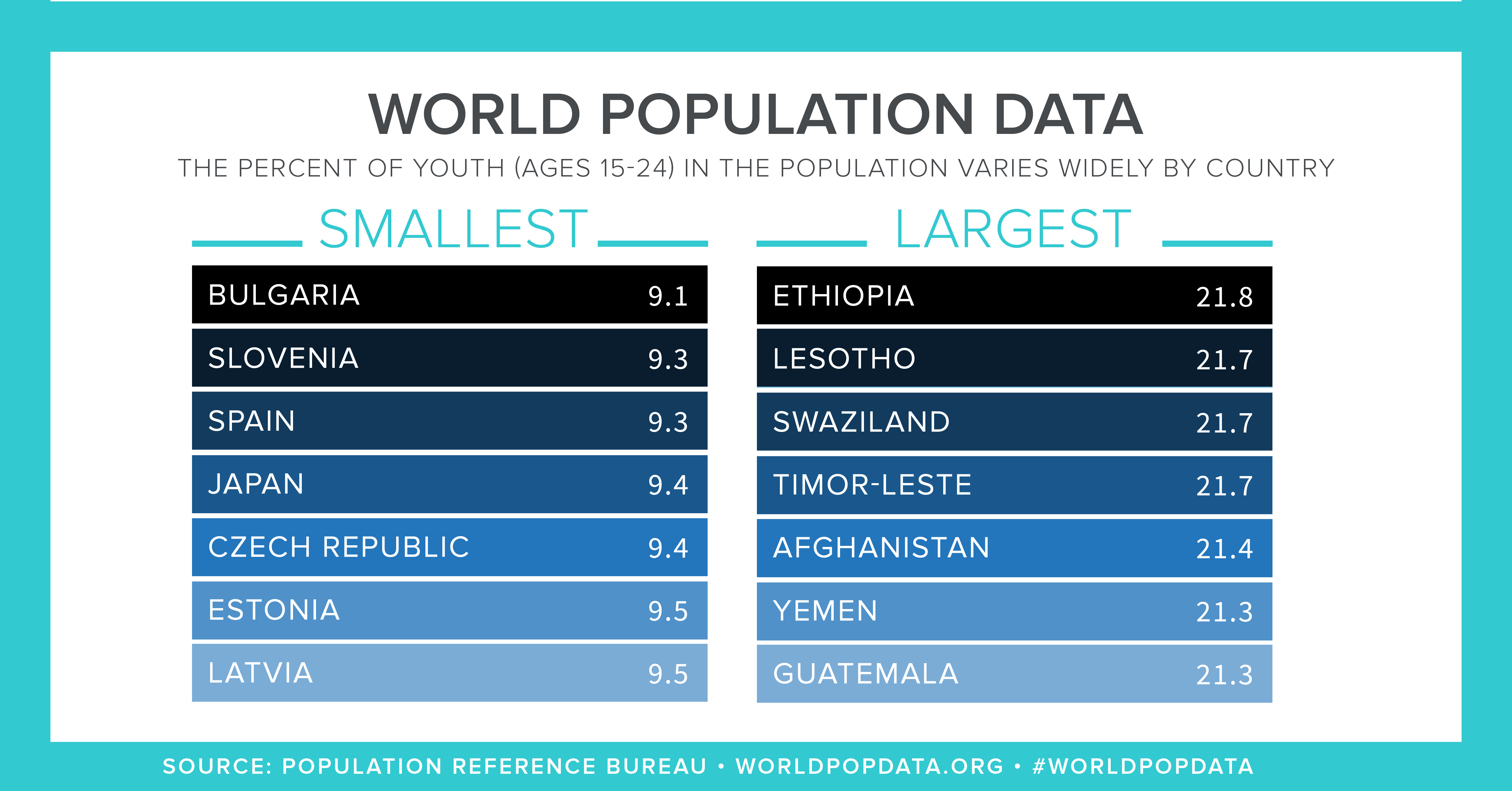
- Ethiopia currently has the highest share of youth population at 21.8 percent while Bulgaria has the lowest share at 9.1 percent.
- The global adolescent fertility rate (ages 15 to 19) is 50 births per 1,000 women, compared to only 16 per 1,000 in more-developed countries and 54 per 1,000 in less-developed countries.
The analytical features focusing on youth explore the extent to which youth are engaged in productive activities (such as education, employment, or training) in the United States and globally, the prevalence of modern family planning use among young married women, HIV/AIDS rates among African youth, the prevalence of behaviors among youth that can lead to noncommunicable diseases, and in the digital edition, level of access by youth to information and communication technologies.

 ">
"> ">
">Download: 2016 World Population Data Sheet (PDF: 4.12 MB)
Teach: Data Sheet Lesson Plan
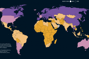
Interactive: 2016 Interactive Map
PRB Projects World Population Rising 33 Percent by 2050 to Nearly 10 Billion
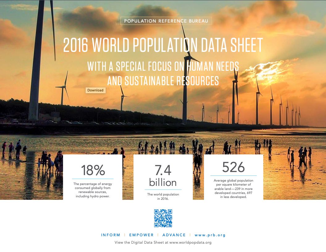
The world population will reach 9.9 billion in 2050, up 33 percent from an estimated 7.4 billion now, according to projections included in the 2016 World Population Data Sheet from the Population Reference Bureau (PRB).
The world population would hit the 10 billion mark in 2053 if the assumptions underlying PRB’s 2050 projections are applied to subsequent years.
“Despite declines in fertility rates around the world, we expect population gains to remain strong enough to take us toward a global population of 10 billion,” said Jeffrey Jordan, president and CEO of PRB. “Significant regional differences remain, though. For example very low birth rates in Europe will mean population declines there while Africa’s population is expected to double.”
PRB’s projections show Africa’s population will reach 2.5 billion by 2050, while the number of people in the Americas will rise by only 223 million to 1.2 billion. Asia will gain about 900 million to 5.3 billion, while Europe registers a decline from 740 million to 728 million. Oceania (which includes Australia and New Zealand) would rise from 40 million to 66 million.
PRB’s widely referenced World Population Data Sheet has been produced annually since 1962. This year’s edition provides the latest data on 19 key population, health, and environment indicators for the world, major regions, and more than 200 countries. PRB also added six indicators and analytical graphics that explore the balance between providing for human needs and sustainably managing the natural resources on which people depend.
The Data Sheet’s midcentury population projections indicate that:
- The combined population of the world’s least developed countries in the world will double by 2050 to 1.9 billion. There are 48 least developed countries, based on United Nations criteria, most of which are in Africa.
- The population in 29 countries will more than double. Nearly all of these countries are in Africa.
- Forty-two countries will register population declines. These countries are scattered throughout Asia, Latin America, and Europe. Some European countries will post significant declines, such as Romania, which is projected to have a population of 14 million in 2050, down from 20 million today.
- The population of the United States will be 398 million, up 23 percent from 324 million today.
According to the Data Sheet’s estimates of current population:
- Over 25 percent of the world’s population is less than 15 years old. The figure is 41 percent in least developed countries and 16 percent in more developed countries.
- Japan has the oldest population profile, with over a quarter of its citizens older than 65. Qatar and the United Arab Emirates are at the other end of the spectrum, with each having only 1 percent over 65.
- The top 10 fertility rates in the world are in sub-Saharan African countries, with nearly all above six children per woman, and one topping seven. In Europe, the average is 1.6.
- The fertility rate in the United States is 1.8 children per woman, down from 1.9 in 2014. “Replacement” fertility in the United States—that is, the rate at which the population exactly replaces itself from one generation to the next, excluding the effects of migration—is 2.1 children per woman.
- Thirty-three countries in Europe and Asia already have more people over age 65 than under 15.
Human Needs, Sustainable Resources
As part of this year’s Data Sheet theme, “Human Needs and Sustainable Resources,” PRB compiled statistics that speak to the environmental and resource aspects of human development. The Data Sheet included measures of carbon emissions (related to climate change), access to electricity, power from renewable energy resources, how much land countries have set aside for protection, and population per square kilometer of arable land. A few key figures include:
- Globally, there was a 60 percent increase in annual carbon emissions between 1992 and 2013, to 9.8 billion metric tons. China posted the largest increase by volume over this period, from 735 million metric tons to 2.8 billion metric tons—which was also the largest amount of any country in 2013.
- Forty-three countries reduced their carbon emissions over the same period. The largest reduction by volume was in Ukraine, where carbon emissions declined by 98 million metric tons to 74 million tons.
- Eighteen percent of the world’s energy comes from renewable sources, which include hydroelectric power.
- There is an average of 526 people per square kilometer of arable land. The number is 238 in more developed countries and 697 in less developed countries.
 ">
">
 ">
">
Data Show Gains For Women, But More Progress Needed
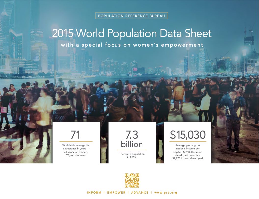
Women worldwide are achieving gains in key barometers of personal well-being, but far more progress is needed to foster real gender equality and empower women, according to the Population Reference Bureau (PRB).

These findings are based on the 2015 edition of PRB’s annual World Population Data Sheet and a related package of interactive data features, all produced by PRB and released today at worldpopdata.org.
This year’s Data Sheet provides the latest data on 20 population, health, and environment indicators for the world, major regions, and more than 200 countries. It includes a special set of indicators and analytical graphics aimed at assessing the state of women’s empowerment globally.
“Women’s empowerment is when women and girls have the power to act freely, to exercise their rights, and to be full and equal members of society,” said Jeff Jordan, president and CEO of PRB. He added: “We’ve seen a lot of progress in recent years, but impediments remain in critical areas for women. They also need guarantees that they’ll receive equal reward for equal effort to men.”
For example, PRB analysis shows that earnings gaps between men and women persist despite women’s educational gains. In the United States, where women have closed the gap with men in college completion—and are actually outpacing men in the 25-to-29 age group—women with a bachelor’s degree or higher earn an average of only 73 percent of what male counterparts earn.
Globally, acceptance of gender-based violence remains a barrier to empowerment. For example, tolerance of wife beating has declined in a broad sense over the past several decades but remains alarmingly high in many countries, even among women themselves. In Indonesia and Zambia, 24 percent and 30 percent of women, respectively, agree that a husband is justified in beating his wife if she leaves the house without telling him. These levels are about twice as high as rates among men in these countries.
And, despite declining rates of marriages of girls at young ages, this practice is far from disappearing. In Bangladesh, the most recent data show 65 percent of Bangladeshi females married by age 18 and 29 percent married by age 15. In Niger, 76 percent are married by age 18 and 28 percent by age 15.
Worldwide, only one in five national parliamentarians are women. Regional rates range from 18 percent in Asia to 25 percent in Europe. Rwanda tops the list of female parliamentarians at 58 percent.
Meanwhile, PRB’s population projections in the 2015 Data Sheet show world population reaching 9.8 billion by 2050, up from an estimated 7.3 billion now, though the projections mask wide variations among countries, notably:
- National populations are projected to more than double in 40 countries, the vast majority of which are in Africa. Niger’s population is projected to more than triple.
- Thirty-four countries are projected to have smaller populations in 2050 than they do today. The biggest absolute decline would be in Japan, shrinking by 30 million people, while the biggest percentage decline would be Latvia, falling by 30 percent.
The Data Sheet’s global indicators on women’s empowerment also show that:
HEALTH:
- Women’s life expectancy averages 73 years globally, compared to 69 for men. Women’s average life expectancy is 82 years in the world’s more developed countries and only 63 years in the least developed. Lesotho, a small country in southern Africa affected by HIV/AIDS, has the world’s lowest average life expectancy for women, at 46 years.
- Maternal deaths averaged 136 per 100,000 births in 2013 (the latest year for which global data are available), down from 269 in 1990. While rates have fallen generally around the world, surprisingly, some developed countries have shown upswings. The rate in the United States was 28 deaths per 100,000 births in 2013, up from 12 in 1990.
ECONOMIC LIVELIHOOD:
- Financial inclusion of women is expanding globally, providing more women with access to affordable, convenient ways to save and borrow money to gain financial independence. But women continue to lag behind men in rates of financial inclusion in most less developed and least developed countries.
- Women’s share of nonagricultural employment shows marked regional differences. Women in African countries make up 30 percent, on average, of nonagricultural workers, compared to 44 percent in Latin America and the Caribbean, 25 percent in Asia, 48 percent in Europe, and 48 percent in Northern America (the United States and Canada). Moldova, in Eastern Europe, has the highest rate at 55 percent.
EDUCATION:
- Women’s educational attainment at higher levels varies substantially. In the least developed countries, there are only 66 females enrolled in tertiary education for every 100 males enrolled, while female enrollees outnumber male enrollees by 125 to 100 in more developed countries.
 ">
">
PRB’s World Population Data Sheet is an excellent reference and data analysis tool. Teachers are encouraged to have their students use the data sheet for a variety of topics and activities. The following are a series of short activities to provide access to the wealth of data on the world, regions, and individual countries.
This lesson plan uses PRB’s 2015 World Population Data Sheet
- Digital Visualization
- Graphics from the 2015 World Population Data Sheet
Also valuable is PRB’s Population Handbook 6th edition (2011).
These lessons may also be used with PRB’s online Data Center, a searchable database that includes all the data from the most recent PRB World Population Data Sheet. Data can be displayed as a map, chart, or table, and downloaded into Excel.
Grade Level: 6–12
Time Required: One class period for each activity.
Standards Addressed: Math and geography.
Vocabulary/Concepts: Population size, birth rate, death rate, infant mortality rate, total fertility rate, life expectancy, age distribution.
Objectives:
- Ask geographic questions about the population characteristics of a country.
- Acquire information about the key population characteristics of a country, by using the World Population Data Sheet.
- Organize population information about a country.
- Compare and contrast population characteristics of selected countries.
Materials:
- All activities: 2015 World Population Data Sheet (PDF: 2.5MB)
- Activity 2: County Profile Worksheet (PDF: 23KB)
- Activity 5: Country Outline Map (PDF: 94KB) Country outline maps for classroom use, including those for individual world regions, may be found online in a number of places.
Activity 1: The World Population Data Sheet at a Glance
Find answers to the following questions using the current World Population Data Sheet.
- What is the population of the world?
- Rank the ten countries with the largest population (from largest to smallest).
- Instead of absolute numbers, rates are often used to tell how frequently a population or demographic event is occurring — rates show how common an event is (often expressed as per 1,000 people). List the type of information on the data sheet reported by a rate.
- The death rate is the annual number of deaths per 1,000 population. Which country (or countries) has the highest death rate? Which country (or countries) has the lowest?
- The infant mortality rate measures the number of deaths each year to infants under one year of age per 1,000 live births. Which country (or countries) has the highest infant mortality rate and what is that rate? Which country (or countries) has the lowest and what is that rate?
- The total fertility rate (TFR) is the average number of children women would have if they maintained the current level of childbearing throughout their reproductive years. Which countries (or countries) share the highest TFR and what is it? Which country (or countries) has the lowest TFR. What is it?
- Which country (or countries) has the “youngest” population, that is, the highest proportion of population under age 15? Which country (or countries) has the “oldest” population, that is, the highest proportion of population over age 64?
- In which country (or countries) are people expected to live the longest? Which country (or countries) has the lowest life expectancy?
- In which African country (or countries) does the highest proportion of people live in urban areas? In Asia? In Latin America? In Europe? In Oceania?
- Gross national income in purchasing power parity per capita (GNI PPP) converts income into “international dollars” and indicates the amount of goods and services one could buy in the United States with a given amount of money. Which country (or countries) is the wealthiest in terms of GNI PPP? Which is the second wealthiest?
- A population projection is a computation of future changes in population numbers based on assumptions about future trends in fertility, mortality, and migration. Which categories on the data sheet are shown as projections?
- Rank the 10 countries with the largest projected populations for both 2023 and 2050 (from largest to the smallest). Which country’s (or countries’) population is projected to drop out of the top 10 by 2050? Which country (or countries) is projected to be added to the top 10? Look back to the rankings for the current year. What are the major shifts in this ranking from now to 2050?
- Rank the regions according to population size (from largest to the smallest).
- What proportion of the world’s people live in Africa? In Asia? In North America? In Latin America? In Europe? In Oceania? What are the projected proportions? Draw a bar chart showing the regional distributions of the world’s population for this year, 2030 and 2050.
- What proportion of the world’s people live in less developed countries (LDCs) in the current year? In more developed countries (MDCs)? What proportion of the world’s people is projected to live in LDCs in 2030? In 2050? What proportion is projected to live in MDCs in 2030? In 2050?
Activity 2: Profiling a Country
The purpose of this activity is to introduce students to the demographic indicators listed on the Data Sheet by providing them with a tool to organize population information about a country. As students study different countries they can accumulate country profiles in their notebook. Students will need to use the World Population Data Sheet and the Country Profile Worksheet.
Note: The rate of natural increase is the rate at which a population is increasing (or decreasing) in a given year due to a surplus (or deficit) of births over deaths, expressed as a percentage of the base population. It is calculated by subtracting death rates from birth rates and then dividing by 10. This rate does not include the effects of immigration or emigration.
- Display the Country Profile Worksheet. Distribute blank copies to students. Complete the profile of the United States, defining the indicators as they are mapped out on the worksheet. After completing the “country comparison blocks,” discuss.
- Have students place a copy of the U.S. profiles in their notebooks. Have students complete a new profile each time they start a unit on a new country. Before they do the profile of the new country, students should develop hypotheses about the population characteristics of the country and use the mapping activity to test their hypotheses. They should compare the profile of each new country with the profile of the United States.
- As students learn more about the country, they can add other information from the Data Sheet (or other sources) to their profiles.
This lesson was adapted from a lesson developed by Jane Moriarty of the Michigan Geographic Alliance.
Activity 3: Mapping the Data
Mapping data is often a good method for analysis. Most of the demographic characteristics on the World Population Data Sheet lend themselves to mapping. A map that uses color to represent quantitative data is called a choropleth map. Areas are distinguished from one another using different colors or different shades of the same color based on the values they represent. Brighter colors or dark shades of the same color indicate greater values and dimmer colors or lighter shades indicate lesser values.
Choose one of the following demographic variables using the World Population Data Sheet and map the world or regional distribution of that indicator on a world or regional country outline map:
Infant Mortality Birth Rate Death Rate
Total Fertility Rate Percent 65 and Over Percent Under Age 15
Per Capita GNI PPP Life Expectancy
Interpret the map
After the map has been drawn, consider the following to guide interpretation:
- Describe the patterns observed on the map.
- What accounts for the variation?
- Discuss the factors that could lead to the range of outcomes within this distribution.
Draw another map
Draw another map to examine the relationships that may exist between two variables or compare results with another student who has mapped a different variable. Possible pairs of variables to compare:
- Infant Mortality — Life Expectancy
- Death Rate — Percent of Population Under Age 15
- Birth Rate — Percent of Population 65+
- Infant Mortality — Per Capita GNI PPP
Answer the following:
- Does there appear to be a relationship between the two variables? If so, is the relationship positive of negative? For example, are the countries with the highest rates of one variable the same countries with the highest rates of the other variable? If so, then the relationship is positive. If the countries with the highest rate of one variable also have the lowest rates in another, then the relationship is negative.
- Discuss whether or not the factors that contribute to the patterns in one variable affect the patterns in another.
This activity was adapted from exercises submitted by Eugene J. Kinerney of the University of the District of Columbia and Basheer K. Nijim of the University of Northern Iowa. The lesson plan was updated in 2015 by Paola Scommegna, PRB.
 ">
">
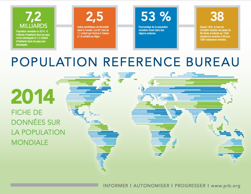
(janvier 2015) La Fiche de données sur la population mondiale 2014 du PRB contient les toutes dernières estimations et projections de population, ainsi que des indicateurs clés pour plus de 200 pays. La Fiche de données 2014
a point sur « les Progrès et les défis ».
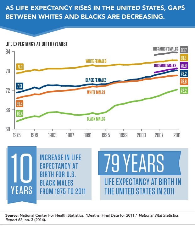
(October 2014) Since 1975, life expectancy at birth in the United States has increased by 10 years for black males, by 7 years for white males and black females, and by only 4 years for white females. In addition, the gap in life expectancy between white and black females decreased from 6 years to 3 years between 1975 and 2011; while the gap between white and black males decreased from 7 years to 4 years across this period. However, these remaining gaps between whites and blacks are one factor contributing to lower life expectancy at birth in the United States compared with other developed countries. Japan, Switzerland, Sweden, Norway, and France have life expectancies of 82 years or higher, compared with only 79 years in the United States. And, at 81 years, life expectancy at birth for women in the United States is considerably lower than it is for women in many other developed countries, where it has reached 84 years or higher. Hispanic females in the United States have a higher life expectancy at birth than whites or blacks of either gender.
See more in the 2014 World Population Data Sheet.
2014 World Population Highlights
Narrated by Jeff Jordan, PRB’s president, this short video illustrates the 2014 World Population Data Sheet’s main findings about world population, infant and maternal health, poverty, and the environment.
2014 World Population Data Sheet
 ">
">
 ">
">
Africa, by far the world’s poorest region, will record the largest amount of population growth of any world region between now and 2050.
Africa’s population is expected to more than double, rising from 1.1 billion today to at least 2.4 billion by 2050. “Nearly all of that growth will be in the 51 countries of sub-Saharan Africa, the region’s poorest,” says Wendy Baldwin, president and CEO of the Population Reference Bureau (PRB). “Rapid population growth makes it difficult for economies to create enough jobs to lift large numbers of people out of poverty.”
Today, women in sub-Saharan Africa average 5.2 children, a rate that rises as high as 7.6 in Niger. The 10 countries worldwide with the highest fertility are all in sub-Saharan Africa. In addition to high birth rates, the region’s population is also quite young, with 43 percent of the population below age 15.
“Given its youthful population, future population growth in Africa will depend upon the degree to which the parents of tomorrow use family planning,” says Carl Haub, PRB senior demographer and co-author of the data sheet. “The projections that we cite assume that family planning will become more widespread. If not, Africa’s population will grow more rapidly, further constraining efforts to address poverty, create jobs, and protect the environment.”
This year’s Data Sheet provides detailed information on 20 population, health, and environment indicators for more than 200 countries, and has a special focus on wealth and income inequality. Developing countries tend to have wide income gaps between rich and poor that are associated with dramatic differences in fertility and health. For example, in Uganda, women from the poorest fifth of families have twice as many children as those from the wealthiest fifth. And children from the poorest families are much more likely to die before turning 5 than their counterparts in the wealthiest families.
PRB’s 2013 World Population Data Sheet shows the stark contrasts between rich and poor countries, illustrated by comparing Niger and the Netherlands. Even though the two countries have almost the same population size today, Niger is projected to nearly quadruple its population from about 17 million today to 66 million in 2050. The Netherlands’ population will likely grow very slowly from 17 million to 18 million over that same time.
At the root of this “demographic divide” are differences in the average number of births per woman and the share of the population in their childbearing years. Niger’s total fertility rate of 7.6 lifetime births per woman is more than four times the Netherlands’ rate of 1.7 per woman. One-half of Niger’s population is younger than age 15, compared with 17 percent of the Netherlands’ population.
The Demographic Divide: Niger and Netherlands
| Niger | Netherlands | |
|---|---|---|
| Population (2013) | 16.9 million | 16.8 million |
| Projected Population (2050) | 65.8 million | 17.9 million |
| 2050 Projected Population as a Multiple of 2013 | 3.9 | 1.1 |
| Lifetime Births per Woman | 7.6 | 1.7 |
| Annual Births | 845,000 | 176,000 |
| Annual Deaths | 195,000 | 141,000 |
| % of Population Below Age 15 | 50% | 17% |
| % of Population Ages 65+ (2013) | 3% | 16% |
| % of Population Ages 65+ (projected 2050) | 3% | 27% |
| Life Expectancy at Birth (all) | 57 years | 81 years |
| Infant Mortality Rate (per 1,000 live births) | 51 | 3.7 |
| Annual Number of Infant Deaths | 43,000 | 650 |
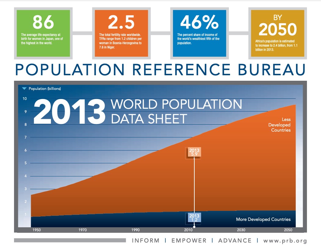
OTHER HIGHLIGHTS FROM THE 2013 WORLD POPULATION DATA SHEET
- Worldwide, the total fertility rate (TFR, or average number of children per woman) is 2.5, and 4.4 in the poorest countries. TFRs range from a low of 1.2 in Bosnia-Herzegovina to a high of 7.6 in Niger.
- With a current population of 4.3 billion, Asia will likely experience a much smaller proportional increase than Africa, but will still add almost 1 billion people by 2050—determined in large part by trends in China and India.
- Despite having one of the world’s highest standards of living, the gap in the United States between the income share of the wealthiest and the poorest households is one of the widest among industrialized countries. And the gap has been expanding since 2007. In 2011, the poorest fifth of U.S. households received only 3 percent of total national household income while the richest fifth received 51 percent.
REGIONAL HIGHLIGHTS
Africa
By 2050, Africa is projected to increase to 2.4 billion from 1.1 billion today, making it the region with the largest population growth. But this projection should be treated very cautiously, because it assumes that birth rates will decline smoothly in all African countries in much the same way as birth rates declined in other regions. And that assumption, in turn, assumes that the effective use of family planning will spread in Africa. In most countries, declines in birth rates have been very slow or even nonexistent. And even with declining birth rates, sub-Saharan Africa’s population will continue to grow at a fairly rapid pace after 2050 as it will still be quite youthful.
Asia
Asia is home to 60 percent of global population. China and India account for more than half of Asia’s total population. China’s total fertility rate is a very low 1.5 children per woman. Should China become concerned about population aging and relax its strict “one-child” policy, projections of China’s population may have to be raised. In India, the TFR has fallen from about 5.5 children in the past to 2.4 today. But doubts about the future course of the birth rate in India’s heavily populated and impoverished northern states make projections challenging. Nonetheless, India is projected to pass China in population size in about 15 years, becoming the world’s most populous country, about 1.5 billion people.
Latin America/Caribbean
Population growth has been in slow decline in this region, largely due to a lower birth rate in Brazil and Mexico, the two countries that account for more than half of the region’s population. In Brazil, women average 1.8 children, while in Mexico the average is about 2.2. Among developing regions, Latin America/Caribbean has the highest prevalence of family planning at 75 percent for all methods and 68 percent for modern methods among married women. The region’s population is projected to increase from 606 million today to 780 million in 2050. Three-quarters of a million people (on a net basis) leave the region for North America and Europe each year.
North America
The United States and Canada have rather low TFRs: Canada at 1.6 and the United States at 1.9. In the United States, fertility declined during the recent economic recession, a decline that was especially sharp among Hispanics. Immigration is a significant engine of population growth in both countries.
Europe
Europe’s birth rate has plummeted to an unexpectedly low level in the past few decades. Europe’s population of 740 million is projected to decrease to 726 million by 2050, but even that lower number depends on whether immigration helps to stall a more-rapid decline. Today, women in Europe average only 1.6 children, compared to 2.6 in 1960. This low fertility has created unprecedented aging. In Europe, only 16 percent of the population is below age 15. Compare that to 41 percent in Africa and 25 percent in Asia. Europe’s population ages 65 and older is projected to rise to 27 percent by 2050.
Oceania
In Australia and New Zealand, continued growth from higher birth rates and immigration is expected. Australia’s TFR is 1.9; New Zealand’s, 2.0. Australia’s population of 23 million is expected to increase to 34 million by 2050; New Zealand’s population will increase from 4.5 million to just under 6 million.
Webinar Presentation on PRB's 2012 World Population Data Sheet
 ">
">
In this webinar recorded on July 19, 2012, PRB demographers Wendy Baldwin and Carl Haub presented key findings from PRB’s 2012 World Population Data Sheet. A question and answer session followed the presentation.
Nearly all future population growth will be in the world’s less developed countries, and the poorest of these countries will see the greatest percentage increase, according to Carl Haub, PRB senior demographer and co-author of PRB’s 2012 World Population Data Sheet.
Even though declines in birth rates have been virtually universal across countries, some of the poorest countries have shown little if any decline. “What we are left with is rapid population growth in countries that can least afford it,” said Haub during a July 19, 2012, webinar to mark the data sheet’s release.
In contrast, developed countries as a whole will experience little or no population growth in this century, and much of that growth will be from immigration from less developed countries. Europe’s population is expected to decline slightly by 2050, reflecting low fertility. But this slight size change hides a dramatic shift toward countries with unprecedented shares of elderly people, Haub noted.
He compared Tanzania and Spain to show the clear contrasts between less developed and more developed countries, known as “the demographic divide.” The two countries have almost the same population size today: Tanzania’s population is 48 million and Spain’s is 46 million. But Tanzania has a youthful population, with 45 percent of Tanzanians under age 15. In contrast, Spain has only 15 percent of its population under age 15.
Projections to 2050 for the population ages 65 and older show an even larger divide, according to Haub. Tanzania’s older population will change only slightly, from 3 percent now to 4 percent in 2050. But Spain’s population ages 65+ will nearly double, from 17 percent in 2012 to 33 percent in 2050. The elderly share of Tanzania’s population “will barely grow while in Spain one-third of the population will be elderly by 2050,” he pointed out.
Differences in each country’s age structure and fertility level have enormous implications for each country’s future size. Tanzania has 1.5 million more births each year than Spain. By 2050, Tanzania’s population is projected to nearly triple to reach 138 million, while “any growth in Spain is likely to come mainly from immigration,” he said. In Europe births and deaths are “just about in balance,” while in less developed countries births far outnumber deaths, reflecting a large share of young people in their childbearing years and much higher birth rates.
The U.S. population also is beginning to age rapidly and is growing more slowly. “The U.S. non-Hispanic white population looks like a European country, with dwindling numbers of youth,” said Haub. With a higher birth rate and more youth, Hispanics and other minorities “keep the U.S. population young.” Women in the United States now average 1.9 children, down from 2.1 several years ago. In Haub’s opinion this decline reflects the recent economic recession and “will probably turn around when the economy improves.”
CHRONIC DISEASES LIKE CANCER AND DIABETES TAKING GROWING TOLL WORLDWIDE
PRB’s 2012 World Population Data Sheet has a special focus on chronic or noncommunicable diseases (NCDs), such as cardiovascular disease, cancers, diabetes, and respiratory diseases. While developing countries are typically still battling infectious diseases like tuberculosis, HIV/AIDS, and malaria, NCDs are now the leading cause of death in all world regions except sub-Saharan Africa, reported Wendy Baldwin, PRB’s president and CEO.
While the number of people suffering and dying from NCDs will continue to increase around the world over the next several decades, the greatest increases are expected in low-income countries. Even in sub-Saharan Africa, NCDs will account for almost half of all deaths by 2030.
Because NCDs in developing countries “strike earlier in life than in wealthier countries,” they may affect breadwinners, putting “a greater burden on families,” said Baldwin. In South Asia the mean age of first heart attack is six years earlier than the rest of the world. The prolonged nature of NCD-related illnesses also “creates massive burdens on health care systems,” she said.
Four behavioral risk factors account for most NCDs: tobacco use, unhealthy diet, insufficient physical activity, and harmful use of alcohol. These behaviors “are often exacerbated by urban living and the developing world is the urbanizing world,” noted Baldwin.
But these are behaviors that can be changed. “There are many examples of effective programs but programs need to be tailored to specific settings,” she said. Targeting youth and adolescence when behaviors such as alcohol and tobacco use begin is one of the most cost-effective approaches and “reaps benefits for decades.” In Baldwin’s view, it is “preferable to support positive behaviors early in life rather than wait a few decades and try to change entrenched habits.”
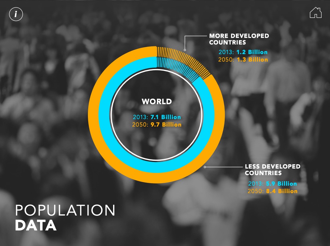
FROM 7 BILLION TO 8 BILLION IN 12 YEARS?
World population reached 7 billion in 2011, and now totals almost 7.1 billion. The new data sheet clearly illustrates a continuing rapid expansion in world population. Sub-Saharan Africa will grow at the fastest rate and is projected to add a “truly astounding” 1.2 billion people by 2050, according to Haub. With a current population of 4.3 billion, Asia will likely experience a much smaller proportional increase than Africa, but will still add about 1 billion people by 2050—determined in large part by what happens in China and India. Latin America and the Caribbean is the developing region with the smallest proportional growth expected by 2050, from 599 million today to 740 million, largely due to fertility declines in several of its largest countries such as Brazil and Mexico.
When will world population reach 8 billion? “Quite likely within 12 years” of reaching 7 billion, said Haub. The timing depends on what happens to birth rates in developing countries and the availability of family planning, he explained. While there is a strong desire for more than two children in many countries, there are many women—particularly women in the poorest share of their country’s population—who want to limit or space their children but do not have access to family planning.
(July 2012) This population clock reflects data from PRB’s 2012 World Population Data Sheet.
| Measure | World | More Developed Countries | Less Developed Countries | Less Developed Countries (excluding China) |
|---|---|---|---|---|
| Population: | 7,057,075,000 | 1,234,018,000 | 5,814,057,000 | 4,463,679,000 |
| Births per: | ||||
| Year | 140,541,944 | 13,923,718 | 126,618,226 | 110,508,216 |
| Month | 11,711,829 | 1,160,310 | 10,551,519 | 9,209,018 |
| Week | 2,702,730 | 267,764 | 2,434,966 | 2,125,158 |
| Day | 385,046 | 38,147 | 346,899 | 302,762 |
| Hour | 16,044 | 1,589 | 14,454 | 12,615 |
| Minute | 267 | 26 | 241 | 210 |
| Second | 4.5 | 0.4 | 4.0 | 3.5 |
| Deaths per: | ||||
| Year | 56,238,002 | 12,191,662 | 44,046,340 | 34,404,641 |
| Month | 4,686,500 | 1,015,972 | 3,670,528 | 2,867,053 |
| Week | 1,081,500 | 234,455 | 847,045 | 661,628 |
| Day | 154,077 | 33,402 | 120,675 | 94,259 |
| Hour | 6,420 | 1,392 | 5,028 | 3,927 |
| Minute | 107 | 23 | 84 | 65 |
| Second | 1.8 | 0.4 | 1.4 | 1.1 |
| Natural Increase per: | ||||
| Year | 84,303,942 | 1,732,056 | 82,571,886 | 76,103,575 |
| Month | 7,025,329 | 144,338 | 6,880,991 | 6,341,965 |
| Week | 1,621,230 | 33,309 | 1,587,921 | 1,463,530 |
| Day | 230,970 | 4,745 | 226,224 | 208,503 |
| Hour | 9,624 | 198 | 9,426 | 8,688 |
| Minute | 160 | 3 | 157 | 145 |
| Second | 2.7 | 0.1 | 2.6 | 2.4 |
| Infant Deaths per: | ||||
| Year | 5,779,276 | 72,128 | 5,707,148 | 5,441,172 |
| Month | 481,606 | 6,011 | 475,596 | 453,431 |
| Week | 111,140 | 1,387 | 109,753 | 104,638 |
| Day | 15,834 | 198 | 15,636 | 14,907 |
| Hour | 660 | 8 | 652 | 621 |
| Minute | 11 | 0.1 | 11 | 10 |
| Second | 0.2 | 0.002 | 0.2 | 0.2 |
Source: Carl Haub and Toshiko Kaneda, 2012 World Population Data Sheet (Washington, DC: Population Reference Bureau, 2012). Numbers may not add to totals due to rounding.