
 ">
">
 ">
">
 ">
">
PRB’s World Population Data Sheet is an excellent reference and data analysis tool. Teachers are encouraged to have their students use the Data Sheet for a variety of topics and activities. The following series of short activities allows students to access a wealth of data on the world, regions, and individual countries, and develop their data literacy skills and knowledge of geography.
- Interactive Map for the 2018 World Population Data Sheet.
- Customizable Chart and Table.
- Insights from the 2018 World Population Data Sheet.
PRB’s Population Handbook, 6th edition (2011), is also a valuable resource.
These lessons may also be used with PRB’s online version of the Data Sheet, which includes all the data from the most recent edition except net migration. Data can be displayed as a map, chart, or table, and downloaded.
Grade Level
6–12.
Time Required
One class period for each activity.
Standards Addressed
Math and geography.
Vocabulary/Concepts
Population size, birth rate, death rate, infant mortality rate, total fertility rate, life expectancy, age distribution.
Learning Objectives
Activity 1
- Select a country’s population characteristics using the World Population Data Sheet.
- Identify countries that rank highest/lowest in a population indicator.
Activity 2
- Practice organizing a country’s population information into a country profile.
- Hypothesize about the data in the country profile.
Activity 3
- Illustrate countries’ selected population characteristics on a map
- Compare the illustrated population characteristics of selected countries.
Materials
- All activities: Using the 2018 World Population Data Sheet (PDF: 2.0MB).
- Activity 2: County Profile Worksheet (PDF: 80KB).
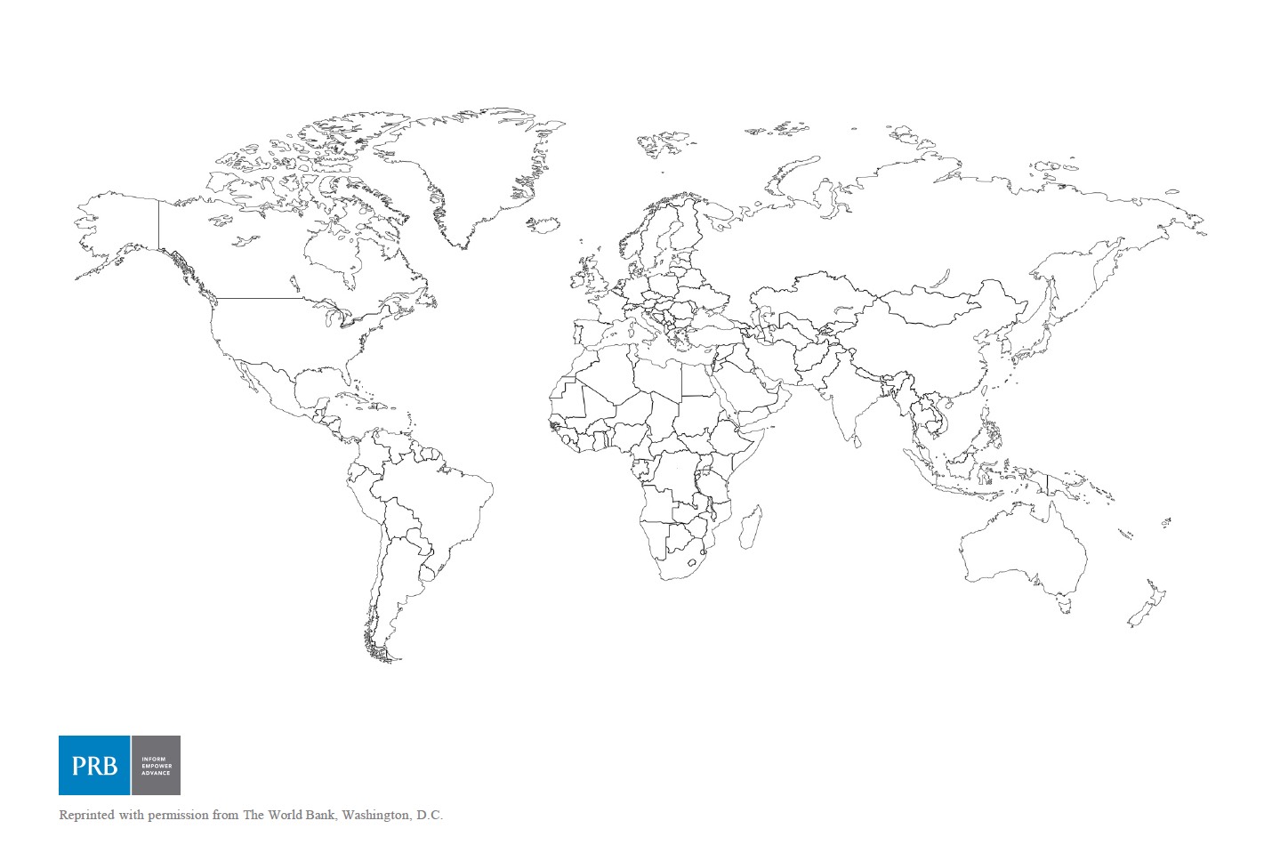
- Activity 3: Country Outline Map (PDF: 368KB). Country outline maps for classroom use, including those for individual world regions, may be found online in a number of places.
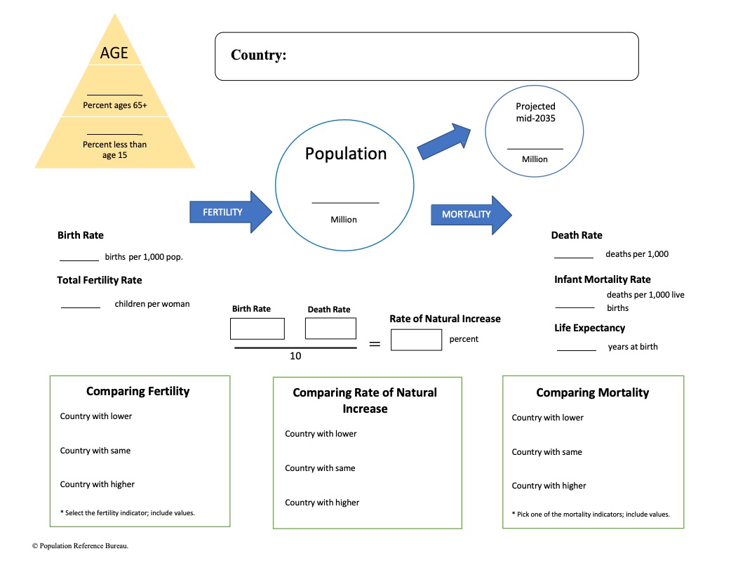
ACTIVITY 2: PROFILING A COUNTRY
The purpose of this activity is to introduce students to the demographic indicators listed on the Data Sheet by providing them with a tool to organize population information about a country. As students study different countries they can accumulate country profiles in their notebook. Students will need to use the World Population Data Sheet and the Country Profile Worksheet.
Note: The rate of natural increase is the rate at which a population is increasing (or decreasing) in a given year because of a surplus (or deficit) of births over deaths, expressed as a percentage of the base population. It is calculated by subtracting death rates from birth rates and then dividing by 10. This rate does not include the effects of immigration or emigration.
- Display the County Profile Worksheet. Distribute blank copies to students. Complete the profile of the United States, defining the indicators as they are mapped out on the worksheet. After completing the “country comparison blocks,” discuss.
- Have students place a copy of the U.S. profile in their notebooks and complete a new profile each time they start a unit on a new country. Before they do the profile of the new country, students should develop hypotheses about the population characteristics of the country and use the mapping activity (Activity 3) to test their hypotheses. They should compare the profile of each new country with the profile of the United States.
- As students learn more about the country, they can add other information from the Data Sheet (or other sources) to their profiles.
This lesson was adapted from a lesson developed by Jane Moriarty of the Michigan Geographic Alliance.
ACTIVITY 3: MAPPING THE DATA
Mapping data is often a good method for analysis. Most of the demographic characteristics on the World Population Data Sheet lend themselves to mapping. A map that uses color to represent quantitative data is called a choropleth map. Areas are distinguished from one another using different colors or different shades of the same color based on the values they represent. Brighter colors or dark shades of the same color indicate greater values and dimmer colors or lighter shades indicate lesser values.
Choose one of the following demographic variables using the World Population Data Sheet and map the world or regional distribution of that indicator on a world or regional country outline map:
| Infant Mortality | Birth Rate | Death Rate |
| Total Fertility Rate | Percent Ages 65 and Over | Percent Under Age 15 |
| Per Capita GNI PPP | Life Expectancy (Male) | Life Expectancy (Female) |
Note: PRB’s online resource (www.worldpopdata.org) is particularly appropriate for this activity. It includes all the data from the most recent PRB World Population Data Sheet except net migration. Data can be displayed as a map, chart, or table, and downloaded. Step-by-step instructions for creating a choropleth map are below.
Create a Choropleth Map: Country Outline Map
Determine the mapping categories by finding the range of values for that indicator. Determine the number of categories to be used for your map and the interval of each category. For example:
- After choosing the variable, determine the highest and lowest values for that measure.
- Subtract these two numbers to calculate the range for the data.
- Divide the range by the number of mapping categories planned for the map. Four to five categories will be adequate for most measures. The number produced by the division will indicate how many numbers to include in each category interval.
- Always construct categories so that the numbers in one category do not overlap those in adjacent categories.
- Arrange a color code or shading pattern for each category. Colors or patterns should increase from light to dark, from lowest to highest category.
- Determine the proper mapping category for each country and color or shade the country on an outline map, title the map, place a legend on the page, and indicate the source.
Interpret the Map
After the map has been drawn, consider the following to guide interpretation:
- Describe the patterns observed on the map.
- What accounts for the variation?
- Discuss the factors that could lead to the range of outcomes within this distribution.
Draw Another Map
Draw another map to examine the relationships that may exist between two variables or compare results with another student who has mapped a different variable. Possible pairs of variables to compare:
- Infant Mortality—Life Expectancy (Male or Female)
- Death Rate—Percent of Population Under Age 15
- Birth Rate—Percent of Population Ages 65 and Older
- Infant Mortality—Per Capita GNI PPP
Engage
- Does there appear to be a relationship between the two variables? If so, is the relationship positive of negative? For example, are the countries with the highest rates of one variable the same countries with the highest rates of the other variable? If so, then the relationship is positive. If the countries with the highest rate of one variable also have the lowest rates in another, then the relationship is negative.
- Discuss whether the factors that contribute to the patterns in one variable affect the patterns in another.
This activity was adapted from exercises submitted by Eugene J. Kinerney of the University of the District of Columbia and Basheer K. Nijim of the University of Northern Iowa. The lesson plan was updated in 2018 by Paola Scommegna and Nancy Matuszak, Population Reference Bureau.


Break It Down (The Pop Song)
Here’s a Song About Population
At its essence, measuring population is about counting births, deaths, and net migration. Mark Mather, associate vice president for U.S. Programs at PRB, explains population growth in this animated music video based on his original composition, “Break It Down (The Pop Song).” The tune also explores some of the nuances of other terms in the field of demography. The audience is middle-school students.
“I wrote this song to introduce kids to demography. This was a fun side project,” said Mark, who holds a doctorate in sociology/demography from the University of Maryland, College Park. Please share this video with your contacts, both young and not so young!
“Break It Down (The Pop Song)”
Here’s a song about population
With births and deaths and some immigration.
Demography is a key foundation
For understanding our world and nations.
Break it down.
What’s the population in your town?
Take the number and then break it down.
Count by age, gender, race and then,
Add the births and deaths and movers,
And then you start again.
Babies make the population grow,
But people come and sometimes people go.
Some will die and others move away.
Millions of people come and go every day.
Break it down, break it down,
That’s demography.
Break it down like they do at PRB.
Break it down, break it down,
It’s 1-2-3.
To balance the equation
For your town or for your nation,
Add the births, subtract the deaths,
And don’t forget about migration,
And through this simple computation
You will know what makes the population grow.
Seven billion people on the Earth,
But there are fewer deaths than there are births.
That’s what makes the population grow,
But if the birth rate keeps on falling
The growth will start to slow,
Break it down, break it down,
That’s demography.
Break it down like they do at PRB.
Break it down, break it down,
It’s 1-2-3.
Here’s a song about population,
Break it down.
It’s a ‘Pop Song,’
Come and sing along
To the ‘Pop Song,’
Come and sing along.
© 2016 Population Reference Bureau. All rights reserved.
Mark Mather is associate vice president of U.S. Programs at PRB, where he specializes in issues related to U.S. social and demographic trends, child and family well-being, and data from the U.S. Census Bureau.

 ">
">
(Octobre 2014) Nous faisons tous partie d’une population et les mouvements de population nous intéressent donc tous d’une façon ou d’une autre, qu’il s’agisse de l’endroit où nous vivons ou des prix que nous payons pour les produits et services. Les besoins en matière de santé préoccupent les dirigeants politiques des pays industrialisés dont les populations « vieillissent », alors que les besoins en matière de salles de classe, d’emploi et de logements sont au centre des préoccupations des dirigeants des nations dont la population continue à augmenter encore rapidement.
Les conditions démographiques influencent l’histoire. De même, des événements historiques peuvent avoir des répercussions importantes sur les populations. Les guerres peuvent décimer toute une génération d’hommes, comme ce fut le cas en Union soviétique, en France, en Irak et dans d’autres pays au vingtième siècle. La découverte de nouveaux médicaments permet bien souvent d’accroître l’espérance de vie et de modifier les principales causes de mortalité. Parallèlement, une modification de la population peut laisser présager d’autres changements importants. Une contamination de l’environnement peut se manifester, au début, par une augmentation du nombre des maladies et de la mortalité dans certaines régions géographiques. Par ces divers aspects, et beaucoup d’autres, la population constitue un sujet d’actualité.
Il est préférable de communiquer les informations concernant la population avec des chiffres et des pourcentages. Il ne suffit pas de dire que l’espérance de vie augmente. Combien d’années voit-on s’ajouter à l’espérance de vie ? Quand ce changement s’est-il opéré ? Quel segment de la population cela touchet-il ? Quelle est la proportion de la population concernée ? Ces informations sont beaucoup plus parlantes lorsqu’elles fournissent l’ampleur et la répartition du phénomène, ainsi que des tendances démographiques. Pour être utiles, les données doivent être énoncées clairement de même qu’avec précision. On confond parfois les taux de natalité avec les taux de croissance, et on parle du fléchissement des taux de croissance comme si la taille de la population était en train de diminuer.
La démographie est l’étude scientifique des populations. Les démographes analysent les niveaux et les tendances de la taille de la population et de ses composantes. Ils tentent d’expliquer les changements démographiques et leurs impacts sur les sociétés. Ils utilisent des recensements, des registres de naissances et de décès, des enquêtes, des dossiers de délivrance de visas, voire des documents tels que les immatriculations de véhicules et les inscriptions scolaires. Ils analysent ces données et les rendent utilisables sous forme de chiffres bruts, de taux et de rapports.
L’objet de ce Guide de la population est de clarifier et d’expliquer la terminologie de la démographie aux journalistes, aux responsables, aux enseignants, aux étudiants et à tous ceux qui doivent comprendre et diffuser des informations concernant la population.
Vignette Démographique: Déchiffrer Les Pyramides Des Ages
(Février 2014) Les pyramides des âge nous donnent un aperçu du profil démographique d’un pays, mais ce qui nous disent-ils sur le passé et le future d’un pays ? Cette vignette démographique montre que les tendances démographique ont des ramifications sociales et économiques.
 ">
">
(February 2011) The core issues of population studies are among the central concerns of our societies and those we study, and have been for a very long time. This fact is widely recognized inside and outside the population profession. As Charles Hirschman notes, “Ever since the days of Malthus and Graunt, demographers have had an abiding interest in public affairs.”1 The late Senator Daniel Patrick Moynihan said, “[T]here is simply nothing so important to a people and its government as how many of them there are, whether their number is growing or declining, how they are distributed as between different ages, sexes…and different social classes and racial and ethnic groups…”2
Support for population studies on the scale we experience it today is justified by the discipline’s expected social utility, by the hope that research results can improve well-being. How well population research satisfies that expectation is difficult to measure, but the goal that population studies should be useful has been a guiding principle of the discipline.
Given the well-established link between population studies and public welfare, a priority of population scientists should be public demography, which I define as an effort to reach a public audience with demographic analysis and summaries of our research results, discussions about what these results mean, and what, if any, action the public and its elected and appointed officials ought to take based on what we have learned.
This paper outlines what I mean by public demography; highlights why public demography is important; suggests ways to implement a public demography agenda; and addresses some prominent objections to these suggestions.
My ideas about public demography have been shaped by the work of Michael Burawoy.3 In his 2004 presidential address to the American Sociological Association and in articles and presentations before and after that, Burawoy distinguishes and describes four types of sociology—professional, critical, policy, and public.4 But a less complex model posits that a professional can take on several of these roles simultaneously or over the span of one’s career.
Peter J. Donaldson is president of the Population Council, and was president of the Population Reference Bureau.
References
-
- Charles Hirschman, “The Future of Demography,” Asian Population Studies 4, no. 3 (2008): 233-34.
-
- Daniel Patrick Moynihan, “The Most Important Decision-Making Process,” Policy Review 1 (Summer 1977): 89-93.
-
- Burawoy’s public sociology publications and comments from others, accessed at http://burawoy.berkeley.edu/PS.htm, on Aug. 27, 2008.
-
- Michael Burawoy, “For Public Sociology,” American Sociological Review 70, no. 1 (2005): 4-28. The characteristic activity of professional sociology is basic research—the effort to advance theoretical and empirical knowledge within the framework of the discipline’s scientific norms. Critical sociology deconstructs and explores paradigm shifts. Policy sociology is concerned with applied research and concrete questions about public policies or service programs. Public sociology focuses on public interest and producing material that addresses the public’s concerns. A great deal of what demographers do is on the border between what Burawoy defines as “professional” and “policy” work. Formal demography, biometrics, the development of better methods and data collection procedures aside, demography is about issues of public concern. Think of the research of scholars such as Linda Waite on marriage, Sara S. McLanahan on children, or Douglas Massey on immigration.
The United States is a dynamic country, where the increasing complexity of American society calls for an examination of change. For Americans to adjust to new demands for resources, transportation, school systems, employment opportunities, and social services, they must understand the level and geographic distribution of population change. In this activity, students will create a choropleth map to illustrate the population growth rate of the United States. Students will learn how to construct a choropleth map, analyze the distribution of population change in specific regions, and discuss the impact of this change for the future.
Grade Levels: 4–12
Time Required: 1 to 2 class periods
Standards Addressed: The geographically informed person knows and understands how to use maps and other geographic representations, tools, and technologies to acquire, process, and report information from a spatial perspective; how to analyze the spatial organization of people, places, and environments in a spatial perspective; how the characteristics, distribution, and migration of human populations on Earth’s surface; and how to apply geography to interpret the present and plan for the future.
Skills and Objectives:
- Ask geographic questions about population growth in the U.S.,
- Organize geographic information by preparing a choropleth map,
- Analyze geographic information about the distribution of population change, and
- Answer geographic questions about the impact of population change on resource use and services.
Vocabulary: population distribution, growth rate, choropleth map
Materials Needed:
- United States Outline Map (PDF: 28KB)
- Data from the U.S. Census Bureau: www.census.gov
- Crayons, markers, or colored pencils
The Learning Activity
Background:
Depending on the students’ skill level, review the concept of choropleth mapping and its importance for representing data. The teacher may choose to show a choropleth map as an example.
Introducing the Activity:
First, provide students with the United States outline map. Ask students to speculate on the growth trends of the United States by looking at the state map. Teacher may refer to a map of the population size of each state, prompting students to speculate on any changes relative to current population size as well as to state area. Do they think that the states with the largest population will grow the fastest or will the states with the largest area?
Provide students with the “2000 Data Table” or data from the Census Bureau and ask them to draw conclusions based on the information about population change. What assumptions can be made from these data? Which areas are growing the fastest? The slowest? Are there any regional trends apparent in the growth rates of these states?
Executing the Activity:
Discuss how students could interpret these data to answer these questions about population growth. Point out that maps provide a visual representation of information, making data easier to understand. Students can use maps to organize information in a meaningful way by identifying regions and analyzing their content. The students will construct their own choropleth map to represent population growth for the United States in order to answer these questions.
- Ask students to quickly rank the 50 states and DC according to their growth rate indicated on the “2000 Data Table.”
- Next students must examine the data and determine the categories to be used for classification. (Teacher may choose to review directions for making a choropleth map and selecting classes and ranges.) For this lesson, the population growth of United States will be mapped using the following set of ranges:
Percent Change 1990–2000
25.0% or Greater
10.0% – 24.9%
5.0% – 9.9%
0.0% – 4.9%
Less than 0.0% - Students will create a choropleth map using the United States outline map. Each range/class will be colored differently. Color selection is based on the values they will represent. Brighter colors or darker shades of the same color indicate greater values; and dimmer colors or lighter shades indicate lesser values. Areas are distinguished one from another using different colors or different shades of the same color. These colors also indicate which values are greater in comparison to other values. Possible color selections for this map: 25.0% or greater, purple; 10.0% – 24.9%, red; 5.0% – 9.9%, orange; 0.0% – 4.9%, yellow; Less than 0.0%, white. (Reminder: All maps should contain a title, key, and source.)
Concluding the Activity:
When the maps are completed, ask students to examine the maps and draw conclusions from the data. Review the questions asked in the beginning of the lesson:
- What conclusions can be reached from the data on population growth?
- Which areas are growing the fastest? The slowest?
- Are there any regional trends apparent in the growth rates of the United States?
- What does this information mean for each state when making decisions about providing certain services, transportation, education, etc.?
Evaluating the Activity:
Students can be evaluated on the accuracy of their maps and their participation in the discussion of the map. Students can also be asked to do a writing assignment.
Extensions and Variations:
- Have students create maps for other demographic variables of the United States or for counties within a state. A good source of data is the County and City Data Book from the Census Bureau at: www.census.gov.
- Have students write a mock proposal to their local government about changes that should be made in providing different services to the community, based on the evaluations from their maps.
- Allow students to create choropleth maps on their own, having them establish classes and colors.
- Have different groups of students create independent maps of different states using a particular demographic variable and then have them compare.
A working knowledge of the basic vocabulary of population geography is required in order for students to master important underlying concepts. Likewise, students need to understand the mathematical relationships implicit in population statistics and the broader social and economic implications of such relationships. Students should be able to present demographic data in a graphic format that supports analysis and interpretation.
Objectives
- To develop a working vocabulary for population geography
- To understand relationships and implications of demographic data
- To construct and analyze population pyramids at different scales
Content Standards
AP Human Geography*: Unit II—Population Unit
A. Geographical analysis of population
1. Density, distribution, and scale
3. Patterns of composition—age, sex, race, and ethnicity
Student Activities
- Activity 1: World Population Data Sheet at a Glance
- Activity 2: Working with Demographic Data
- Activity 3: Constructing and Interpreting Age-Sex Graphs
- Activity 4: How to use MS Excel to Construct Age-Sex Pyramids
[heading text=”Activity 1: The World Population Data Sheet at a Glance” include_in_toc=”true” type=”heading-top” level=”h3″ /]
Instructions
Find answers to the following questions using the current World Population Data Sheet. Provide students with blank world maps and have them locate, shade, and label the countries identified in the questions that follow.
- What is the current population of the world?
- Rank, in descending order, the 10 countries with the largest population.
Rates are often used, instead of absolute numbers, to determine how frequently a population or demographic event is occurring—rates show how common an event is. Rates also make it possible to compare countries that vary greatly in terms of population size.
The crude birth rate (CBR) is the annual number of births per 1,000 population.
- Which country has the highest CBR? Which country has the lowest?
The crude death rate (CDR) is the annual number of deaths per 1,000 population.
- Which country has the highest CDR? Which country has the lowest?
The infant mortality rate measures the number of deaths each year to infants under 1 year of age per 1,000 live births.
- Which country has the highest infant mortality rate and what is that rate? Which country has the lowest and what is that rate
The total fertility rate (TFR) is the average number of children a woman would have if she maintained today’s level of childbearing throughout her reproductive years.
- Which countries share the highest TFR and what is it? Which countries share the lowest TFR. What is it?
The age and sex structure of a population refers to the number or proportion of males and females who are in each age category. Age-sex structure tells us about a population’s past trends in fertility, mortality, and migration. It also provides information about the population’s potential for future growth. The greater the proportion of people in the younger-adult age groups, the greater the potential for more births and population growth.
- Which country has the “youngest” population, that is, the highest proportion of population under age 15? Which country has the “oldest” population, that is, the highest proportion of population over age 64?
- In which country are people expected to live the longest? Which country has the lowest life expectancy?
- Which African country has the highest proportion of people living in urban areas? In Asia? In Latin America? In Europe? In Oceania?
Gross national income in purchasing power parity per capita (GNI PPP/capita) converts income into “international dollars” and indicates the amount of goods and services one could buy in the United States with a given amount of money.
- Which country is the wealthiest in terms of GNI PPP/capita? Which is the second wealthiest? Which are the poorest two countries?
A population grows because there are more births than deaths or more people are moving in than moving out. The difference between births and deaths is expressed as a percentage called the rate of natural increase.
- Which major region is growing the fastest through natural increase? Which major region is growing at the slowest rate? Within the major regions identified, which subregions are growing fastest? … slowest?
- Which country is growing the fastest through natural increase? Which country is growing at the slowest rate?
A population projection is a computation of future changes in population numbers based on assumptions about future trends in fertility, mortality, and migration.
- Rank the 10 countries with the largest projected populations for both 2025 and 2050 (in descending order).
- Which country (ies) is projected to drop out of the top 10 by 2050? Which country (ies) is projected to be added to the top 10?
- Rank the major regions according to population size (in descending order) for the present, for 2025, and for 2050. What trend can be observed in terms of population change?
Extension
Based on the information collected (above) from the current World Population Data Sheet, write an essay (1-2 pages) discussing current patterns and trends in population at global, regional, and national scales. Be sure to support any generalizations with specific examples from the data sheet.
[heading text=”Activity 2: Working With Demographic Data” include_in_toc=”true” type=”heading-top” level=”h3″ /]
Instructions
Use the current World Population Data Sheet to answer the following questions:
- China and India have the largest populations in the world. Which of these two countries adds more people to its population annually? [Calculate the numbers added by applying the rate of natural increase to the population of each country. Hint: the rate is a percent]
- What proportion of the world’s people live in Africa? In Asia? In North America? In Latin America? In Europe? In Oceania? What are the projected proportions by 2025 and 2050?
Construct a bar chart showing the regional distributions of the world’s population for the current year, 2025, and 2050.
What trends are reflected in the bar chart?
- What proportion of the world’s people live in less developed countries (LDCs) in the current year? In more developed countries (MDCs)?
What proportion of the world’s people is projected to live in LDCs in 2025? In 2050? What proportion is projected to live in MDCs in 2025? In 2050?
Discuss as a class the economic and social implications of the changing proportions of the world’s people in LDCs and MDCs.
- Examine the crude birth rate, crude death rate, and rate of natural increase of any three countries listed on the World Population Data Sheet. Discuss as a class the mathematical relationship among these three rates.
The age-dependency ratio is the ratio of persons in the “dependent” ages (under 15 and over 64 years) to those in the “economically productive” ages (15-64 years) in a population. The age-dependency ratio is often used as an indicator of the economic burden the productive portion of a population must carry—even though some persons defined as “dependent” are producers and some persons in the “productive” age range are economically dependent.
The formula for this ratio:
| % of population under age 15 + % of 65 and over | X 100 |
| % of population ages 15-64 |
[Hint: The three percents will equal 100%. ]
The age-dependency ratio in the United States in 2004 was:
| 21% + 12% | X 100 |
| 67% |
This means that there were 49 people in the dependent ages for every 100 people of working age.
Select 2 LDCs and 2 MDCs from the data sheet and compute the age-dependency ratios for each. Discuss student responses in class. What factors do you think contribute to a high age-dependency ratio? What are some economic and social consequences of a high age-dependency ratio?
[heading text=”Activity 3: Constructing and Interpreting Age-Sex Graphs” include_in_toc=”true” type=”heading-top” level=”h3″ /]
Introduction
What Is an Age-Sex Graph?
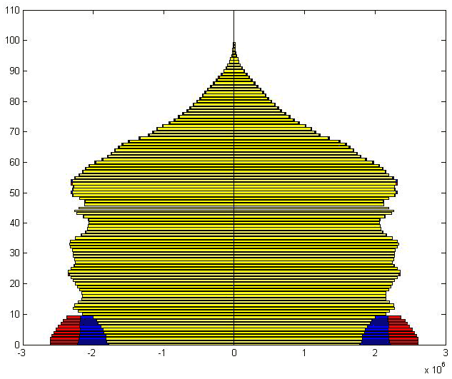
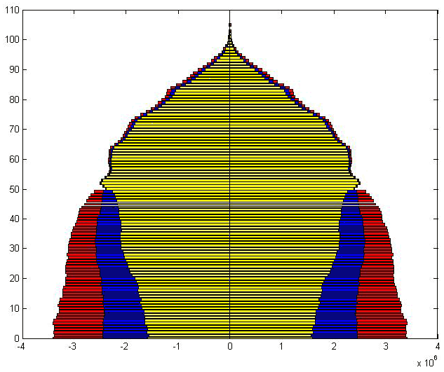
An age-sex graph, commonly referred to as a population pyramid even though the graph for some countries is not actually a pyramid shape, displays a population’s age and sex composition. Horizontal bars represent the numbers or proportions of males and females in each age group, or cohort. The sum of all the age-sex cohorts in the population pyramid equals 100 percent of the population. Cohorts may vary from single years to groups of years.

The left side of the pyramid represents the male population and the right side, the female population. The bars at the bottom of the pyramid represent the percent of the population that is male, 0-4 years old (left) and the percent of the population that is female, 0-4 years old (right). Each bar above the base represents the next five-year cohort, male and female, in the population. As cohorts age, they inevitably lose members because of death and they may gain or lose members because of migration. After age 45 the loss of population accelerates, causing the narrowing peak of all population pyramids.
Population pyramids reveal a great deal about a population at a glance. Populations of countries can differ markedly as a result of past and current patterns of fertility, mortality, and migration.
Part One: How Do You Construct an Age-Sex Graph?
Instructions
In order to understand how to interpret population pyramids, read the following selections from PRB publications:
- Population Handbook, 5th edition
- Population: A Lively Introduction, 3rd edition , pp. 23-28.
- Provide each student with a copy of the “Age-Sex Graph” handout, colored pencils, and the age-sex data table. Also transfer a copy of the graph to a transparency for use as a demonstration.
- Explain that the raw population numbers need to be converted to percents before beginning to construct a pyramid. This can be done using a calculator or using a spreadsheet, such as MS Excel. [Divide the population of each cohort by the total population of the country to determine what percent of the total population is in each cohort.]
- Using the graph transparency, demonstrate how to transfer the data (%) for the first pyramid by drawing the bar for the first male cohort (0-4 years) to the left, and for the first female cohort (0-4 years) to the right. Have students proceed on their own, completing pyramids for both country A and country B.
- When students have completed both pyramids, lead a discussion of the similarities and differences in the shapes of the two pyramids. Based on the readings noted above, what inferences can be drawn about social and economic circumstances in each country? What might be some reasons for the differences in the two pyramids?
Instructions
In this activity students will analyze demographic data for selected countries of the world. They will also construct population pyramids and speculate on differences in the quality of life in these countries.
- Assign students (or pairs of students, depending on class size) one country from the list below. Direct students to locate the most current age-sex data for their assigned country.
Column AColumn BArgentina Bangladesh France Brazil Germany Egypt Israel Ethiopia Japan Indonesia New Zealand Thailand Russia Turkey United Kingdom Vietnam
Open the U.S. Census Bureau “International Database,” available at: www.census.gov/ipc/www/idbnew.html
Choose “Summary Demographic Data.”
Select the assigned country from the country list. Then “Submit Query.”
Print or copy the data for the country. [Note: Disregard pyramids that appear on the Census IDB site. These are based on absolute numbers and are not appropriate for use in this activity.]
Use the Census Bureau website to complete the chart below for the assigned country.
Country: ____________________________________
|
Demographic Variable
|
Value
|
|---|---|
| Birth Rate (per 1,000) | |
| Death Rate (per 1,000) | |
| Natural Increase (%) | |
| Infant Mortality Rate (per 1,000 live births) | |
| Total Fertility Rate | |
| Population <15 yrs. (%)/>65 yrs. (%) | |
| Life Expectancy at Birth (male/female) | |
| Urban Population (%) | |
| GNP/capita (U.S.$) |
- Construct a pyramid for the assigned country either manually using a copy of the graph template, or by following the steps for pyramid construction using MS Excel (see instructions provided under Materials Needed).
- Compare the demographic variables and the pyramid for the country. How does the pyramid reflect the variables? [for example, how is Birth Rate reflected in the base of the pyramid?]
- Characterize the level of development in the country—high, medium, low? Use two specific examples from the table and pyramid to support the decision about level of development.
- Have students with pyramids in the “a” group compare their pyramid with a pyramid from the “b” group. Have them also compare the demographic variables for both countries. What generalizations can be made concerning demographic indicators and level of development? [for example, if the birth rate is high, then the level of development is…] Encourage students to form at least three generalizations that are supported by the pyramids and data charts.
- Lead a class discussion on the use of population data and graphs as tools for analysis of population structure and composition. Describe the age/gender patterns you observe. Discuss the implications of the patterns. Think about the kinds of problems that could occur because of the differences in lifestyle and community priorities for different age groups in each location. Identify some investments (stores, entertainment, etc.) that might do well or some social programs (child care, education, medicine, etc.) that might be required in places with these populations.
[heading text=”Activity 4: How to Use MS Excel to Make an Age-Sex Graph” include_in_toc=”true” type=”heading-top” level=”h3″ /]
Instructions
Installing an Autoformat for a Population Pyramid in MS Excel
Copy the files above “Pyramid Blank” and “New Pyramid” to a disk or to the desktop of your computer.
- Open the “Pyrblank” file in your own copy of Excel. Then select “Save As” from the File menu. Under “Save as Type,” select “Template.”This will add the pyramid spreadsheet template to your copy of Excel.
- Open the saved “New Pyramid” in your own copy of Excel.
Under Chart….
- select Chart type
- select “Custom types”
- select “User defined”
- select “Add” then type a “format name”: population pyramidand click ok
This will add the custom format for a pyramid to the list of options in your program.
Constructing a Population Pyramid Using Excel
Follow the steps below carefully and accurately to convey age-sex data into a five-year cohort population pyramid.
Click on the “Start” button (lower left). From “Programs,”
- Open Excel. Under File, select “New.” Open the template “Pyramid Blank.”
- In Col. E, cells2-17*, type the population for each male cohort.
- In Col. F, cells 2-17*, type the population for each female cohort.
- In Col. B, cell 24, type the total population for the country.
- Select Col. B, cell 2. Then click on the Formula Bar just above the column letters and type: =E2/$B$24*-100
Press Enter. Select Col. B, cell 2 again; then point to the small black box in the lower right corner of cell B2; click and drag down through cell B19. Release. [Note: All percents are negative order to make the bars representing the male cohorts to appear to the left of the center axis).
- Repeat step 5 for Col. C, using the formula: =F2/$B$24*100
- Highlight Col. A, B, and C, cells 1-19.
- Under Insert, select “Chart.” Select the tab “Custom Types” and then the option “User-defined.” From the User-defined options, select “New Pyramid.” At the on-screen prompt, click on “Next” until you reach “Step 4.” Select the option “As a new sheet,” then click “Finish.”
- Use the “text box” tool (on the tool bar at the bottom of the page) to add an appropriate title, include “where, what, and when.” Also use the text box tool to add a source note in the lower left corner below the pyramid. Save your work; then print.
* AP and the Advanced Placement Program are registered trademarks of the College Entrance Examination Board, which was not involved in the production of these lesson plans.