


- A citizenship question appeared on the decennial census long form, completed by approximately one in six households, in 1980, 1990, and 2000. A citizenship question also appears on the annual American Community Survey.
- Hansi Lo Wang, “Multi-State Lawsuit Against Census Citizenship Question to Move Ahead,” NPR, July 26, 2018, accessed at www.npr.org/2018/07/26/629773825/multi-state-lawsuit-against-census-citizenship-question-to-move-ahead, on Oct. 2, 2018.
- John M. Abowd, “Memorandum: Technical Review of the Department of Justice Request to Add Citizenship Question to the 2020 Census” (Jan. 19, 2018), accessed at www.osec.doc.gov/opog/FOIA/Documents/AR%20-%20FINAL%20FILED%20-%20ALL%20DOCS%20%5bCERTIFICATION-INDEX-DOCUMENTS%5d%206.8.18.pdf#page=1289, on Oct. 2, 2018.
- David Brown et al., “Understanding the Quality of Alternative Citizenship Data Sources for the 2020 Census,” Center for Economic Studies (August 2018), accessed at www2.census.gov/ces/wp/2018/CES-WP-18-38.pdf, on Oct. 2, 2018.
- J. David Brown et al., “Understanding the Quality of Alternative Citizenship Data Sources for the 2020 Census.”
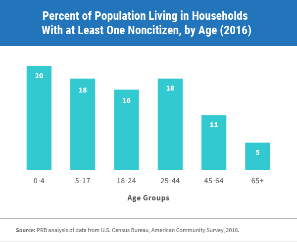
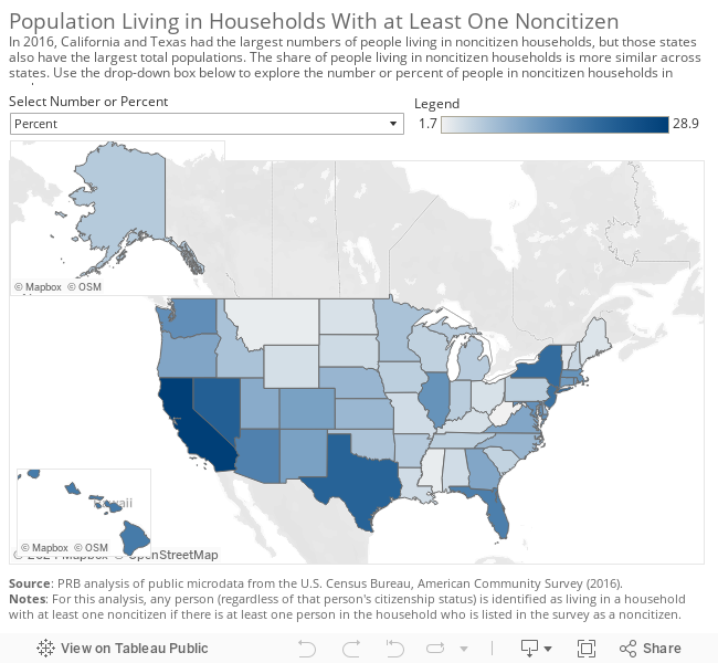
- PRB analysis of data from U.S. Census Bureau, American Community Survey, 2016.
- William P. O’Hare, “Why Are Young Children Missed So Often in the Census?,” The Annie E. Casey Foundation, KIDS COUNT Working Paper (December 2009), accessed at www.aecf.org/m/resourcedoc/aecf-WhyareYoungChildrenMissedInCensus-2009.pdf, on Oct. 2, 2018; and “One Million Missing: Undercount of Young Kids in the 2020 Census Threatens Gains,” The Annie E. Casey Foundation, June 27, 2018, accessed at www.aecf.org/blog/one-million-missing-undercount-of-young-kids-in-2020-census-threatens-gains/, on Oct. 2, 2018.
- “The Constitution: Amendments 11-27,” National Archives, accessed at www.archives.gov/founding-docs/amendments-11-27#14, on Oct. 2, 2018.
Beth Jarosz
Senior Program Director


 ">
">