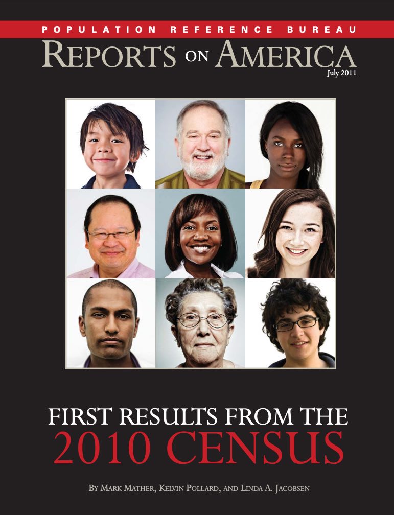
Mark Mather
Associate Vice President, U.S. Programs

Source: PRB analysis of data from the U.S. Census Bureau.
Just 20 counties—mostly located in California, New York, and Texas—account for 41% of all young children living in very high-risk census tracts (see Table 2). A few of these counties stand out because they have both large numbers and shares of children living in very high-risk neighborhoods, in combination with relatively low self-response rates. For example, 84% of children under age 5 in Miami-Dade County, Florida (132,235), live in neighborhoods with a very high risk of undercounting young children, and the average self-response rate in that county in late June was 59%, which is below the average across all large counties (63%). Over two-thirds of young children in Hidalgo County, Texas, live in very high-risk neighborhoods, and the mean self-response rate in that county was 46% in late June.
| wdt_ID | Counties | Number of Young Children Living in Very High-Risk Tracts | Percent of Young Children Living in Very High-Risk Tracts | Average Tract-Level Response Rate (%) |
|---|---|---|---|---|
| 1 | All large counties | 4,062,432 | 24.7 | 63.0 |
| 2 | Los Angeles County, CA | 290,389 | 46.5 | 57.8 |
| 3 | Harris County, TX | 140,160 | 39.7 | 55.0 |
| 4 | Miami-Dade County, FL | 132,235 | 84.0 | 58.6 |
| 5 | Cook County, IL | 130,949 | 39.9 | 59.9 |
| 6 | Kings County, NY | 94,935 | 49.0 | 48.8 |
| 7 | Queens County, NY | 91,986 | 63.5 | 51.0 |
| 8 | Bronx County, NY | 87,466 | 82.5 | 52.9 |
| 9 | Dallas County, TX | 86,532 | 42.2 | 57.9 |
| 10 | Broward County, FL | 71,264 | 63.9 | 59.1 |
| 11 | Philadelphia County, PA | 69,185 | 64.2 | 50.9 |
| 12 | Maricopa County, AZ | 55,238 | 19.8 | 62.2 |
| 13 | Hidalgo County, TX | 54,216 | 67.7 | 46.4 |
| 14 | Orange County, CA | 52,528 | 27.8 | 71.0 |
| 15 | Wayne County, MI | 45,665 | 39.6 | 61.9 |
| 16 | San Diego County, CA | 45,340 | 21.4 | 67.5 |
| 17 | San Bernardino County, CA | 44,715 | 28.9 | 59.5 |
| 18 | El Paso County, TX | 42,160 | 64.7 | 58.8 |
| 19 | Santa Clara County, CA | 41,967 | 35.4 | 71.3 |
| 20 | Bexar County, TX | 39,492 | 28.5 | 59.7 |
| 21 | Riverside County, CA | 36,421 | 23.1 | 60.5 |
Why does it matter if a neighborhood has a large share of households that have not responded to the census? Low self-response rates could lead to less accurate counts and fewer dollars for communities that need those funds the most. Accurate census data ensure that funding is equitably distributed for numerous programs benefitting children and families, such as the National School Lunch Program and Head Start. Census Bureau data are used to distribute more than $675 billion in federal funds to states and local communities for health, education, housing, and infrastructure programs each year.
Self-response rates were lowest in neighborhoods with high concentrations of racial and ethnic minorities in the young child population. The mean self-response rate for all tracts where Blacks make up the majority of young children was 51%, compared with 64% for tracts with a majority of non-Hispanic White children. The average self-response rate was just 21% in tracts with a majority of American Indian/Alaska Native children, which probably reflects the delayed start of the Census Bureau’s Update Leave operation in many rural areas. The average self-response rate for tracts with a majority of Latinx children was also relatively low, at 54%. The mean self-response rate was 62% in neighborhoods with a majority of Asian American children under age 5—similar to the average rate for neighborhoods with a majority of non-Hispanic White children.
These low response rates in communities of color are important because historically, certain racial and ethnic groups have faced a higher risk of being missed in the decennial census. Results from the 2010 Census show that among children under age 5, the net undercount rate was 7.5% for Latinx children and 6.3% for children classified as Black alone or in combination with one or more other races. The net undercount rate for all children under age 5 was 4.6%—higher than any other age group.
PRB has developed a series of maps and databases, which are being updated on a weekly basis, to help improve targeting of communities where children are most likely to be missed in the census. These resources highlight census tracts with a very high risk of undercounting young children and low 2020 Census self-response rates.
Users can zoom in and out of these maps to view patterns in their states and local areas and can click on a census tract to view the tract FIPS code, undercount risk category, 2020 Census self-response rate, and estimated number of children under age 5 in 2014-2018.
The maps are divided into 11 separate files, covering all 50 states and the District of Columbia.
Each database includes data on the risk of undercounting young children, the latest 2020 Census self-response rates, weekly change in response rates, key predictors of child undercount, and the racial/ethnic composition of the young child population.
The Census Bureau calculates household self-response rates for geographic areas that receive their census invitations in the mail, as well as households in Update Leave areas that receive their census invitation and paper form when a census taker drops off a package of materials at their residence.
Net undercounts represent a balance between two groups. One group is people omitted from the Census. The second group is erroneous enumerations (mostly people counted twice) and whole-person imputations.
The estimated risk of undercount for young children is based on PRB’s analysis of American Community Survey estimates and the U.S. Census Bureau’s Revised 2018 Experimental Demographic Analysis Estimates for young children. Data are based on 2020 Census tract boundaries.
While 2020 Census self-response rates are available for 2020 Census tracts, PRB’s original database on the undercount of children is based on 2010 Census tract boundaries. PRB matched 2010 Census tracts to 2020 Census tracts using a crosswalk file provided by the Census Bureau.
For a detailed description of the methods and data sources used to predict child undercount risk, please refer to William P. O’Hare, Linda A. Jacobsen, Mark Mather, and Alicia Van Orman’s report, Predicting Tract-level Net Undercount Risk for Young Children.
Acknowledgement
This research was funded by The Annie E. Casey Foundation, Inc., and we thank them for their support. The findings and conclusions presented in this report are those of the authors alone and do not necessarily reflect the opinions of the Foundation.
We also thank Dr. William P. O’Hare for all his work on the undercount of children in the census and for providing expert guidance to PRB staff on this project.
If you have any questions, please contact Mark Mather at PRB.

Household size and composition play an important role in the economic and social well-being of families and individuals. The number and characteristics of household members affect the types of relationships and the pool of economic resources available within households, and they may have a broader impact by increasing the demand for economic and social support services. For example, the growth in single-parent families has increased the need for economic welfare programs, while a rising number of older adults living alone has led to greater demand for home health care workers and other personal assistance services. The decennial census provides the most comprehensive and reliable data on changing household size and composition, especially for less numerous household types such as same-sex married couples.
Average household size has declined over the past century, from 4.6 persons in 1900 to 3.68 persons in 1940 to only 2.58 persons by 2010.1 This decline is due to decreases in the share of households with three or more persons and increases in the share with only one or two persons. In 1940, for example, more than one in four households (27 percent) had at least five persons and less than one in 10 (8 percent) had only one person.2 By 2010, these shares had nearly reversed, with more than one-fourth of all households (27 percent) having only one person and slightly more than one-tenth (11 percent) having five or more persons.3
However, there are signs of a reversal in the decline in average household size. Although the trend away from large households has continued since 2010, average household size actually increased between 2010 and 2017 from 2.58 to 2.65 persons.4 If average household size remains larger than 2.58 in 2020, it will be the first such intercensal increase since the 1900 Census. The increase in average household size since 2010 appears to be driven by growth in the share of households with two persons—from 33 percent to 34 percent—and a decline from 40 percent to 38 percent in the share with three or more persons. Changes in household composition help explain these trends in household size.
The shifts in U.S. household composition over the last five decades have been striking, as the share of family households has declined and the share of nonfamily households has increased. In 1960, 85 percent of all households contained families, but by 2017, this share had dropped to 65 percent (see Table). Conversely, the share of nonfamily households more than doubled from 15 percent to 35 percent during this period. The types of households within the family and nonfamily categories have also shifted, with a consistent decline in the share of married couples with children and a steep and consistent increase in the share of people living alone. Since 1960, the shares of single-parent families and other nonfamily households more than doubled.
| wdt_ID | Household Type | 1960 | 1980 | 2000 | 2010 | 2017 |
|---|---|---|---|---|---|---|
| 1 | Family Households | 85 | 74 | 68 | 66 | 65 |
| 2 | Married Couples w/ children | 44 | 31 | 24 | 20 | 19 |
| 3 | Married Couples w/out children | 31 | 30 | 28 | 28 | 30 |
| 4 | Single Parents w/ children | 4 | 7 | 9 | 10 | 9 |
| 5 | Other Family | 6 | 6 | 7 | 8 | 9 |
| 6 | Nonfamily Households | 15 | 26 | 32 | 34 | 35 |
| 7 | One Person | 13 | 23 | 26 | 27 | 28 |
| 8 | Other Nonfamily | 2 | 4 | 6 | 7 | 7 |
Note: Percentages may not sum to 100 due to rounding.
Sources: James A. Sweet and Larry L. Bumpass, American Families and Households, Table 9.2 (New York: Russell Sage Foundation, 1987); U.S. Census Bureau, 2000 and 2010 decennial censuses; 2017 American Community Survey.
In 1960, married-couple families made up 75 percent of all U.S. households, and 44 percent of these families had children. Single-parent families made up only 4 percent of all households, and other families accounted for 6 percent. By 1980, a significant shift in the composition of family households was underway. Married-couple families made up only 61 percent of all households, and the share with children dropped to 31 percent. The share of single-parent families nearly doubled from 4 percent to 7 percent of all households, while the share of married-couple families without children remained about the same at 30 percent.
Since 1980, the pace of change has slowed but the transformation of family households has continued. By 2017, married-couple families accounted for less than half of all households, and only about one-fifth (19 percent) of households were married couples with children. The share of married-couple families without children also declined slightly to 28 percent between 1980 and 2010, but increased to 30 percent between 2010 and 2017—almost back to the 1960 level of 31 percent. In contrast, the share of single-parent families continued to increase after 1980, rising to 10 percent by 2010, while the share of other families rose from 6 percent to 9 percent of all households by 2017.
In 1960, only 15 percent of all U.S. households were nonfamily households, and 13 percent were one-person households. Over the next 20 years, nonfamily households underwent dramatic shifts: The share of one-person households jumped to 23 percent, and the share of other nonfamily households doubled to 4 percent. The rapid growth in one-person households was largely due to increases in the share of older adults living alone, particularly women. The share of women ages 65 and older who lived alone rose from 23 percent in 1960 to 37 percent in 1980.5
The share of nonfamily households continued to rise after 1980, but at a slower pace. By 2017, more than one-third (35 percent) of all households were nonfamily households, and more than one-fourth (28 percent) were one-person households. The share of other nonfamily households also increased after 1980, reaching 7 percent by 2010. Beginning in the 1980s, the rise in cohabitation contributed to the growth in two-person nonfamily households; unmarried partners made up almost all of the households in this category in 2010. The share of other nonfamily households has not changed since 2010.
Household composition varies among householders in different age groups and reflects the sequence of life-cycle stages that individuals experience as they age—from moving out on their own to marriage and family formation to empty nest to retirement. Changes in the share of householders in different age groups have contributed to shifts in household composition in the United States.
Most young adult householders in the United States live alone or with roommates. Three-fifths (61 percent) of households headed by an adult under age 25 were nonfamily households in 2017, while only 39 percent were family households (see Figure 1). One-third (33 percent) of householders under age 25 lived with unrelated roommates—including cohabiting partners—while an additional 28 percent lived alone. Only a small share (15 percent) headed married-couple families with or without children, but 14 percent of householders under age 25 headed single-parent families in 2017.
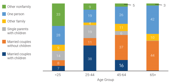
Notes: Percentages may not sum to 100 due to rounding. Among householders ages 65 and older, 0.4 percent headed married-couple households with children and 0.1 percent headed single-parent households with children.
Sources: U.S. Census Bureau, 2017 American Community Survey Public Use Microdata Sample (PUMS).
In contrast, the split between family and nonfamily households is reversed among householders ages 25 to 44—only 28 percent headed nonfamily households and 72 percent headed family households. While only one-fifth of households headed by an adult under age 25 included children, almost three-fifths (56 percent) of householders ages 25 to 44 headed families with children—both married-couple families (38 percent) and single-parent families (19 percent). Only 11 percent headed married-couple families without children. About one-fifth (19 percent) of householders in this age group lived alone in 2017, but less than one in 10 (9 percent) headed 2+-person nonfamily households—down from 33 percent among householders under age 25.
More than a third of householders ages 45 to 64 (37 percent) were empty nesters, heading married-couple households without children. Only about one-fifth (21 percent) of householders ages 45 to 64 headed families with children—16 percent were married-couple families and only 6 percent were single-parent families. However, a relatively high share of householders ages 45 to 64 were heading other family households (11 percent) and one-person households (26 percent).
Eight in 10 householders ages 65 and older were either heading married-couple families without children (44 percent) or living alone (42 percent). Only 10 percent of householders in this oldest age group headed other family households and only 3 percent headed other nonfamily households.
Beginning in the 1960s—and accelerating over the last two decades—changes in marriage, cohabitation, and childbearing have played a key role in transforming household composition in the United States. More recently, population aging and shifts in the age distribution of householders are also contributing to these changes in composition.
Delays in marriage and childbearing and increases in cohabitation among young adults have contributed to the decline in the share of family households—particularly married couples with children—and the steep rise in the share of nonfamily households. The median age at first marriage reached a new high in 2017—29.5 for men and 27.1 for women—and cohabitation rates have continued to increase.6 In 2011-2013, 65 percent of women ages 19 to 44 reported having had a cohabiting relationship, up from 33 percent in 1987.7
Birth rates among women under age 30 have continued to decline since 2010, although the rates for women ages 30 to 34 increased through 2016 before decreasing from 2016 to 2017.8 The share of births to women under age 40 that occurred outside of marriage increased from about 21 percent in 1980-1984 to 43 percent in 2009-2013; about 60 percent of the nonmarital births in 2009-2013 were to cohabiting couples—up from only 28 percent in 1980-1984.9
Between 2000 and 2010, the increase in cohabiting couples with children contributed to growth in the shares of both single-parent families and other nonfamily households due to the ways the Census Bureau classifies such couples by household type. However, between 2010 and 2017, the share of other nonfamily households stayed constant, and the share of single-parent families declined slightly from 10 percent to 9 percent. This decrease may be due to the drop from 18 percent to 14 percent in the share of householders under age 25 who were heading single-parent families. While declining birth rates among young women are partly responsible, this decline could also be related to more young couples with children living with their parents rather than in their own households. This explanation is supported by evidence of an increase in the number of multigenerational households, which rose from 4.4 million in 2010 to 4.6 million in 2017.
As fertility rates have fallen and baby boomers have aged, the distribution of the adult population ages 18 and older in the United States has shifted to older age groups. Between 2010 and 2017, the share of adults ages 45 to 64 declined from 35 percent to 33 percent, while the share ages 65 and older increased from 17 percent to 20 percent. About 22 percent of the adult population is projected to be age 65 or older by 2020.
These shifts in the age distribution of the adult population have been accompanied by changes in the age distribution of householders. Between 2010 and 2017, the shares of householders under age 25, ages 25 to 44, and ages 45 to 64 all declined by 1 or 2 percentage points, while the share of householders ages 65 and older increased by nearly 4 percentage points. This increase in the share of older householders is contributing to growth in the shares of both married-couple households without children and one-person households. These trends are likely to continue as more baby boomers enter older age groups in the coming decades.
Young adults forming new, independent households—alone, with a spouse or partner, or with unrelated roommates—has historically been an important factor in the overall household growth rate. Between 2010 and 2017, the young adult population (ages 18 to 34) increased by 4.2 million, accounting for nearly a quarter of the growth in the adult population (ages 18 and older).10 Yet, the household growth rate slowed to only 3 percent during this period—much lower than the 11 percent growth rate between 2000 and 2010. While the living arrangements of adults ages 35 to 64 have remained stable, recent changes in young adults’ living arrangements help explain the decline.
The share of young adults ages 18 to 34 who have formed an independent household has declined since 2010, while the share living with their parents has increased sharply. In 2010, less than one-third (32 percent) of young adults ages 18 to 34 were living with their parent(s), but this share jumped to 35 percent by 2017. The increase was sharpest among 25- to 29-year-olds, rising from 21 percent in 2010 to 26 percent in 2017 (see Figure 2). The share of 30- to 34-year-olds living with their parent(s) also increased by 4 percentage points across this period. In contrast, the share of young adults living in a married-couple family declined for all age groups between 2010 and 2017, with the largest drop among those ages 25 to 29.
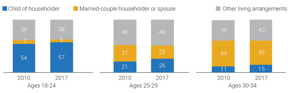
Notes: “Other living arrangements” include householders living alone, with an unmarried partner, with other relatives, or with nonrelatives. Percentages may not sum to 100 due to rounding.
Source: U.S. Census Bureau, 2010 and 2017 American Community Survey PUMS.
The Great Recession and the slow economic recovery, high student debt loads, and high relative housing costs have all likely contributed to the declining shares of young adults forming or maintaining independent households since 2010. Whether these patterns persist into 2020 and beyond is an open question. If the job market and earnings continue to improve, the ability of young adults to form new households may increase. If housing costs continue to rise, however, the resulting economic burden on young adults may counteract any improvements in employment and earnings and dampen household growth rates in the future.
This article is excerpted from Mark Mather et al., “What the 2020 Census Will Tell Us About a Changing America,” Population Bulletin 74, no. 1 (2019).

No other country in the world is experiencing population aging on the same scale as China.
The United Nations projects that there will be 366 million older Chinese adults by 2050, which is substantially larger than the current total U.S. population (331 million).1By that time, China’s share of adults ages 65 and older wills have risen from just 12% to a projected 26%. This rapid population aging—driven by recent declines in fertility and mortality—raises concerns about the health and well-being of older Chinese adults and will create considerable challenges for the health care system.
While life expectancy in China is increasing, older adults may spend more of their advanced years in poor health and with disabilities. Families have been the primary source of care for older adults, but the country’s rapid economic development and urbanization have separated millions of older adults from their children, contributing to an increasing demand for community-based health care.
These demographic and socioeconomic changes raise important questions for researchers and policymakers. How are older Chinese adults faring relative to their parents’ and grandparents’ generations? How is rapid urbanization affecting health and the availability of potential caregivers among older adults? How are older women faring relative to men, and which factors contribute to the gender gap in health? More broadly, what are the key factors associated with healthy aging in China, and what can policymakers do to improve health and reduce health disparities in the context of the country’s rapid socioeconomic development?
This issue of PRB’s Today’s Research on Aging (Issue 39) summarizes recent research on aging and health in China from U.S. National Institute of Aging-sponsored investigators and surveys, especially the China Health and Retirement Longitudinal Study (CHARLS) and Chinese Longitudinal Healthy Longevity Study (CLHLS). Results from these studies can shed light on the key determinants of healthy aging and help identify policies to address the challenges posed by rapid population aging in China.2The findings can also offer insights to policymakers in other countries with rapidly growing older populations.
China’s life expectancy has increased steadily during the past half century. In 1960, average life expectancy at birth in China was around 44 years. By 2017, it had increased to 76 years.3
Physical and cognitive health among older adults—especially women—is also improving with rising educational attainment and better medical care.4
Yi Zeng and colleagues find evidence of morbidity compression among China’s older adults—a reduction in the proportion of life spent with disability. Among adults ages 80 and older, mortality and self- reported disability rates have fallen relative to cohorts born 10 years earlier, according to their analysis of CLHLS data.5A recent study of adults ages 50 and older, based on CHARLS data, shows that at age 50, men can expect to live 24 years without activity limitations (26 years for women).6
These life expectancy gains and reductions in disability, however, are linked to rapid economic development in urban areas. Older adults in rural areas have not fared as well, leading to growing rural-urban disparities in health.7
Rising obesity rates and high smoking prevalence (among men) also present major health challenges for China’s aging population. In 2011, 28% of men and 38% of women ages 45 and older were overweight, putting them at higher risk of heart disorders, hypertension, diabetes, and stroke.8 Over half of men ages 45 and older (53%) smoked in 2011, compared with 5% of women in that age group.9 High levels of pollution—especially in urban areas—pose additional health risks.
“Public health campaigns and incentives are urgently needed on all these fronts so that the predictable long-term consequences of these behaviors on older age disease are not realized,” report researchers James Smith and his colleagues.9
Source: James P. Smith, Meng Tian, and Yaohui Zhao, “Community Effects on Elderly Health: Evidence from CHARLS National Baseline,” Journal of the Economics of Ageing 1-2 (2013): 50-59.


U.S. 2010 Census results show that black-white residential segregation declined modestly since 2000, continuing the gradual pace begun in 1980.
Among large metropolitan areas with a total population of 500,000 or more, the least segregated metros were located in the faster-growing South and West, while the most segregated metro areas were mainly concentrated in the slower-growing Northeast and Midwest (see table).
The 10 least-segregated metro areas all grew faster than the national average of 11 percent between 2000 and 2010, with seven of them seeing increases of 20 percent or more, reports Kelvin Pollard, PRB demographer and co-author of PRB’s Reports on America: “First Results From the 2010 Census.” Only one of the 10 most-segregated metros experienced growth rates that reached even half the national average.
“Least-segregated Raleigh and Las Vegas were among the nation’s fastest growing metros with growth rates topping more than 40 percent for the decade, while most-segregated Detroit, Cleveland, and Buffalo were among those that lost population,” he notes.
Demographers use the segregation (or dissimilarity) index to measure how racial groups are spread throughout a metro area’s census tracts. An index of 100 would mean blacks live in exclusively black neighborhoods and whites live in exclusively white neighborhoods, while a score of zero means each neighborhood has the same share of black and white residents as the metro area as a whole.
“Milwaukee’s index of 81.5 means that about eight out of 10 black residents would need to move to another Milwaukee neighborhood to be distributed throughout the metro area in the same way as whites,” Pollard explains. Demographers call levels of 60 and above highly segregated, 39 to 59 moderately segregated, and below 39 less segregated.
| wdt_ID | Least Black-White Segregated Metros | Segregation Index, 2010 | Percent Population Change, 2000-2010 |
|---|---|---|---|
| 1 | Tucson, Ariz. | 3.7 | 1.6 |
| 2 | Las Vegas-Paradise, Nev. | 37.6 | 41.8 |
| 3 | Colorado Springs, Colo. | 39.3 | 20.1 |
| 4 | Charleston-North Charleston-Summerville, S.C. | 41.5 | 21.1 |
| 5 | Raleigh-Cary, N.C. | 42.1 | 41.8 |
| 6 | Greenville-Mauldin-Easley, S.C. | 43.6 | 13.8 |
| 7 | Phoenix-Mesa-Glendale, Ariz. | 43.6 | 28.9 |
| 8 | Lakeland-Winter Haven, Fla. | 43.9 | 24.4 |
| 9 | Augusta-Richmond County, Ga.-S.C. | 45.2 | 11.5 |
| 10 | Riverside-San Bernardino-Ontario, Calif | 45.7 | 29.8 |
Note: Metro areas with fewer than 500,000 total residents or where non-Hispanic blacks made up fewer than 3 percent of the population were not included when ranking black-white segregation indices.
Sources: Segregation Indices: William H. Frey, Brookings Institution, and University of Michigan Social Science Data Analysis Network, Analysis of 1990, 2000, and 2010 Decennial Census tract data, accessed at www.psc.isr.umich.edu/dis/census/segregation2010.html, on Aug. 29, 2011. Population Data: Population Reference Bureau, analysis of 2000 and 2010 Decennial Census data.
| wdt_ID | Most Black-White Segregated Metros | Segregation Index, 2010 | Percent Population Change, 2000-2010 |
|---|---|---|---|
| 1 | Milwaukee-Waukesha-West Allis, Wisc. | 8.2 | 0.4 |
| 2 | New York-Northern New Jersey-Long Island, N.Y.-N.J.-Pa. | 78.0 | 3.1 |
| 3 | Chicago-Joliet-Naperville, Ill.-Ind.-Wisc. | 76.4 | 4.0 |
| 4 | Detroit-Warren-Livonia, Mich. | 75.3 | -3.5 |
| 5 | Cleveland-Elyria-Mentor, Ohio | 74.1 | -3.3 |
| 6 | Buffalo-Niagara Falls, N.Y. | 73.2 | -3.0 |
| 7 | St. Louis, Mo.-Ill. | 72.3 | 4.3 |
| 8 | Cincinnati-Middletown, Ohio-Ky.-Ind. | 69.4 | 6.0 |
| 9 | Philadelphia-Camden-Wilmington, Pa.-N.J.-Del.-Md. | 68.4 | 4.9 |
| 10 | Los Angeles-Long Beach-Santa Ana, Calif. | 67.8 | 3.7 |
Note: Metro areas with fewer than 500,000 total residents or where non-Hispanic blacks made up fewer than 3 percent of the population were not included when ranking black-white segregation indices.
Sources: Segregation Indices: William H. Frey, Brookings Institution, and University of Michigan Social Science Data Analysis Network, Analysis of 1990, 2000, and 2010 Decennial Census tract data, accessed at www.psc.isr.umich.edu/dis/census/segregation2010.html, on Aug. 29, 2011. Population Data: Population Reference Bureau, analysis of 2000 and 2010 Decennial Census data.
Segregation persists in older cities in the Northeast and Midwest where a large share of the nation’s African American residents live, “buttressed by a history of poor race relations and continuing discrimination,” says John Iceland, a Penn State University demographer who studies segregation and poverty. Cities like Chicago, Detroit, and Philadelphia have long-established black communities—often called ghettos—that grew during the migration of African Americans from the South for industrial jobs during the first half of the 1900s.
Still, the 2010 Census results offer some good news: “The ghettoes of the Northeast and Midwest are not being reconstituted in the fast-growing areas of the South and West,” he notes.
U.S. cities with high levels of growth and new construction tend to be less segregated. One reason may be that newer housing lacks a reputation for discrimination, while in older areas the perception—widely held or not—that blacks are unwelcome in a particular suburb or area of the city can linger for decades. Metro areas in the South and West tend to have more mobile populations, fewer blacks, and sometimes no long-established black community, Iceland points out. “The world of difference is easy to see in a short drive through Milwaukee or Detroit where there are starkly black and starkly white neighborhoods that you don’t see to nearly the same extent driving in places like Tucson or Las Vegas,” he says.
The way city boundaries were drawn in the past also plays a role in regional differences today, according to Reynolds Farley, a University of Michigan sociology professor emeritus, who began studying segregation in the 1960s. The boundaries of the Rustbelt cities of the Northeast and Midwest were established decades ago and are surrounded by independent suburbs, some with a history of hostility to blacks. In the South and West, central cities annexed outlying land after World War II; metro areas like Tucson include much of what might be considered the suburban ring in the Midwest. In some parts of the West and South, public schools are often organized on a county-wide basis, limiting white suburban enclaves.
By the 1990s, more African Americans were calling the suburbs home, but in many places those suburbs were predominantly black. “The important finding revealed by Census 2010 is that many, many places within suburban rings in the Northeast and Midwest appear to be quite open to African American residents,” says Farley. “You can find almost all-black neighborhoods, but such segregation is certainly declining. In quite a few metro areas in the South and West and some in the Midwest, you could say that black-white segregation is not much more than moderate.”
Researchers are now tracking the impact of growing Hispanic and Asian populations on black-white segregation. “As a community becomes more diverse, racial mixing appears easier to achieve and a different dynamic seems to be playing out,” says Iceland.
Black-white segregation has declined gradually and continuously over the last 40 years, but as the nation’s population has become more diverse some analysts anticipated more rapid change, even hoping for a breakthrough.
“The growth of the black middle class, the passage of time since Fair Housing Laws were enacted, and the evidence from surveys that white Americans are becoming more tolerant of black neighbors all point toward progress in overcoming the high level of segregation that had been reached in 1970,” says Brown University sociology professor John Logan.
A report from the US2010 Census Project, directed by Logan, found overall black-white residential segregation in U.S. metropolitan areas declined from a high of 79 in 1970 to 59 in 2010 (as measured by the segregation index).1 Logan calls the progress “mixed,” noting that at the current rate of change it will be 2030 before blacks reach the same level of segregation as Hispanics today (index of 48). The report also found that cities with the largest share of black residents registered the smallest declines in segregation over the past 30 years, while metro areas with black populations of less than 5 percent showed the greatest declines.
One cost of residential segregation for African Americans is quality of life. The neighborhoods where they live typically have fewer resources and higher poverty than neighborhoods where comparable non-Hispanic whites live, according to the US2010 Census Project.2 The average black household earning more than $75,000 was in a neighborhood with a higher poverty rate than the average white household earning less than $40,000.
For children, segregation continues to be more pronounced than for adults. The Harvard School of Public Health’s Diversity Data project reports that segregation declined moderately for black children in most U.S. metropolitan areas since 2000, but remains high.3 Their analysis of 2010 Census data found that black child segregation relative to white children in the 100 largest metropolitan areas fell between 2000 and 2010 from 72 to 68, as measured by the segregation index. Child segregation declined most in larger, very highly segregated metros in the Midwest and smaller metros in Florida and the western United States, the researchers found.
“In very few instances do the very best neighborhoods where black and Hispanic children live have opportunities and amenities close to the average level of neighborhoods where white children live,” write the Diversity Data project authors.
Farley calls “residential segregation a lens to assess whether the U.S. has achieved the equality that some felt the 2008 election symbolized.”4 He points to declines in segregation, increases in interracial marriages, documented changes in racial attitudes, and widespread acceptance of equal housing opportunities as signs of weakened systemic discrimination.
Yet he acknowledges that while white attitudes have become more accepting over the past 30 years, full acceptance is a long way off. About half of whites surveyed in Detroit in 2004 told Farley’s research team they would move if the racial composition of their neighborhoods reaches 50-50, down from three-quarters in 1976. Still, he is cautiously optimistic: “The long trend toward lower levels of black-white segregation seems sure to continue.”
(October 2008) Offshoring is the movement of jobs and tasks from one country to another, usually from high-cost countries, such as the United States, to low-cost countries where wages are significantly lower. Offshoring is often confused with outsourcing, which is instead the movement of jobs and tasks from within a company to a supplier firm. The offshoring of manufacturing jobs has been occurring for decades, but the offshoring of service-sector jobs is an incipient phenomenon, emerging in substantial numbers since 2002 and growing rapidly.
While there is widespread interest in measuring offshoring, available government data have significant limitations, making it nearly impossible to get an accurate picture of its scale and scope.1 The table below shows the results of an exploratory study by Princeton University economist Alan Blinder that attempts to fill this void. He estimates the 10 most vulnerable occupations, where U.S. workers in these jobs now face competition from overseas workers. Blinder estimates that about 30 million jobs, accounting for a little more than one-fifth of the U.S. workforce, are vulnerable to offshoring.
| wdt_ID | Rank | Occupation | Annual Mean Wage | Number Employed |
|---|---|---|---|---|
| 1 | 1 | Computer programmers | 72,010 | 394,710 |
| 2 | 2 | Data entry keyers | 26,350 | 286,540 |
| 3 | 3 | Electrical and electronics drafters | 51,710 | 32,350 |
| 4 | 4 | Mechanical drafters | 46,690 | 74,260 |
| 5 | 5 | Computer and information | 100,640 | 28,720 |
| 6 | 6 | Actuaries | 95,420 | 18,030 |
| 7 | 7 | Mathematicians | 90,930 | 3,160 |
| 8 | 8 | Statisticians | 72,150 | 72,150 |
| 9 | 9 | Mathematical science occupations (all other) | 61,100 | 6,930 |
| 10 | 10 | Film and video editors | 61,180 | 17,410 |
Sources: Alan S. Blinder, “How Many U.S. Jobs Might Be Offshorable?” CEPS Working Paper 142 (March 2007); and Bureau of Labor Statistics, National Occupational Employment and Wage Estimates, May 2007 (www.bls.gov/oes/current/oes_nat.htm,accessed May 28, 2008).
Most studies identify whether the work can be done remotely and whether it can be easily reduced to a set of written rules and procedures as determining the likelihood that a job or activity may be transferred to another country. An occupation that requires being physically present with a customer is less vulnerable because it cannot be done remotely. Work which requires judgment combined with a deep understanding of the customer’s cultural context is difficult to do remotely because it cannot be easily written into a set of rules and protocols.
One important finding of many of the forecasts is that a large share of vulnerable jobs pay high wages and require advanced education (as shown in the table), making it more difficult to predict the overall impact of offshoring on the U.S. economy and to devise appropriate policy responses.
Firms use offshore jobs to reduce costs. A typical accountant in India earns about $5,000 per year, whereas a U.S. accountant earns about $63,000.2 These large wage differentials make it very attractive for companies to lower costs by substituting U.S. workers with lower-cost overseas workers. As the CEO of a major technology company put it, “If you can find high quality talent at a third of the price, it’s not too hard to see why you’d do this [send jobs offshore].”3 By lowering costs through offshoring, firms can gain a business advantage over their competitors.
Some factors that influence offshoring are driven by markets while others are based on government intervention. Companies selling to an overseas market sometimes find it easier to use local workers to customize a product because they better understand the tastes of the customers. Also, the markets in many emerging countries with a burgeoning new consumer class, such as India and China, are growing at three to four times the rate of markets in developed countries in North America and Europe. In other cases, governments are actively pursuing offshore outsourcing of U.S. and European jobs by offering an array of incentives, such as tax holidays (where the firm pays no income or property taxes), new facilities at reduced rates, and training subsidies. And some countries require the transfer of technology and high-wage jobs as a condition for selling in their markets.
U.S. government tax and immigration policies are actually speeding up offshoring. U.S.-based multinational corporations that outsource work offshore receive tax breaks.4 And offshore outsourcing firms have exploited loopholes in U.S. immigration policy, particularly in the H-1B and L-1 guest worker visas, to facilitate the transfer of work overseas.5
Major changes in technology and social norms have enabled offshoring. Technological breakthroughs in telecommunications, the Internet, and collaborative software tools have dramatically lowered the costs of doing business remotely and across borders.
Additionally, shifts in employment relations and norms have made it much easier for firms to substitute foreign workers for U.S. workers.
Information technology (IT) services was the first industrial sector to move a significant number of jobs offshore. Labor costs, which are often 70 percent of the net cost for IT firms, make the sector ripe for offshoring. Other information-intensive sectors, such as insurance and financial services, are aggressively offshoring. While not well publicized, occupations in a wide variety of other sectors (for example, journalism, law, medicine, and animation) are also moving offshore.
India has been the major beneficiary of white-collar offshoring from the United States, but almost every other developing country is trying to replicate India’s success. India has many advantages, including its large English-speaking educated workforce, its large diaspora living in the United States and the U.K., and its specialization in IT. Western Europe is about three to five years behind the United States in offshoring due to language barriers and greater protection for their domestic workers. But this phenomenon is growing in importance both economically and politically there as well.
Ron Hira is an assistant professor of public policy at Rochester Institute of Technology and co-author of Outsourcing America (AMACOM, 2008).
This article appears in: Marlene A. Lee and Mark Mather, “U.S. Labor Force Trends,” Population Bulletin 63, no. 2 (2008).
(October 2005) Hurricane Katrina’s devastation in late August of much of the northern Gulf Coast followed by the slow institutional response to the crisis exposed the impoverishment and disempowerment of many African Americans. The media images of a predominantly African American population left to fend for itself in New Orleans demonstrated to many surprised observers the enduring color line in that city.
But striking disparities between urban blacks and whites in the United States are hardly unique to New Orleans. In large cities across the nation, African Americans are much more likely than whites to be living in communities that are geographically and economically isolated from the economic opportunities, services, and institutions that families need to succeed. These disparities have left African Americans disproportionately vulnerable to the next urban calamity, be it from terrorism or another natural disaster.
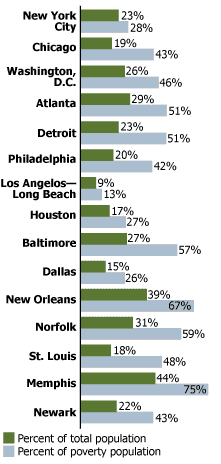
Of the 15 U.S. metropolitan areas with the most African Americans in absolute numbers in 2000, New Orleans had the highest black poverty rate, at 33 percent.1 But racial differences in poverty were stark in each of these metropolitan areas except New York. In Chicago, Newark, Memphis, and St. Louis, African Americans were about five times more likely than whites to be impoverished.
Higher poverty rates for African Americans are also linked to lower levels of education and employment—key elements in attaining economic well-being. In 2000, blacks in these large cities were also far less likely to own a car or a phone, and they were on average younger and more often female than their white counterparts.
Education. Nationwide, about 75 percent of African Americans age 25 or older do not have a college diploma, and 80 percent lacked college degrees in all but two of the 15 largest U.S. metropolitan areas—Washington, D.C. and Atlanta. Whites were more than twice as likely to be college graduates in a dozen of these cities, with the largest disparities (2.5 times) in Memphis, New York City, and Philadelphia.
Employment. One-third to one-half of African American males age 16 or older in the largest 15 U.S. cities were not employed in 2000. Some of these were “discouraged” workers who have left the labor force after numerous unsuccessful attempts to secure a job. In Chicago, Detroit, Philadelphia, Los Angeles-Long Beach, New Orleans, and St. Louis, only about one-half of African American males were employed (see table). Blacks in these cities were three-quarters as likely as whites to have a job.
Cars and phones. African Americans are also much more likely than whites to lack basic amenities—such as an automobile or a telephone—that facilitate economic mobility and that many Americans take for granted (see table). In each of the 15 largest U.S. metropolitan areas except New York (where many residents do not have personal transportation), African Americans were about three times as likely as whites to not have an automobile in 2000. In a dozen of these areas, African Americans were at least three times more likely than whites to not have a telephone, with the racial gap in telephone ownership being eight-fold in Newark and Chicago.
Age and sex ratio. African Americans in major U.S. cities are often younger and more likely to be female than their white urban counterparts. Sex ratios (the number of males per 100 females) as of 2000 were approximately 95 or higher among whites in 11 of the 15 largest metropolitan areas, while they were about 85 or lower among African Americans in 10 of the 15 localities. The relative absence of African American males in U.S. cities reflects their high mortality and incarceration rates—factors that weigh heavily in their social and economic entrapment.
Selected Demographic and Socioeconomic Characteristics Among African Americans and Whites in Selected U.S. Metropolitan Areas, 2000
|
Metropolitan area
|
Percent
civilian males 16+ employed |
Percent
no automobile |
Percent
no phone |
|||
|---|---|---|---|---|---|---|
|
Afr. Amer.
|
White
|
Afr. Amer.
|
White
|
Afr. Amer.
|
White
|
|
| Baltimore |
54.4
|
73.2
|
31.4
|
7.8
|
4.7
|
0.9
|
| Chicago |
50.2
|
74.0
|
29.4
|
9.4
|
7.2
|
0.9
|
| Detroit |
51.4
|
71.7
|
19.5
|
5.9
|
6.3
|
1.5
|
| Los Angeles-Long Beach |
50.9
|
67.4
|
20.1
|
7.8
|
2.8
|
0.8
|
| Newark |
54.2
|
72.4
|
32.3
|
7.4
|
5.7
|
0.7
|
| New Orleans |
50.0
|
68.6
|
29.6
|
7.7
|
5.9
|
1.8
|
| Philadelphia |
50.7
|
70.6
|
36.6
|
10.0
|
3.5
|
0.6
|
| St. Louis |
52.0
|
72.3
|
22.9
|
5.9
|
4.8
|
1.3
|
Source: Census 2000 5% Public Use Microdata Sample (PUMS).
African American Percentage of Total Population and Poverty Population in Selected U.S. Cities, 2000
Source: Census 2000 5% Public Use Microdata Sample (PUMS).
Not surprising, poor urban African Americans exhibit even greater levels of social and economic isolation in the United States than the general black population, even when compared with poor urban whites:
African Americans not only have the highest levels of poverty in the country, but they are also the group that is most residentially segregated from and least likely to intermarry with whites. Surveys also continue to reveal that many nonblack Americans express high levels of social distance (the degree to which people desire close or remote social relations with members of other groups) from African Americans.2 Given their limited social and economic resources along with their geographic isolation, poor urban African Americans—especially children and the elderly—are disproportionately vulnerable to being left behind during a crisis situation.
What measures need to be taken to improve the social and economic position of African Americans and to avoid future disasters such as the recent one in New Orleans?
Aggressive actions are needed to erase the marginalization of African Americans that Hurricane Katrina exposed. The failure to take such actions will have enormous economic and social costs—not just for African-Americans, but for a society living with a disjuncture between its ideals and the reality of continued stratification along the color line.3
Rogelio Saenz is a professor of sociology at Texas A&M University and author of “Latinos and the Changing Face of America,” in The American People: Census 2000, ed. Reynolds Farley and John Haaga (New York: The Russell Sage Foundation, 2005).nbsp;


 ">
">


 ">
">


 ">
">

 ">
">