Mark Mather
Associate Vice President, U.S. Programs


Associate Vice President, U.S. Programs
Contributing Senior Writer
As the large Baby Boom generation enters advanced ages, more family members and other unpaid helpers are stepping in as caregivers. In just over a decade, the number of family caregivers regularly assisting older adults with daily activities at home grew by 32%, increasing from 18.2 million to 24.1 million between 2011 and 2022.1
While the caregiving cadre has grown, who’s getting care has also changed. Older Americans receiving family care are younger, better educated, and less likely to have dementia than they were in 2011, report Jennifer L. Wolff of Johns Hopkins University, independent consultant Jennifer C. Cornman, and Vicki A. Freedman of the University of Michigan.
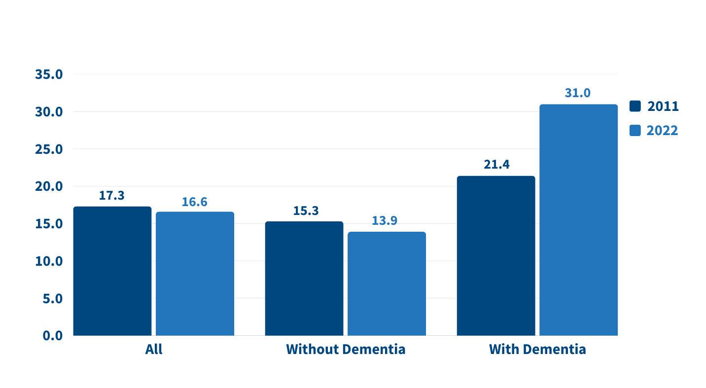
The increase in family caregiving partly reflects the rising share of older adults with multiple chronic conditions, such as heart disease, hypertension, stroke, and cancer. And while the share of older adults with dementia has declined, unpaid caregivers average twice as many hours each week caring for people with dementia than without dementia (about 31 hours versus 14), Wolff and team found (see Figure 1).
In addition, a new study estimates that the number of new dementia cases will double over the next 40 years as the population ages—setting the stage for more demands on dementia caregivers and more changes to the caregiving landscape.
“Understanding the changing composition and experiences of family caregiving has never been more important, but it is challenging to assess,” the researchers write. “[It] requires consistent measurement for well-characterized, generalizable samples of people who receive and provide help.”
The nationally representative National Study of Caregiving and the National Health and Aging Trends Study offer important insights. The two studies provide a snapshot of the family caregivers that help Americans ages 65+ who live in the community (i.e., at home or with a relative) or in a residential care setting other than a skilled nursing facility, such as an assisted or independent living facility, a personal care home, or a continuing care retirement community.
Family caregivers include relatives and unpaid helpers, like neighbors and friends, who assist with personal care tasks like bathing and dressing; mobility tasks like getting out of bed and getting around the house; and household activities such as laundry, food preparation, shopping, and managing money.
On average, the time that family caregivers spent helping older adults with dementia increased by almost 50% over the decade, rising from 21.4 hours per week in 2011 to 31.0 hours in 2022. By contrast, time spent assisting older adults without dementia fell from 15.3 hours a week in 2011 to 13.9 hours in 2022 (Figure 1).
Source: Jennifer L. Wolff, Jennifer C. Cornman, and Vicki A. Freedman, “The Number of Family Caregivers Helping Older US Adults Increased From 18 Million to 24 Million, 2011–22,” Health Affairs 44, no. 2 (2025): 189-95.
People caring for older adults with dementia have high—and increasing—demands on their time. More than half (51.7%) of dementia caregivers lived with the person they were caring for in 2022, up from 39.4% in 2011, Wolff and team report. And the share able to hold jobs—outside their caregiving work—dropped from 42.5% to 34.6% during the same period.
Among caregivers with formal jobs, the share who reported challenges with their employment—including working fewer hours or being less productive—increased over the decade, regardless of whether they cared for someone for dementia.
“Challenges are exacerbated when caregivers are in poor health themselves; have a lack of choice in assuming the caregiving role; and, for the substantial proportion of family caregivers who are employed, work in low-wage jobs with limited flexibility,” the researchers note.
Which older Americans get family care? As in the past, they tend to be female, non-Hispanic white women who are married or widowed. But growing numbers of family care recipients are male and have some college education. More are also separated and divorced compared to 2011, reflecting national trends.
Who’s providing care? Family caregivers continue to be largely female and married, and most report being in good health. In 2022, adult children still made up the largest share of family caregivers for older adults, at 40.7%, but this represents a significant decline since 2011 (Figure 2).
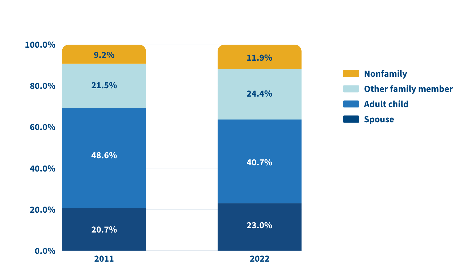
Source: Jennifer L. Wolff, Jennifer C. Cornman, and Vicki A. Freedman, “The Number of Family Caregivers Helping Older US Adults Increased From 18 Million to 24 Million, 2011–22,” Health Affairs 44, no. 2 (2025): 189-95.
In 2022, adult children accounted for about half (49.1%) of family caregivers for older adults with dementia, compared with 38.4% of caregivers for those without dementia. Just 17.7% of family caregivers for older adults with dementia were spouses, compared with 24.5% of family caregivers for people without dementia.
A sizeable share of family caregivers (17.0%) had children under age 18 at home in 2022, and 6% to 13% viewed their care responsibilities for older adults as a source of financial, physical, or emotional difficulty.
Despite these challenges, the researchers report a decline in the use of support groups (4.1% to 2.5%) and respite services (12.9% to 9.3%) between 2011 and 2022.
Many caregivers face extraordinary demands and should be the focus of support services, Wolff and colleagues say. They single out those caring for older adults with dementia or nearing the end of life, as well as caregivers “from racial and ethnic minority groups who are more likely to assist people who have extensive care needs in circumstances that involve scare economic resources.”
Family care needs are likely to rise as the number of U.S. adults ages 85 and older is projected to triple by 2050. The researchers note that the number of family caregivers rose even as the long-term use of skilled nursing facilities among older Americans dropped and community living increased. The challenges these caregivers continue to face is “sobering,” they write, including competing time demands from work and child care while spending an average of 17 hours per week on care. In addition, about 1 in 8 family caregivers report financial, physical, or emotional difficulties related to their caregiving roles, percentages that were largely unchanged over the 11 years examined.
Policies and programs to help reduce the financial, physical, and emotional burden of caregiving exist, but do not represent a coherent strategy, the researchers say. “Local, state, and federal policies are a patchwork that is uneven in availability and largely symbolic in magnitude,” they argue. Addressing the needs of family caregivers will require a “cohesive framework in support of the care economy.”
1. Jennifer L. Wolff, Jennifer C. Cornman, and Vicki A. Freedman, “The Number of Family Caregivers Helping Older US Adults Increased From 18 Million to 24 Million, 2011–22,” Health Affairs 44, no. 2 (2025): 189-95.

Exploring New Ways to Use Data for Good
Since Population Reference Bureau’s (PRB’s) founding in 1929, the world has changed tremendously and PRB has evolved along with it. We continue to explore new ways of working (globally, locally, even remotely) and hone our expertise to offer solutions relevant to today’s health and well-being challenges, such as the growing prevalence of noncommunicable diseases and the increase in anxiety among young people. What hasn’t changed is PRB’s impact on informing evidence-based practices, which you’ll see highlighted in this report.
In Fiscal Year 2023, we reached wide audiences with analyses and assessments on issues such as population aging, climate adaptation, maternal health, unpaid care work, and big data. We partnered with organizations like the Conrad N. Hilton Foundation, Regional Consortium for Research on Generational Economy, Southern California Association of Governments, and William and Flora Hewlett Foundation. And the people who work here have made it all possible.
Part of any organization’s evolution is change in those people. From PRB’s original staff of 8 to 55 today, we’ve seen a lot of great people walk through our doors. In late 2022, we welcomed a new Vice President to lead our U.S. Programs, Diana Elliott. Midway through 2023, we appointed our first Africa Director, Aïssata Fall. And just a few months ago, PRB’s Board of Trustees appointed me as President and CEO. PRB’s new leadership is guided by the organization’s strategic plan to explore new areas of focus and ways of working while keeping population and demographic data at the core of what we do. It is a strong foundation from which to move forward toward our 100th year in 2029.
Our partners outside the organization are also essential to PRB’s success. My predecessor, Jeffrey Jordan, collaborated with other international organizations in 2023 on the TIME Initiative, an ongoing effort to answer hard questions about the evolving role of international nongovernmental organizations working in sexual and reproductive health and rights. I am pleased to be stepping into this space as I take the helm at PRB.
Barbara Seligman, Senior Vice President of International Programs, led the way in making PRB’s presence more prominent in 2023 as she advocated for our return to hosting more public events like the webinar on young Africa’s potential to power the global workforce. Diana Elliott quickly became another energetic force behind PRB’s increased public engagement, from authoring blogs that delve into the heart of current population concerns to speaking with the media and other organizations. And Reena Atuma, our Team Lead in Kenya, works daily alongside staff and local officials, youth, and others on concrete policy changes aimed at improving people’s health.
There’s so much more. We’ve captured some of the highlights for you in this year’s annual report.
Sincerely,
![]()
President and CEO
![]()
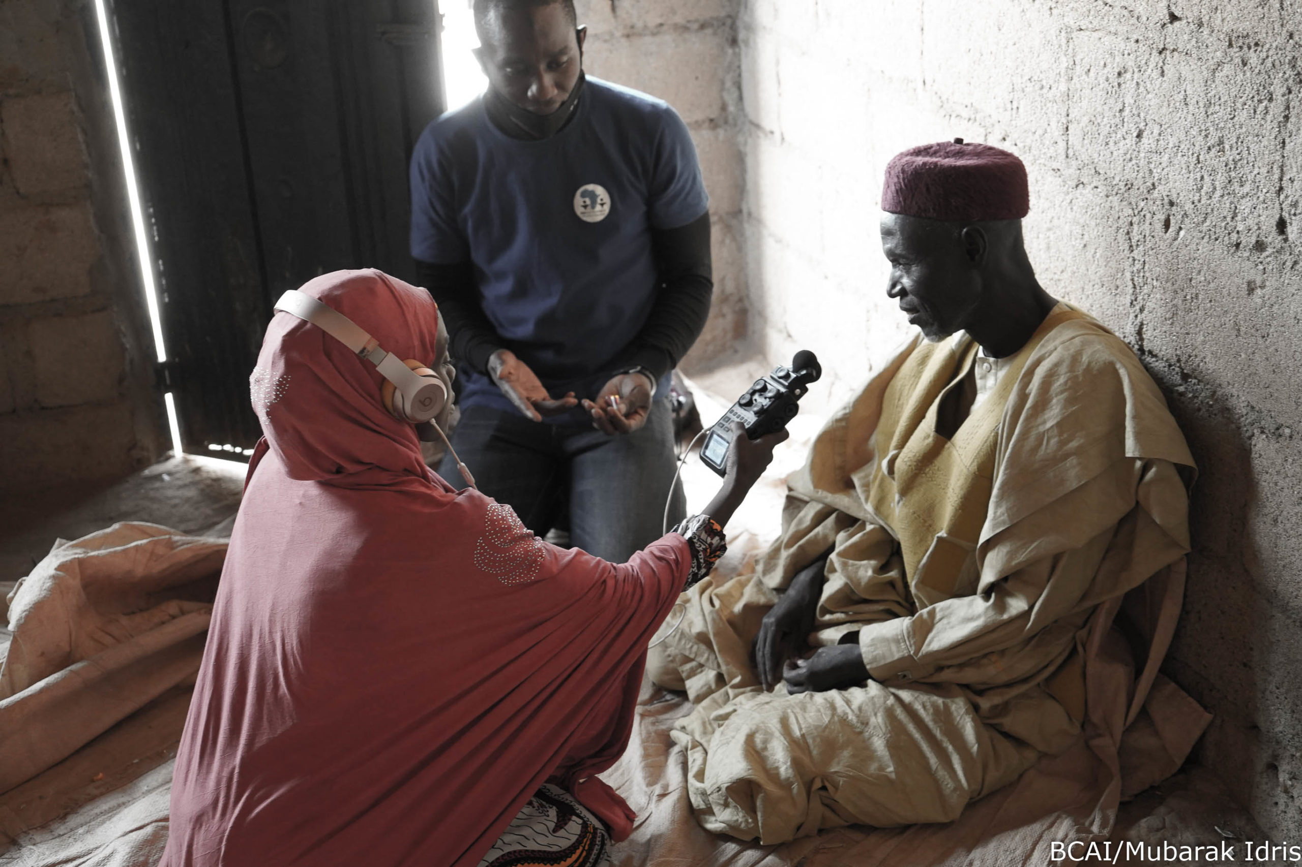
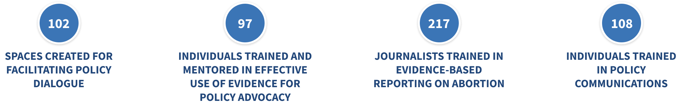
Under the PROPEL Health project, we worked with partner radio stations and community youth in nine districts across Malawi to raise awareness of social challenges around topics concerning nutrition, education, and health services; and harmful cultural norms like child marriage. We supported these local actors in their efforts to make context-specific, change-oriented information on these topics available in their communities and get people talking about them.
And they’ve made an impact.
Local radio programs in Malawi are now using their platform to hold leaders accountable for enforcing the child marriage law, and they are educating communities on how to respond to and prevent gender-based violence.
After a series of radio programs on child, early, and forced marriage and gender-based violence aired, a traditional authority in Monkey Bay in Malawi’s Southern Region publicly committed to enforcing the law against child and forced marriage, stating, “Dzimwe Radio has been insisting that I intervene and show my commitment in dealing with child marriages—hence my order to demote those village heads [found to not be enforcing the law].” In Mchinji, in Malawi’s Central Region, local police began holding town meetings about gender-based violence, and community members involved police and victim support units in investigations that led to the dissolution of child marriages, and arrests and fines for adult perpetrators.
And after Mudzi Wathu Radio aired programs about youth mental health challenges and the lack of available care, Mr. Biziwiki Mwatibu Banda, the clinical officer at Mchinji District Referral Hospital, announced, “We are very thankful to Mudzi Wathu Community Radio for giving youth a platform to express their views and present their complaints… After hearing those complaints, our management decided to train one health care provider from each of the 21 health centers, aiming to provide mental health counseling in all rural areas.”
In the process of spurring these positive changes—and many more like them—the young people involved in this work learned valuable skills that help provide them with more academic and professional opportunities.
Black women in the United States face a high risk of death from pregnancy-related complications. Most of these deaths are preventable, according to a study by the Centers for Disease Control and Prevention. “We need new models of care before, during, and after birth to address these inequities,” says Marie Thoma, a reproductive and perinatal epidemiologist and population health scientist at the University of Maryland.
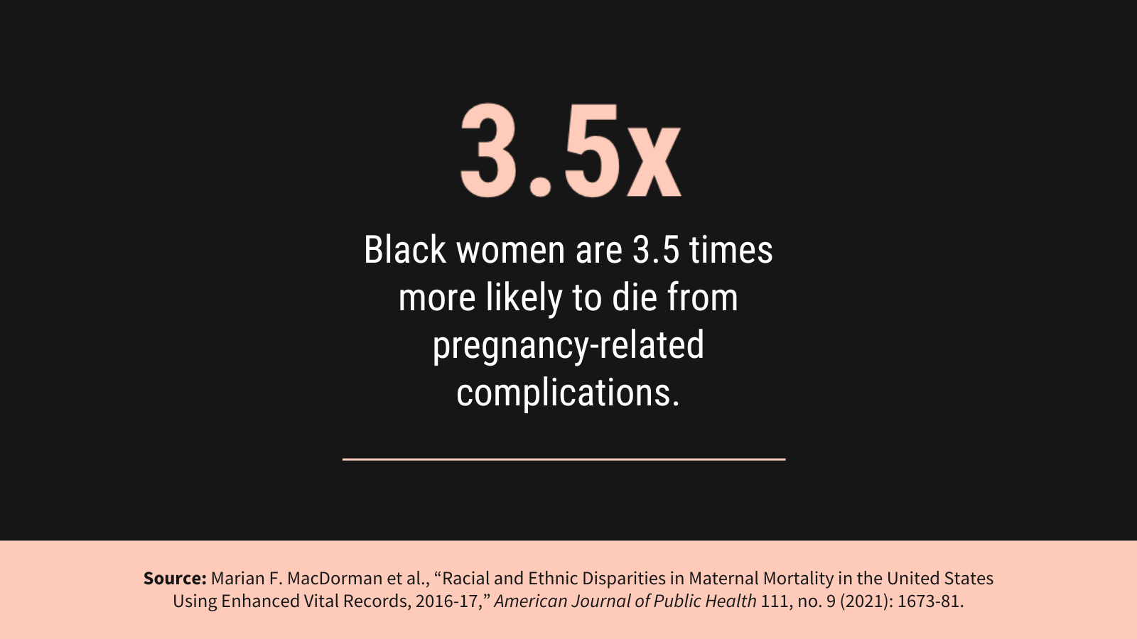
To raise awareness of the Black maternal health crisis in the United States, PRB partnered with creative agency TANK Worldwide and Dr. Shalon’s Maternal Action Project on a 2023 national campaign. It featured data from PRB’s article on NICHD-funded research that found U.S. Black women are 3.5 times more likely to die of pregnancy and postpartum complications than white women. With our partners, we promoted the campaign and research through social media, a press release, and fact sheet, and caught the attention of media, including NPR’s Here and Now. The campaign won a Clio Health award, which recognizes creative marketing and communications in the fields of physical, mental, and social well-being.
Read our follow-up interview with Marie Thoma about emerging research on this crisis.
How can local learning drive global solutions? This question is one we ask daily on the MOMENTUM Knowledge Accelerator project, which is part of USAID’s larger MOMENTUM program that seeks to improve the health and well-being of women, children, and families in more than 38 countries. Part of the project’s role is to identify and share best practices that can be applied across the different settings where MOMENTUM works.
In 2023, MOMENTUM Knowledge Accelerator brought together project staff who are working with their country counterparts to adopt and adapt the World Health Organization’s model of care for small and/or sick newborns in Indonesia, Mali, Nepal, and Nigeria. The goal? Develop a set of common questions and tools to learn about the model’s early rollout in different settings. For instance, how acceptable is the model in these settings? How feasible is it to implement the model in the different country contexts and settings? What adaptations are needed to the model based on the health systems’ contexts? The experiences in each country so far show that when health system and community actors are properly engaged, the model is acceptable, appropriate, and feasible in each setting. If governments can continue to provide resources to support the model’s different elements, more newborns can survive and thrive.
Using this information, we are working to share common approaches and address factors like how different aspects of the health system and variations between the public and private sectors affect the model’s implementation. Identifying and sharing such early insights can help shape global learning and strengthen the quality of care that small and sick newborns receive from their local health care providers—changing and improving lives.
This example is just one of the ways that we collaborate and communicate, gathering and assessing knowledge to share insights that people can put into practice.
Resources—and financial burdens—flow from one generation to another. Understanding how it happens is key for governments focused on fostering sustainable development, and data from national transfer accounts (NTA) can provide key insights.
In 2023, PRB and the Regional Consortium for Research on Generational Economy (CREG) hosted a shared space in Senegal to make complicated topics like the value of women’s unpaid labor easy to understand so decisionmakers could assess needs and accountability. The 3rd National Transfer Account–Africa Conference in La Somone-Senegal, held in partnership with CREG, PRB, the United Nations Population Fund, and United Nations Economic Commission for Africa, brought together more than 130 participants from 19 African countries, including parliamentarians and decisionmakers from various ministries.
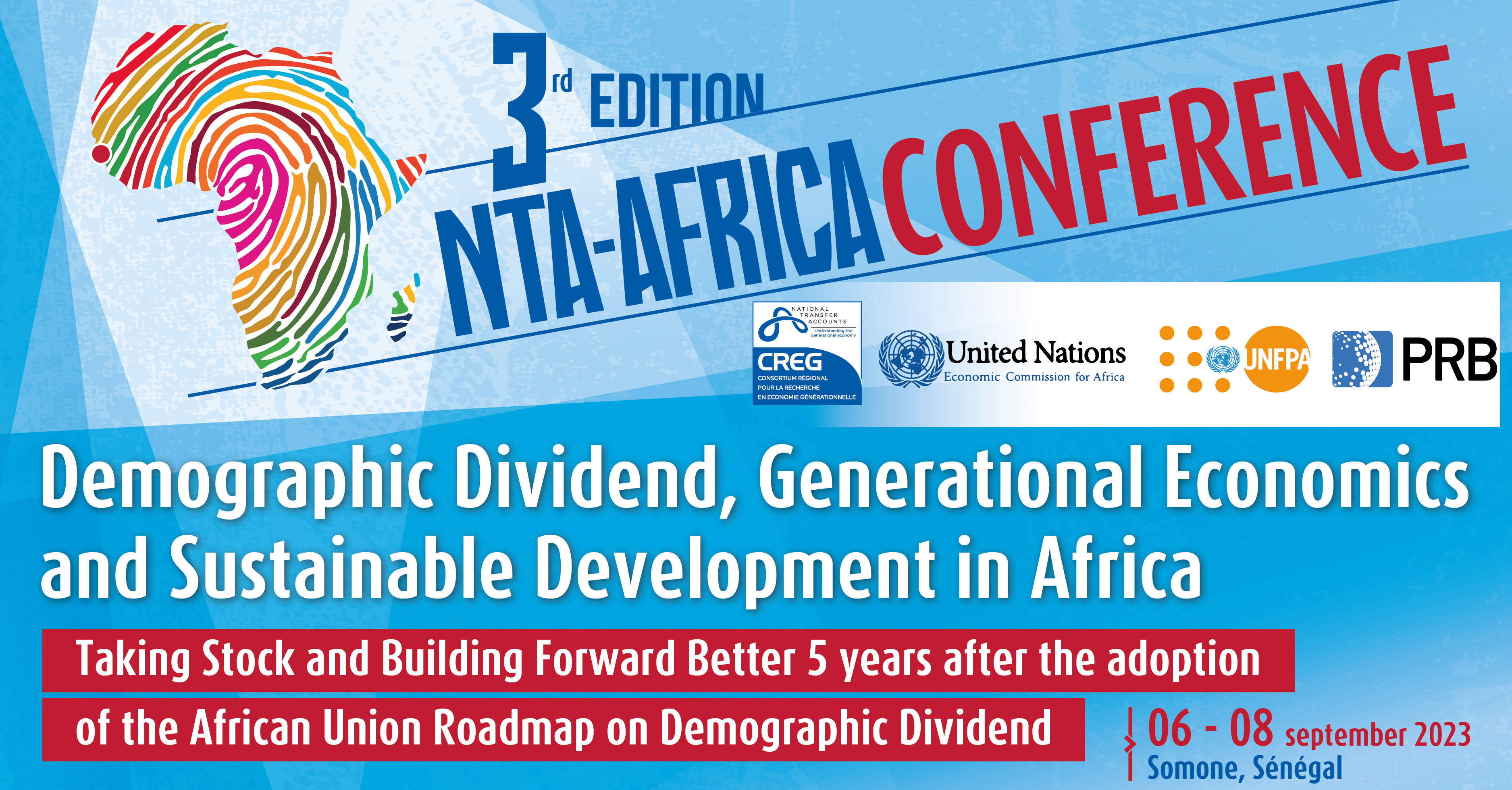
The Africa NTA Network, drawn by our reputation for facilitating high-level policy dialogue informed by data, chose PRB to moderate three of four plenary conference sessions. Africa Director Aïssata Fall facilitated a session on the importance of unpaid care work and achieving a demographic dividend, which featured key messages developed by PRB policy communication fellows participating in the conference. She also directed two plenary sessions focused on high-level policy dialogue with parliamentarians and decisionmakers from ministries of planning, budget, gender, and social affairs. They came together to discuss challenges related to the demographic dividend and the care economy and the difficulty of translating these complex and often-abstract concepts so they can be considered in practical applications.
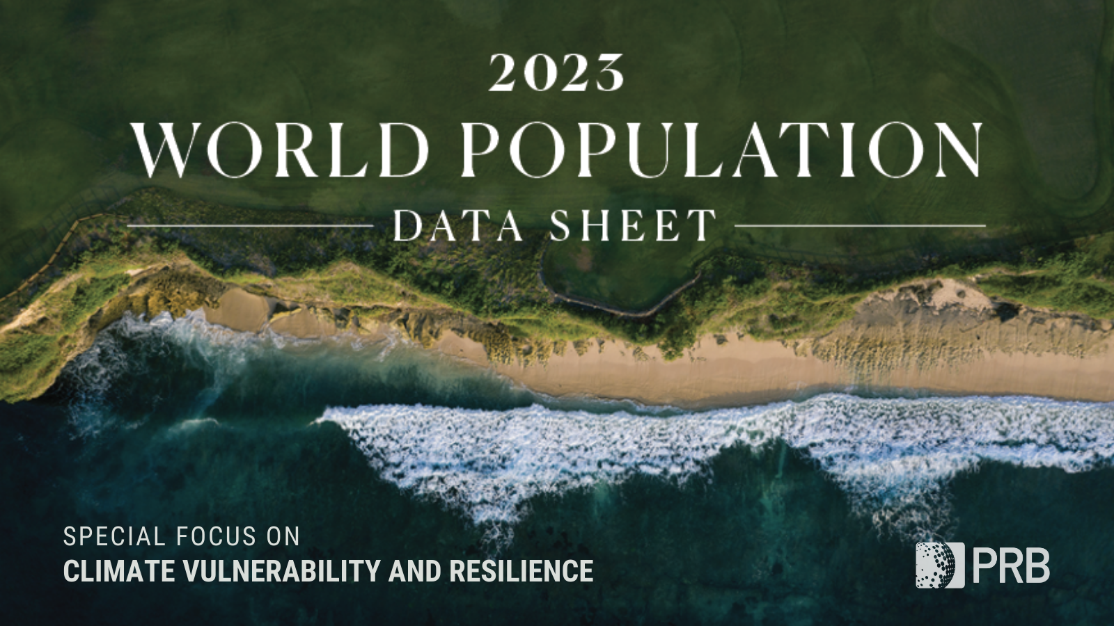
We developed a three-part climate blog series in English and French to advance a new approach to investments in climate adaptation that integrate population, gender, health, and the environment. The series lays the foundation of a people-centered framework for building resilience to climate change centered on agency, equity, and the power of local solutions.
And, in a year that closed as the hottest on record, solutions are more urgent than ever, as is knowing how—and which—populations will be most affected by climate change. Population characteristics like age, gender, and socioeconomic status are a few of the factors that make some people more vulnerable to the effects of a changing climate. Understanding them can help countries adapt and build resilience to future climate-related events, and we put a spotlight on this topic in our 2023 World Population Data Sheet.
We also worked with researchers participating in the 2023 ARUA Climate Change and Inequalities Symposium at the University of Cape Town to provide feedback and coaching on their presentations, which were focused on social inequalities and climate change action, so they could deliver clear, compelling messages. Read our top five tips to make your presentation message stand out.
The year 2023 marked the official end of the COVID-19 state of emergency. Yet the disease continued to spread, and many people continued to feel its effects. Decisionmakers need evidence of these impacts so they can effectively plan for their communities.
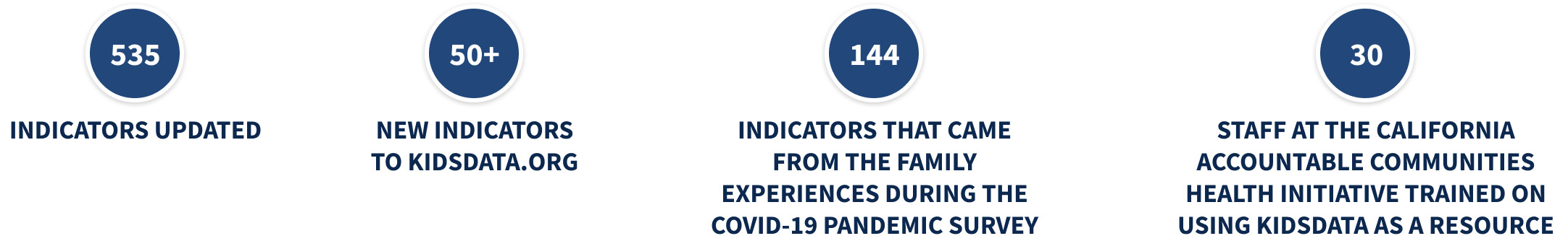
PRB’s KidsData program released data and findings from the Family Experiences During the COVID-19 Pandemic survey that highlighted ongoing challenges. The survey checked in with parents and caregivers four times to track the pandemic’s evolving impact on families. The results released in 2023 showed persistent challenges for California families despite suggestions that life had returned to normal.

In California, three years after the pandemic’s onset, children still faced significant COVID-related challenges, and their caregivers remained concerned. As safety-net supports began to roll back, nearly half of parents and caregivers statewide (45%) said their household finances were negatively impacted since the start of the pandemic, up from 32% a year prior. And more than half (58%) said they worried for the safety of their children as public health measures, like masking mandates, relaxed. Rates of concern were even higher in households with children with special health care needs.
The pandemic’s effects on young people are of particular concern as adverse childhood experiences, especially in early childhood, can have negative, long-term impacts on health and well-being. KidsData remains committed to tracking and analyzing data on the health and well-being of California’s children.
How can gender-transformative approaches and programming help improve outcomes for family planning and reproductive health? How can we address the gender inequities that global health workers experience? What are the links between sexual and reproductive health and technology-facilitated gender-based violence? What intersectional approaches are being applied to gender-transformative programming? How can comprehensive sexuality education help strengthen gender-based violence prevention and response efforts and vice versa?
If you are among the more than 2,600 members of the Interagency Gender Working Group (IGWG), you may already know the answers to these questions.
For 13 years, PRB managed the IGWG, a community of practice founded nearly 30 years ago to promote gender-sensitive considerations as a critical factor in improving family planning and reproductive health outcomes and advancing sustainable development.
Under our management, the IGWG highlighted best practices, challenges, and opportunities for promoting gender equality through global health programming, showcased the work of gender experts and advocates around the world, and led discussions on cutting-edge topics on and approaches to gender-transformative health programming.

In late 2023, we transitioned management of the IGWG to the PROPEL Youth and Gender project. During its time with PRB, the IGWG served as a reputable resource for gender experts, advocates, and program implementers working in global health and other sectors. It centered and elevated the voices of gender experts, advocates, and researchers, with special attention to locally led efforts, and the community of practice made notable contributions to the field with products that captured a wealth of knowledge and actionable recommendations for practitioners, advocates, researchers, and donors.
Both seasoned experts and those just beginning to integrate a gender-sensitive lens into their activities rely on materials like the IGWG’s newsletter and signature Gender Integration Continuum, a valuable tool for program implementers that measures whether and how interventions incorporate gender equity to improve development outcomes.
Explore some of our work with the IGWG:
We look forward to watching the IGWG’s continued growth and success.
As part of our activities on the Stawisha Pwani project, we collaborated with county officials, youth, and others in four coastal counties in Kenya as they sought to create and strengthen policies concerning the health of people in their communities.
We worked with officials in Mombasa County’s Department of Health to bring together youth representatives, county officials, and other stakeholders in the private sector and at nongovernmental organizations to develop the Mombasa County Adolescent and Young People Strategy on Health for 2024-2029. In our role of helping to facilitate dialogue, we drafted a template for the strategy and a plan for communicating its benefits to decisionmakers, and then formed a youth technical working group to draft, review, and revise the policy before it was shared with stakeholder groups for their feedback.
This collaborative process resulted in a strategy—approved by the Mombasa County government—that is in use today, helping to guide decisions across County departments on high impact programming for adolescents and young people.
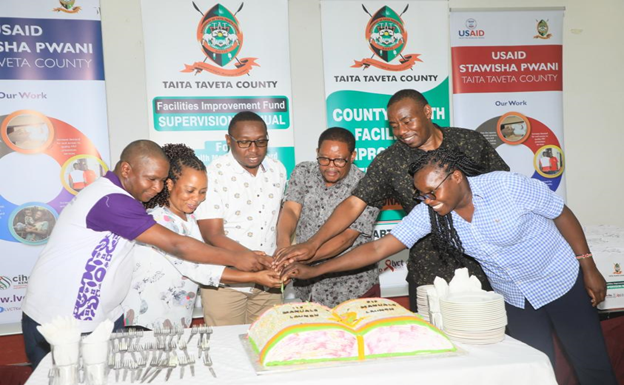
In Taita Taveta County, we helped advance policy change by providing technical assistance to officials reviewing the Health Financing Facility Improvement Fund (FIF) law and developing the FIF operations and supervision manual. The FIF provides a way to collect and manage revenue from the health services delivered by public health facilities, as well as for these facilities to use the revenue to improve service delivery. The County and Subcounty Health Management Teams are relying on the manual as they monitor revenue collection to ensure resources are being used practically and to increase accountability.
The manual’s guidelines and revisions to the FIF law that allow facilities to retain and use revenue—a key element for strengthening health systems in Taita Taveta—contributed to the Department of Health surpassing its FIF collection targets for Fiscal Year 2022-2023. The Taita Taveta County Annual Development Plan 2024/25 reports that the collection goal of KES 100,000,000 was exceeded by more than 50%, for a total of KES 161,118,235. The health facilities can use these additional resources to further improve their efforts to meet the needs of the communities they serve.
![]()
PRB produced articles, blogs, reports, webinars, and other materials in 2023 on a range of topics such as climate adaptation, gender equality, population aging, unpaid care work, and the U.S. labor shortage. Explore some of these works here.
2023 World Population Data Sheet
A New Approach for Climate Resilience
Elements of Climate Resilience: The Foundations of a People-Centered Framework
Five Actions to Help Build Equitable Climate Resilience
Gender Equity for Work and Pay
Eight Demographic Trends We’re Watching as the World Population Passes 8 Billion
PRB CEO Calls for Restoring Public Trust in Data at United Nations Development Event
Comment l’autosoin peut soutenir la résilience en Afrique de l’Ouest et du Centre
How Self-Care Can Support Resilience in West and Central Africa
To Fix the Care Economy, the United States Should Look Internationally
Want Another Perspective on the U.S. Labor Shortage? Talk to a Demographer
The generous support we receive from organizations and individuals helps make our work possible. Thank you.
PRB worked together with 19 organizations in 2023.
Through their generous contributions, the individuals listed here allowed PRB to fund essential program expansion and organizational innovations during the fiscal year ending Sept. 30, 2023.


Research Associate
New data released today by PRB and the Appalachian Regional Commission shows that rates of labor force participation, educational attainment, income, and poverty continue to improve in Appalachia.
The 14th annual update of The Appalachian Region: A Data Overview from the 2018-2022 American Community Survey draws from the latest American Community Survey and comparable 2022 Census Population Estimates. Known as “The Chartbook,” the report contains more than 300,000 data points comparing Appalachia’s regional, subregional, state, and county economic status with the rest of the nation.
Key improvements in the region’s economic indicators are as follows.
Increased income and lower poverty rates
Higher educational attainment and labor force participation
Increased population growth in south
Increase in broadband access
“We celebrate the progress Appalachia has made, including declined poverty rates and increased broadband access. However, we know that there is still much work to be done for our entire region to reach economic parity with the rest of the country,” said ARC Federal Co-Chair Gayle Manchin. “ARC will continue to prioritize the quality of life of Appalachia’s 26 million residents, and remains committed to continued collaboration across federal, state, and local levels to ensure our people have a bright future.”
Despite positive trends, several data points revealed vulnerabilities that emphasize the inequities in Appalachia compared to the rest of the nation:
Overall population decline
Poverty rates for children and families and specific counties
Disability and poverty in older adults
Despite gains in access, digital divides persist
“The data in this year’s Chartbook highlight strides being made in the Appalachian Region, with noteworthy improvements across economic, educational, and health-related measures,” said Sara Srygley, a senior research analyst at PRB. “Yet, these data also emphasize considerable variation throughout the region—particularly the persistent challenges facing rural communities.”
The data show that Appalachia’s rural areas continue to be more vulnerable than its urban areas. Appalachia’s 107 rural counties are also more uniquely challenged, compared to 841 similarly designated rural counties across the rest of the U.S. Though rural Appalachians did have higher health insurance coverage than the rest of rural America, rural Appalachian counties continue to lag behind on educational attainment, labor force participation, broadband access, household income and population growth.
The Appalachian Region: A Data Overview from the 2018-2022 American Community Survey was written by PRB and the Appalachian Regional Commission.
In addition to the written report, ARC offers companion web pages on Appalachia’s population, employment, education, income and poverty, computer and broadband access, and rural Appalachian counties compared to the rest of rural America’s counties. For more information, visit www.arc.gov/chartbook.
The Appalachian Regional Commission is an economic development entity of the federal government and 13 state governments focusing on 423 counties across the Appalachian Region. ARC’s mission is to innovate, partner, and invest to build community capacity and strengthen economic growth in Appalachia to help the region achieve socioeconomic parity with the nation.


Senior Research Associate
Children and youth with special health care needs (CYSHCN) who receive family-centered care generally have better health outcomes, research shows. When health care providers engage and prioritize the needs of the family, CYSHCN enjoy better overall health; better access to coordinated, ongoing, comprehensive health care within a medical home; fewer emergency department visits; and fewer unmet health needs.
Yet in the United States, CYSHCN families from disadvantaged groups face barriers to receiving high-quality family-centered care, according to a new analysis of national survey data by Paul Morgan, now at the University at Albany, SUNY, and colleagues at Penn State University and SRI International.1
The researchers assessed family-centered care by measuring the extent to which doctors or other health providers:
Data were from the 2016–2019 National Survey of Children’s Health (NSCH), which uses a five-question screener to identify CYSHCN.
The study focused on the quality of care received by CYSHCN families in visits to health professionals in the previous year and controlled for potentially confounding factors including children’s general health status and the severity of their impairments.
Morgan and colleagues found that some CYSHCN families report greater barriers to receiving high-quality family-centered health care, including:
By contrast, families of CYSHCN with asthma—the most commonly reported special health care need—were significantly more likely to receive family-centered care than families of CYSHCN without asthma.
The results did not show consistent racial/ethnic disparities across all the measures of family-centered care—a finding that surprised the researchers. However, families of Black and Hispanic CYSHCN reported that providers spent relatively less time with their children compared with families of white CYSHCN. Families of Hispanic CYSHCN also said that providers showed less sensitivity to their family’s culture and customs.
Evidence from the study suggests that socioeconomic factors, rather than race or ethnicity, are central drivers of disparities in family-centered care among CYSHCN in the United States. To address these disparities, policies and systems of care serving these young people and their families can adopt comprehensive, coordinated approaches to increase provider-family engagement, cultural responsiveness, and shared decision-making, the authors noted.
To help particularly vulnerable CYSHCN families, targeted actions should focus on care provided in emergency departments, community clinics/health centers, and other non-office settings, and on providers caring for children with autism spectrum disorders or internalizing disorders, the authors suggested.
This article was produced under a grant from the Eunice Kennedy Shriver National Institute of Child Health and Human Development (NICHD). The work of researchers from Penn State University was highlighted.

Associate Vice President, U.S. Programs
Contributing Senior Writer
The current growth of the population ages 65 and older, driven by the large baby boom generation—those born between 1946 and 1964—is unprecedented in U.S. history.
This aging of the U.S. population has brought both challenges and opportunities to the economy, infrastructure, and institutions.
The number of Americans ages 65 and older is projected to increase from 58 million in 2022 to 82 million by 2050 (a 47% increase), and the 65-and-older age group’s share of the total population is projected to rise from 17% to 23%.1
The U.S population is older today than it has ever been. Between 1980 and 2022, the median age of the population increased from 30.0 to 38.9, but one-third (17) of states in the country had a median age above 40 in 2022, with Maine (44.8) and New Hampshire (43.3) at the top of the list.2
The older population is becoming more racially and ethnically diverse. Between 2022 and 2050 the share of the older population that identifies as non-Hispanic white is projected to drop from 75% to 60%.3
The rising diversity among older Americans can’t match the rapidly changing racial/ethnic composition of those under age 18, creating a diversity gap between generations. In 2022, fewer than half of children ages 0 to 17 (49%) were non-Hispanic white.4 But research shows that there is fluidity in how people identify with racial/ethnic categories: Mixed-race Americans (particularly mixed Hispanic and white) increasingly see themselves as part of the white majority.5
Education levels are increasing. Among people ages 65 and older in 1965, only 5% had completed four years of college or more. By 2023, this share had risen to 33%.6
Older adults are working longer. By 2022, 24% of men and about 15% of women ages 65 and older were in the labor force. These levels are projected to rise further by 2032, to 25% for men and 17% for women.7
The poverty rate for Americans ages 65 and older has dropped sharply during the past 50 years, from nearly 30% in 1966 to 10% today.8 The Census Bureau’s Supplemental Poverty Measure, which accounts for non-cash benefits, tax credits, and medical expenses, shows that 14% of older Americans lived in poverty in 2022.9
More older adults can meet their daily care needs. Older adults are functioning better on their own, and a shrinking share are living in nursing homes and assisted living settings than a decade ago. Home modifications and assistive devices such as walkers have helped older Americans maintain their independence.10
Gains in life expectancy recently stalled. U.S. life expectancy at birth declined by 2.4 years between 2019 and 2021.11 The drop in life expectancy was driven largely by the COVID-19 pandemic, but deaths from drug overdoses, heart disease, chronic liver disease and cirrhosis, and suicide also played a role.12 Life expectancy rebounded slightly in 2022, to 77.5 years, but not enough to offset the decline during the pandemic.
Obesity prevalence among older Americans has increased at an alarming rate. In a single generation—between 1988-1994 and 2015-2018—the share of U.S. adults ages 65 and older with obesity nearly doubled, increasing from 22% to 40%.13
Wide economic disparities are found across different population subgroups. Among adults ages 65 and older, 17% and 18% of those identifying as Latino and African American, respectively, lived in poverty in 2022—more than twice the rate of those who identified as non-Hispanic white (8%).14
More older adults are divorced compared with previous generations. The share of divorced women ages 65 and older increased from 3% in 1980 to 15% in 2023, and for men from 4% to 12% during the same period.15
More older women are living alone. Over one-fourth (27%) of women ages 65 to 74 lived alone in 2023. This share jumped to 39% among women ages 75 to 84, and to 50% among women ages 85 and older.16
Older Americans face a caregiving gap, especially those with lower incomes and dementia.17 Demand for elder care is expected to increase sharply with a rise in the number of Americans living with Alzheimer’s disease, which could more than double by 2050 to 13 million, from 6 million today.18
Social Security and Medicare expenditures will increase from a combined 9.1% of gross domestic product in 2023 to 11.5% by 2035 because of the large share of older adults.19
Federal budget cuts and tax increases may be inevitable as more members of the large baby boom cohort reach retirement age and become eligible for entitlement programs. Policymakers can invest resources today to reduce poverty and improve the economic outlook for workers. These investments can increase young workers’ future productive capacity and help offset the costs of an aging population.
[1] U.S. Census Bureau, 2023 National Population Projections Tables: Main Series.
[2] U.S. Census Bureau, “America Is Getting Older,” June 22, 2023; and U.S. Census Bureau, 1980 Census of Population, Volume 1, Characteristics of the Population (PC80-1).
[3] U.S. Census Bureau, Projected Population by Single Year of Age, Sex, Race, and Hispanic Origin for the United States: 2022 to 2100.
[4] U.S. Census Bureau, Projected Population by Single Year of Age, Sex, Race, and Hispanic Origin for the United States: 2022 to 2100.
[5] Richard Alba, “What Majority-Minority Society? A Critical Analysis of the Census Bureau’s Projections of America’s Demographic Future,” Socius 4, no. 1 (2018).
[6] PRB analysis of data from the U.S. Census Bureau, Current Population Survey.
[7] U.S. Bureau of Labor Statistics, Civilian labor force by age, sex, race, and ethnicity, 2002, 2012, 2022, and projected 2032.
[8] Emily A. Schrider and John Creamer, “Poverty in the United States: 2022,” Table A-1. People in Poverty by Selected Characteristics: 2021 and 2022, Report no. P60-280, U.S. Census Bureau, Sept. 12, 2023.
[9] Schrider and Creamer, “Poverty in the United States: 2022,” Table B-2. Number and Percentage of People in Poverty Using the Supplemental Poverty Measure by Age, Race, and Hispanic Origin: 2009 to 2022, Report no. P60-280, U.S. Census Bureau, Sept. 12, 2023.
[10] Vicki A. Freedman, Jennifer C. Cornman, and Judith D. Kasper, National Health and Aging Trends Study: Trends Dashboards (2021).
[11] U.S. Centers for Disease Control and Prevention, “National Center for Health Statistics, Life Expectancy Increases, However Suicides Up in 2022,” Nov. 29, 2023.
[12] U.S. Centers for Disease Control and Prevention, “Life Expectancy in the U.S. Dropped for the Second Year in a Row in 2021,” Aug. 31, 2022.
[13] U.S. Centers for Disease Control and Prevention, National Center for Health Statistics, National Health and Nutrition Examination Survey.
[14] U.S. Census Bureau, Poverty Status of People by Age, Race, and Hispanic Origin: 1959 to 2022.
[15] PRB analysis of data from the U.S. Census Bureau, Current Population Survey.
[16] PRB analysis of data from the U.S. Census Bureau, Current Population Survey.
[17] Paola Scommegna and Morgan Sherburne, “Vulnerable Older Americans Aren’t Getting Adequate Care—Even With Paid Caregivers or Grown Children,” Population Reference Bureau, Oct. 19, 2022.
[18] Alzheimer’s Association. “2023 Alzheimer’s Disease Facts and Figures,” Alzheimer’s & Dementia 19, no. 4 (2023).
[19] Social Security Administration, Summary of the 2023 Annual Reports.
Informing a Smarter World / Shaping Change for Good
Navigating through Fiscal Year 2022 was an experience in responding to and shaping change: We successfully completed several long-time projects at Population Reference Bureau (PRB), expanded our operations in West Africa, broadened our areas of focus to include self-care and climate adaptation, and began developing a new strategic plan to guide us through the coming years.
Yet for all the change, some things remained constant: Every day, in every PRB office around the world—in Kenya, Senegal, and the United States—our staff continued to work intentionally to bolster people’s and organizations’ capacity to use population data in ways that will advance critical issues like equality, equity, and reproductive health.
For nearly 100 years, PRB has analyzed data, translated research, and shared information widely so it reaches audiences ranging from government officials to researchers, media, advocates, and the public. This work has made a difference in 2022: We developed a new definition of respectful care in reproductive, maternal, newborn, child, and adolescent health. U.S. policymakers are relying on our report about preserving and enhancing the American Community Survey. And our ongoing support to local partners’ research and communication priorities has led to our policy communication training program being embedded in the curricula of five research institutions and universities based in East and West Africa.
This FY22 annual report shares snapshots of some of our activities over the past year, who we worked with, and how our combined efforts came together to make a difference in people’s lives. The voices in this report show that, through all the changes we experience, it’s the relationships we build along the way that allow us to move forward, confident that our actions help ensure good data lead to good decisions that improve lives around the world.

Jeff Jordan, CEO and President
PRB analyzes population data and ensures the research and its applications are understood and used widely by decisionmakers, advocates, and media. Our ability to both assess and easily communicate critical issues about topics like aging, gender equality, and sexual and reproductive health and rights makes us a valued partner and resource for those working at all levels and in all areas of the world, from the United States to Malawi to Bangladesh.
In 2022, we worked with new and long-time partners like the Appalachian Regional Commission, l’Ecole Supérieure de Journalisme des Métiers de l’Internet et de la Communication, Green Girls Platform, the MacArthur Foundation, the U.S. Census Bureau, and the Youth Alliance for Reproductive Health to communicate, convene, and share skills that get evidence-based information into the hands of decisionmakers in government, the private sector, and civil society who can put it to use creating positive change.
![]()
For decades, PRB has worked collaboratively with local organizations and partners so community members lead, set priorities, and identify solutions that are grounded in local realities. The work we do is often out of the spotlight.
The technical assistance and communications support we provide to data users, journalists, policymakers, youth advocates, and others in places like Appalachia, California, Democratic Republic of the Congo, Kenya, and Uganda doesn’t make us the center of attention—and that’s how we want it. As our Africa Director, Aïssata Fall, said about our work on the SAFE ENGAGE project, “We [try] to break the mold. It’s not about us having the funding, it’s about the principle and the commitment to partnership.”
From 2017 to 2022, the EEDA project partnered with youth and civil society leaders working on family planning and sexual and reproductive health and rights in Africa and Asia. Together with these partners, EEDA developed tailored, data-driven advocacy strategies and communications materials to increase policy knowledge, strengthen commitment to implementation, increase funding for existing policies, and reinforce systems for promoting accountability. EEDA’s partners continue to make change happen in their communities.
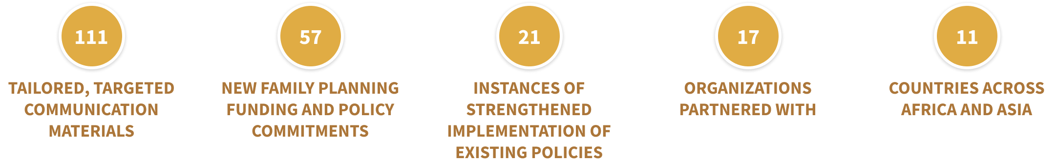
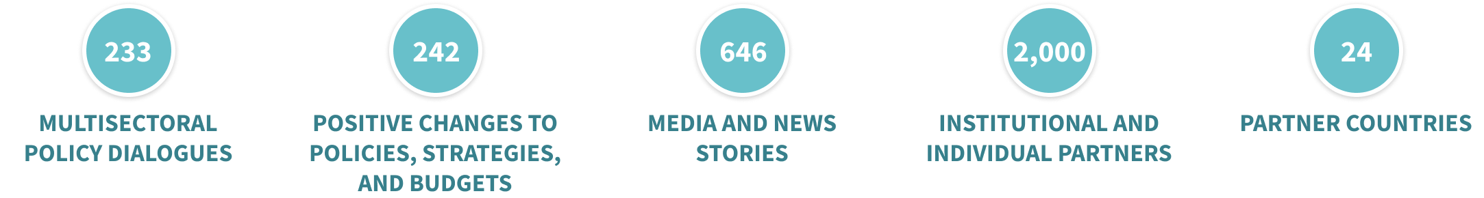
For seven years, the PACE project worked together with local partners to build champions, bridge sectors, and distill evidence to ensure that family planning, reproductive health, and population issues are recognized as key to sustainable and equitable economic growth and development across Africa and Asia. The project ended in 2022, but its focus on connecting with local institutions and intentional shifting of program leadership to local partners ensures its aims and work continue.
For five years, the SAFE ENGAGE project created spaces for dialogue and collaboration among different stakeholders as they worked together to develop strategic messages aimed at improving access to safe abortion, strengthen the capacity of advocates to achieve policy goals, and work with journalists to improve evidence-based reporting. The project’s approach brought together partners from Anglophone and Francophone countries, creating connections that will endure long after the project’s end in FY22.
In the United States, much of the policymaking around population health resides with states and localities. The decentralized nature of decision-making means that, to be effective, research and policy must focus on the communities they serve. PRB’s U.S. Programs staff provide trainings and resources to local leaders around the country to help them find the data they need on population, housing, and health trends so they can understand and respond to their communities’ needs.
In California, we are a force behind the scenes, working as an intermediary between data producers like the U.S. Census Bureau and the California Department of Education. We do the heavy lifting to make data and trends accessible across more than 1,000 indicators so that county program staff, journalists, advocates, and policymakers can spend their limited time and resources focusing on policy and program change instead of looking for the right data.
The KidsData program promotes the health and well-being of children in California by providing an easy-to-use resource that offers high-quality, wide-ranging, local data to those who work on behalf of children in a way that is accessible to policymakers, service providers, grant seekers, media, parents, and others who influence children’s lives.
![]()
PRB information products in 2022 included blogs, briefs, fact sheets, reports, videos, and websites on topics like children’s well-being, family planning and reproductive health, equity, and the challenge of misinformation in today’s world. We’ve curated a sampling for you to explore.
Family Experiences During the COVID-19 Pandemic
Black Women Over Three Times More Likely to Die in Pregnancy, Postpartum Than White Women
Building Up Communities by Breaking Down Data
Dying Young in the United States
Rising Obesity in an Aging America: Policy and Program Implications
The Democratic Republic of the Congo Leads the Way on Abortion Access
The Future of Family Planning in Africa
Resilient Future: Climate Financing Strategies for Family Planning Programs
Youth Family Planning Policy Scorecard
2022 World Population Data Sheet
Data and Demagoguery: Human Rights and Development in the Disinformation Age
We appreciate the organizations and individuals whose generous support makes our work possible. Thank you.
PRB worked together with 48 organizations in 2022.
Through their generous contributions, the individuals listed here allowed PRB to fund essential program expansion and organizational innovations during the fiscal year ending Sept. 30, 2022.


Technical Director, Demographic Research
Europe is the oldest region in the world, with almost one in five people ages 65 and older . Many European countries are concerned about the implications of this aging population, including a growing demand for old-age support and a shrinking pool of working-age people to provide it. As the urgency of the care-work crunch becomes more apparent, new research funded by the National Institute on Aging reveals that women and people without children take on a disproportionate share of this unpaid care work across the continent.
Europeans can expect to spend over half of their lives after age 15 providing unpaid family care work, including taking care of children and older relatives. However, women in Europe spend six more years doing unpaid caregiving work than European men, according to a study by Ariane Ophir, now at the Center d’Estudis Demogràfics, and Jessica Polos, now at DePaul University. 1
Ophir and Polos estimated care life expectancy, or the number of years after age 15 people can expect to spend providing informal care, by sex in 23 European countries. 2 Data on unpaid caregiving came from the European Social Survey , and life expectancy data came from the Human Mortality Database’s abridged period life tables.
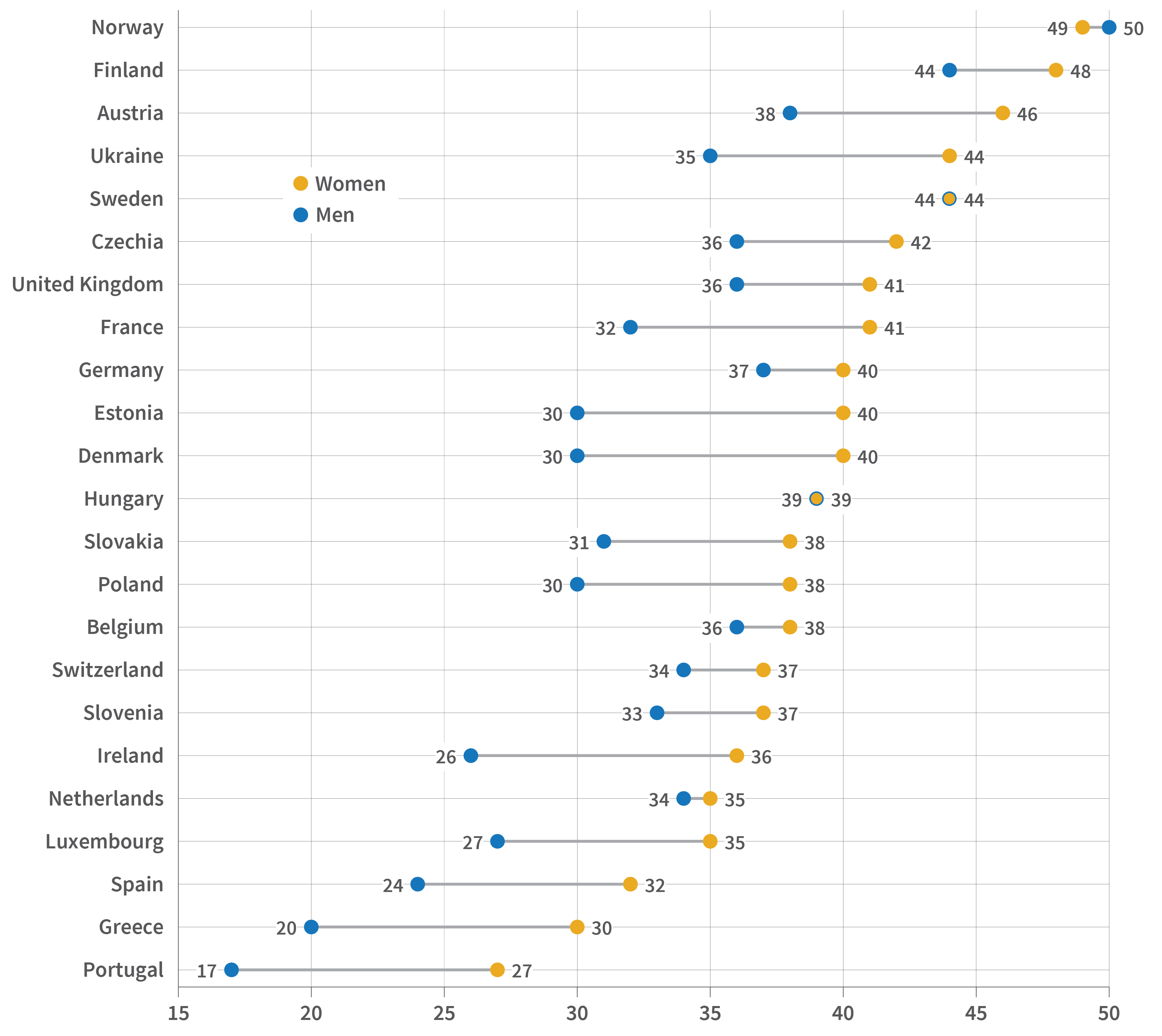
Source: Ariane Ophir and Jessica Polos, “Care Life Expectancy: Gender and Unpaid Work in the Context of Population Aging,” Population Research and Policy Review 41, no. 1 (2022): 197-227.
In the examined countries, the average care life expectancy is 33 years for men and 39 years for women, they found. And while the duration of caregiving life among men differs across countries—from 17 years in Portugal to 50 years in Norway—there is much less variability among women, reflecting how women consistently take on the primary caregiving burden, the authors explained.
By breaking down caregiving years by level of care, the authors also found that women spend significantly more time providing care at a high level, meaning daily or several times a week. In most of the examined countries, more than half of women’s caregiving years are spent on high-level care, compared to less than half of men’s. Women’s care life expectancy includes five to 10 more years of high-level caregiving than men’s in most countries, they found.
A similar gender gap in caregiving exists in the United States, according to Denys Dukhovnov of the University of California-Berkeley, Joan Ryan of the University of Pennsylvania, and Emilio Zagheni of the Max Planck Institute for Demographic Research.3 Compared to men who provide care, women spend 67% more time on average—around 50 minutes per day—providing unpaid care, their analysis found.
Using data from the American Time Use Survey and the Panel Study of Income Dynamics, Dukhovnov, Ryan, and Zagheni also showed that women in the United States spend twice as much time as men caring for young children, and that women in middle age spend slightly more time than men caring for older adults.
Both studies suggest the importance of considering the gender gap in informal caregiving when designing programs to promote more equitable work and family policies.
While women today are in the workforce longer than previous generations, they still spend fewer years employed than men in most European countries. But gender gaps in how long people work shrink or are even reversed when both paid and unpaid work are counted, a separate study by Ophir found.4
Ophir examined paid and unpaid working life expectancy at age 50 by sex, or the years 50-year-old women and men are expected to spend in employment and informal caregiving, including caring for grandchildren and helping older adults with daily activities. The study used data from the Survey of Health, Ageing, and Retirement in Europe (SHARE) from 17 countries across Europe.5
Women’s working life expectancy is longer than men’s by up to a year in all but four countries, but the components of this work are very different for men and women, the study found. The largest component for women is years spent exclusively in unpaid work, while for men it is years spent only in paid work. Women are also expected to spend more years than men simultaneously in paid and unpaid work in most countries, compounding their caregiving burden.
Most of the years women and men care for grandchildren occur after retirement, while some of the years they spend caring for older adults happen while still employed, especially for men, the study found. While women spend more years than men providing both types of care, the gap is larger with grandchild care, possibly reflecting women’s tendency to retire earlier, Ophir says.
Though concerns over the care burden in aging societies often focus on caring for older adults, caring for grandchildren is also an important part of working life among older women, Ophir says. Debates on increasing retirement age and work-family policies should therefore incorporate an intergenerational perspective, she suggests.
The gendered pattern of caregiving years suggests that women’s “additional investment in unpaid care work in older adulthood, which conflicts with paid work and does not count toward pension benefits, could exacerbate gender inequality later in life and expose older women to additional economic disadvantages,” Ophir further explains.
Luca Maria Pesando, now at New York University, found that adults with no children are about 20% to 40% more likely than those with children to provide financial, practical, and emotional support to their older parents, especially to mothers.6 Using Generations and Gender Survey (GGS) data from 11 European countries, his study examined support to older parents among adults ages 40 and older and whether having any children made a difference.7
Assessing the support provided to mothers and fathers separately also reveals gendered patterns. Women are more likely than men to provide support to mothers, regardless of whether they have children, Pesando found. Compared to those with children, both childless men and women are more likely to provide support to their mothers. In contrast, while childless women are more likely to provide support to their fathers, childlessness does not relate to the likelihood that men will provide support to their fathers.
The difference may reflect mothers being more socially and emotionally connected to their children than fathers, Pesando explains. Fathers are also more likely than mothers to have spouses still alive to provide support —reducing the potential burden on adult children—but the study controlled for this gender difference.
These findings are important in light of the growing share of childless adults in most European countries and concerns over the impact on demand for public support as people age. “These findings… support the view that researchers and policymakers should take into more consideration not only what childless people receive or need in old age, but also what they provide as middle-aged adults,” Pesando says.
While most countries in Europe older populations compared to the rest of the world, life expectancy and fertility levels vary. Norms around gender and family responsibilities also vary, partly reflecting differences in social policies that affect gender equality and care provision. All three studies conducted in Europe show variations in their findings across countries, in part due to their unique demographic profiles, norms, and policies.
Ophir and colleagues show that while the care life expectancy does not vary substantially across countries, the proportion of years spent providing high-level care differs. In Nordic countries such as Denmark and Sweden, women and men have longer care life expectancies but spend a smaller share of this time providing high-level care; they also have smaller gender gaps in caregiving. These countries have more egalitarian gender ideologies than other European countries and more generous welfare regimes that include family caregiving, the researchers say. They are also similar across some demographic factors, such as total fertility rate, age at first birth, life expectancy, and healthy life expectancy, they note.
In countries in Southern Europe, such as Greece, and some Central and Eastern European countries, such as Slovakia, care life expectancies are shorter but involve greater shares of high-level caregiving. These countries rely more on families to take on primary caregiving responsibilities, the researchers note. They do not, however, share similar demographic profiles, suggesting the importance of social contexts in addition to demographic factors in shaping the nature of care life expectancy, they add.
In her analysis examining both unpaid and paid work, Ophir also finds variation across countries in the intensity of care. For example, while the overall working life expectancy is the longest for Swedish adults, most of their unpaid work was low intensity, reflecting the country’s generous welfare regime. While the overall working life expectancy is relatively shorter in Greece, Italy, and Poland, most of the unpaid work for women involves higher-level caregiving.
Pesando finds that adults are less likely to care for their older parents in Northern Europe, where comprehensive publicly funded programs can provide this care. Though differences are not large among countries in Eastern and Western Europe, adults are most likely to support older parents in Russia, followed by Czechia. Both countries are former socialist welfare states with heavy reliance on family support and limited publicly funded services for older adults, he notes.
Despite concerns over the economic implications of population aging and the labor force participation of older adults, informal caregiving has received little attention in policy debates. The disproportionate burden that falls on women and adults without children is therefore largely unnoticed. Discussions of aging-related policies, including pension reforms, old-age entitlements, and changes in the retirement age, should be informed by patterns in informal caregiving. Addressing informal caregiving also helps promote gender equality, especially in later life.


Former Research Intern
Research Associate
Having been on the forefront of Manifest Destiny, the Gold Rush, and post-World War II urban sprawl, the Southwest has had a long history of exponential growth, innovation, and development. But is this the case across the entire region?
Here, we present a tale of two states—Arizona and New Mexico—and break down five reasons why the actual story is more nuanced than it seems.
1. Their populations are not growing at the same rate. Compared to the nation as a whole, which grew by roughly 7% over the decade, New Mexico’s population growth was below average (3%), while Arizona’s was above average (12%). This difference is not explained by fertility rates in Arizona and New Mexico. Nor is it explained by mortality rates; despite New Mexico having a higher age-adjusted mortality rate than Arizona between 2010-2020, the difference is not impactful. It boils down to migration, especially of people moving from other, often neighboring, states. Heading into 2020, Arizona had a net migration gain of almost 600,000 new residents, while New Mexico had a net loss of about 40,000 people.
2. Metropolitan counties are booming, especially in Arizona. Growth in metropolitan counties drove population gains in Arizona and New Mexico from 2010 to 2020. And while most of the population in both states resides in metropolitan counties, the share is much higher in Arizona (Figure 1). This is partly due to the more urbanized landscape of the state: More than half of Arizona’s counties are classified as metropolitan, compared to less than 1 in 5 counties in New Mexico.
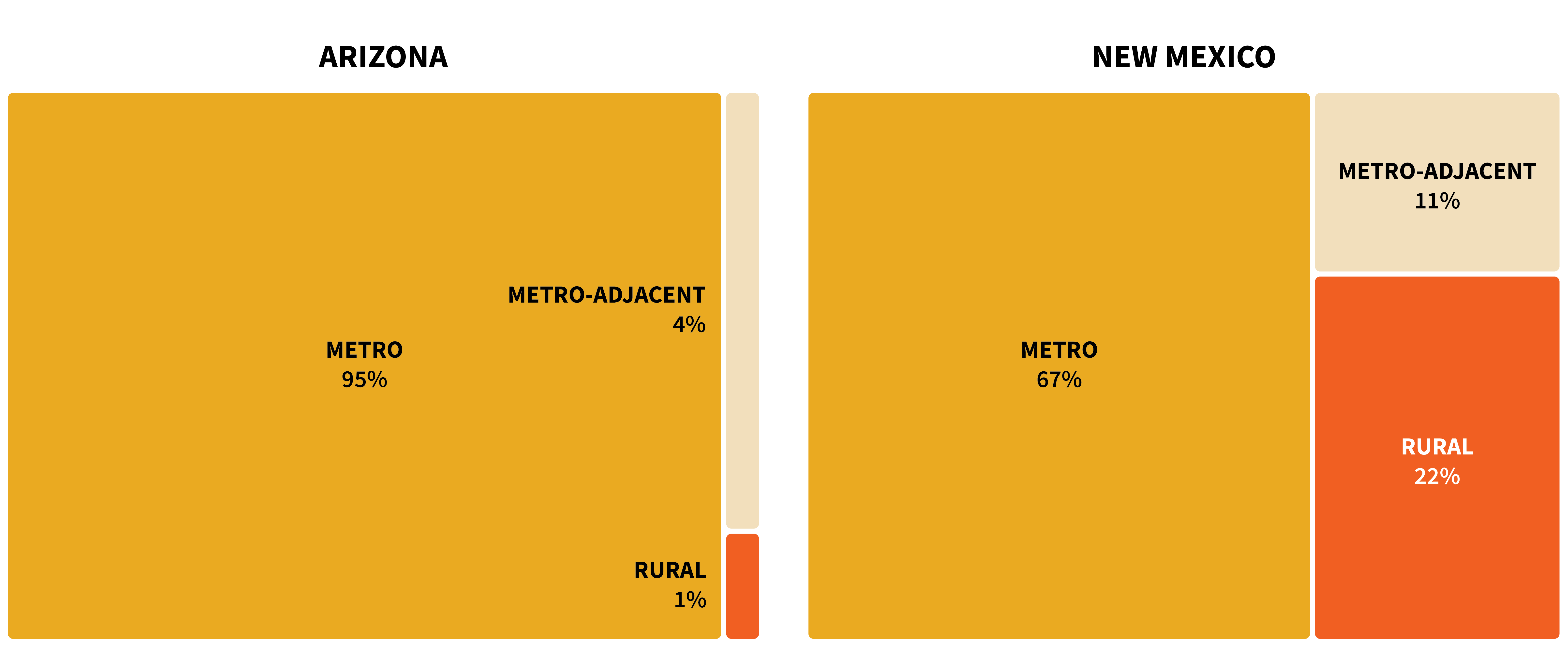
Sources: U.S. Census Bureau, 2020 Census Redistricting Data (Public Law 94-171); USDA Economic Research Service, 2013 Urban Influence Codes.
In fact, more people live in Arizona’s metro counties than in the entire state of New Mexico. The two largest counties in Arizona are each home to over 1 million people, while the largest in New Mexico has under 700,000. While Bernalillo County is home to 1 in 3 New Mexico residents, Arizona’s Maricopa County has over six times as many people (Figure 2).
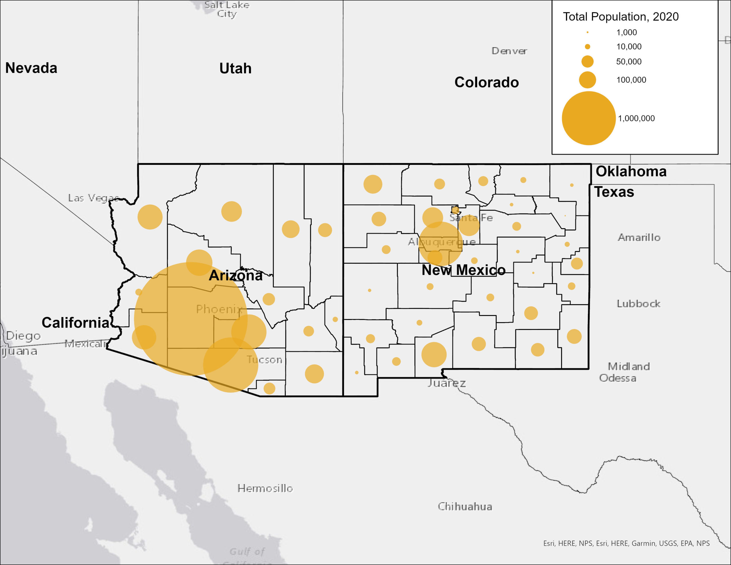
Source: U.S. Census Bureau, 2020 Census Redistricting Data (Public Law 94-171).
Migration into Maricopa County and surrounding counties has driven much of Arizona’s population growth. Meanwhile, most New Mexico counties saw negative net migration; 70% of the metro counties that grew experienced negative net migration, meaning the slight growth that they witnessed can largely be attributed to their birth and mortality ratios. Where New Mexico did see migration gains, the increase was likely due in part to job growth in the oil industry, which may not be sustainable over time.
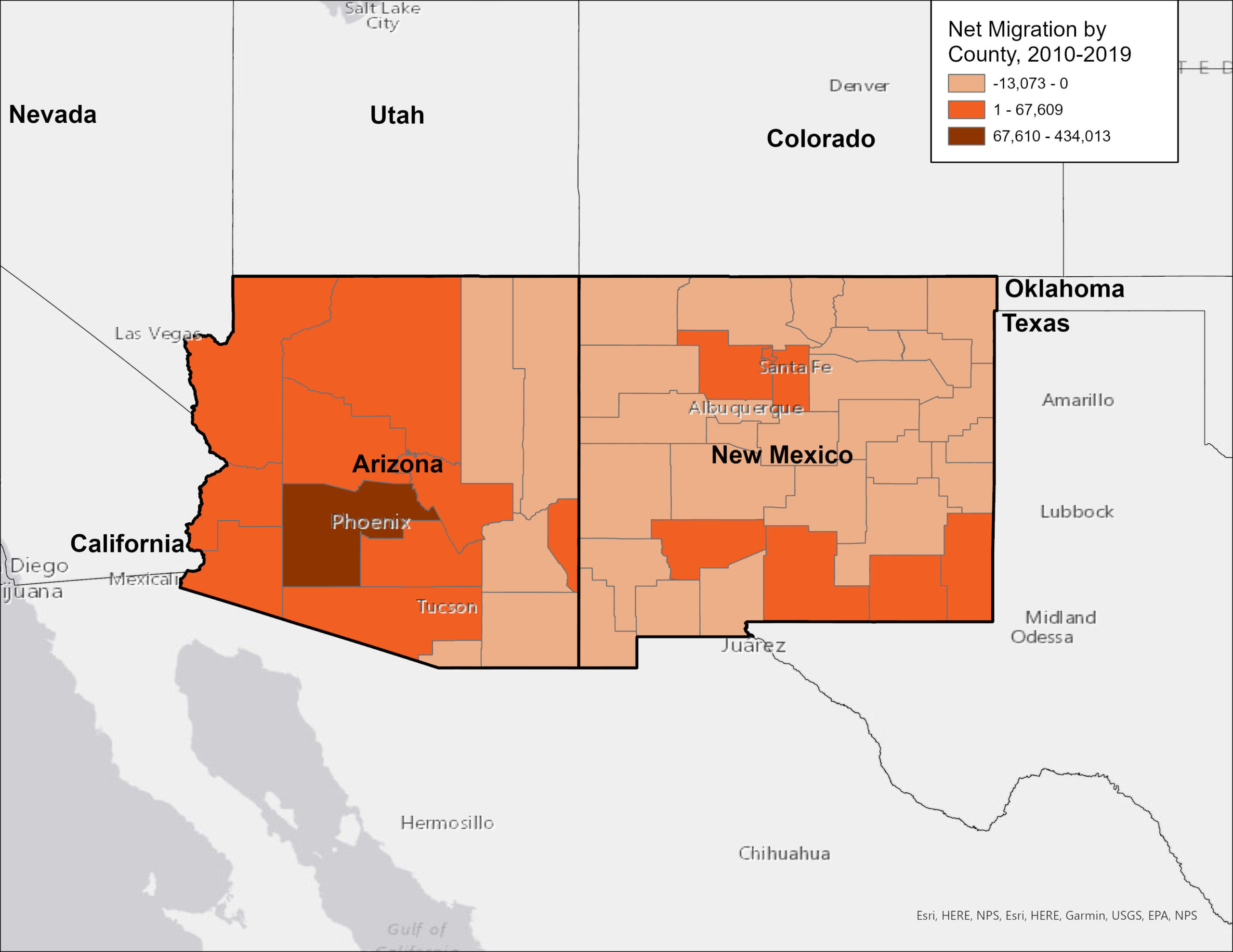
Source: PRB U.S. Indicators: Net Migration (2010-19).
3. Metropolitan Arizona has an abundance of business and employment opportunities. Arizona boasts one of the fastest-growing economies in the country. Over the past half-decade, the state has consistently witnessed job, income, and sales growth above the national average, with Maricopa County experiencing significant expansions in sectors such as health care, information, construction, and accommodation and food services. Home to Phoenix and its multitude of edge cities, the county was the most populous and fastest-growing in the state from 2010 to 2020, witnessing a 16% jump in its population. New business and job growth, particularly in the tech industry, have earned the area the nickname “Silicon Desert”, reflecting its status as a prosperous, pro-business environment supportive of start-ups with a healthy job market that promotes in-migration but without the high cost of living of California’s Silicon Valley.
4. New Mexico’s rural settings and struggling economic and education sectors are pushing people to leave. While New Mexico and Arizona rank similarly on quality of life indicators comparing cost-of-living, labor, inequality, life expectancy, and education characteristics, New Mexico lags a bit behind, mostly due to shorter life expectancy and lower rates of college degree attainment. Concerns about the quality of the K-12 education system may contribute to some of New Mexico’s out-migration, as families with children may choose to relocate to neighboring states for better schools. New Mexico scored among the 10 lowest ranking states on measures of fourth and eight-grade math and reading proficiency for the entirety of the 2010 to 2020 period.
Differences in the states’ economic approaches and opportunities may also help explain the slow growth in New Mexico. While Arizona has largely focused on growing private markets and promoting entrepreneurship, New Mexico has concentrated more resources on public spending. While Arizona regularly ranked among the top 10 states for total job growth, New Mexico frequently ranked among the bottom 10 from 2010-2020. Low job growth combined with a lack of urban settings that appeal to young adults has resulted in out-migration of working-age people to surrounding states such as Arizona, Nevada, Oklahoma, and Texas in search of city life and better job opportunities.
5. The future for the states presents different challenges. While job growth and the entrepreneurial spirit in Arizona may have their appeal, the state’s population growth is perpetuating increasingly urgent concerns about water availability amidst extensive residential development. Despite the current megadrought depleting the Colorado River—the primary source of water Arizona and all the states surrounding it—development continues without slowing. And while municipalities within Arizona are turning to other sources of water, such as groundwater and reservoirs, to continue accommodating population growth, these alternatives come with their own political complications and are finite. As the population grows and the water supply dwindles, Arizona is walking the limits on growth.
Meanwhile the out-migration of working-age adults and declining population of people under the age of 18 means New Mexico’s population is aging, which raises concern for further economic and quality of life consequences. Providing accommodations for a growing older adult population (such as healthcare, caregiving services, and accessibility modifications) and coping with a shrinking workforce puts pressure on the state’s economy. But recent trends, such as the rise in remote work, could present the opportunity to retain younger workers.